

UX Case Study • 14 mins read
meaily
Designed an app to tackle inefficiencies in food delivery, improving convenience and cost-efficiency.
Role
Product Design, Product Strategy, Design Consulting
Industry
Food Delivery & Logistics
Tools
Figma, FigJam, Notion
Team
Client, Developer, Consultant (Me)
Client
A Local Food Delivery Business
Year
2022
Duration
03 Months
Overview
This case study highlights how I identified and leveraged a market gap to redesign meal ordering in India’s competitive food delivery space. By shifting from an on-demand model to a scheduled meal subscription, I balanced user convenience with business efficiency. Explore the research, design process, and strategic decisions that shaped this innovative yet practical solution.


About the client
What is Meaily?
Meaily is a food delivery startup on a mission to make everyday meals affordable, reliable, and hassle-free. Inspired by India’s traditional tiffin services, Meaily aimed to provide a smarter alternative to expensive, inconsistent, and time-consuming food delivery options.
Designed for students, working professionals, and busy individuals, Meaily wanted to simplify daily meal planning, reduce decision fatigue, and offer a cost-effective way to get food without hidden charges or long wait times.

Overview
This case study highlights how I identified and leveraged a market gap to redesign meal ordering in India’s competitive food delivery space. By shifting from an on-demand model to a scheduled meal subscription, I balanced user convenience with business efficiency. Explore the research, design process, and strategic decisions that shaped this innovative yet practical solution.
About the client
What is Meaily?
Meaily is a food delivery startup on a mission to make everyday meals affordable, reliable, and hassle-free. Inspired by India’s traditional tiffin services, Meaily aimed to provide a smarter alternative to expensive, inconsistent, and time-consuming food delivery options.
Designed for students, working professionals, and busy individuals, Meaily wanted to simplify daily meal planning, reduce decision fatigue, and offer a cost-effective way to get food without hidden charges or long wait times.
High-level requirements
What we wanted to achieve?
Meaily aimed to launch a pilot platform to test market demand without excessive upfront investment. The goal was to create a customisable meal delivery service that allowed users to select meals based on their preferences—similar to a traditional tiffin service but with greater flexibility and convenience.
Meaily aimed to launch a pilot platform to test market demand without excessive upfront investment. The goal was to create a customisable meal delivery service that allowed users to select meals based on their preferences—similar to a traditional tiffin service but with greater flexibility and convenience.


Orders from platforms like Swiggy or Zomato cost 2x-3x more than home-cooked meals due to additional fees.
Initial research
Before diving into user research, I conducted secondary research to grasp the broader market landscape and pinpoint key challenges. This analysis validated the demand for an affordable, reliable, and scalable meal delivery service and strengthened our initial hypothesis.
These insights confirmed the need for a solution that delivers affordable, predictable daily meals.
About 20% of food waste in India comes from food services, with 15-25% of prepared food going uneaten.
Commisions
Restaurants pay 20-30% commission per order (up to 35% for smaller businesses)
Over 35% of India's population resides in urban areas, with millions seeking affordable daily meals.
food delivery market in 2022, projected to reach $12B by 2025 (CAGR ~25%).
Approximately 60% of urban professionals and students order food 5-6 times weekly due to time constraints.
Over 35% of India's population resides in urban areas, with millions seeking affordable daily meals.
food delivery market in 2022, projected to reach $12B by 2025 (CAGR ~25%).
Commisions
Restaurants pay 20-30% commission per order (up to 35% for smaller businesses)
Orders from platforms like Swiggy or Zomato cost 2x-3x more than home-cooked meals due to additional fees.
Initial research
Before diving into user research, I conducted secondary research to grasp the broader market landscape and pinpoint key challenges. This analysis validated the demand for an affordable, reliable, and scalable meal delivery service and strengthened our initial hypothesis.
These insights confirmed the need for a solution that delivers affordable, predictable daily meals.
About 20% of food waste in India comes from food services, with 15-25% of prepared food going uneaten.
Approximately 60% of urban professionals and students order food 5-6 times weekly due to time constraints.
Over 35% of India's population resides in urban areas, with millions seeking affordable daily meals.
food delivery market in 2022, projected to reach $12B by 2025 (CAGR ~25%).
Commisions
Restaurants pay 20-30% commission per order (up to 35% for smaller businesses)

Zomato & Swiggy offer variety but are expensive for daily meals, with hidden charges and no meal scheduling, making them inconvenient for time-sensitive users.

Local Tiffin Services are affordable yet lack customisation, have inconsistent quality, and operate offline with rigid meal timings.
Identifying gaps in the market
Competitive analysis
A competitive analysis of Zomato, Swiggy, and local tiffin services revealed distinct market gaps. By addressing these gaps, Meaily positions itself as a cost-effective, flexible, and predictable meal solution that combines affordability with modern digital convenience.
Orders from platforms like Swiggy or Zomato cost 2x-3x more than home-cooked meals due to additional fees.
Initial research
Understanding the market
Before diving into user research, I conducted secondary research to grasp the broader market landscape and pinpoint key challenges. This analysis validated the demand for an affordable, reliable, and scalable meal delivery service and strengthened our initial hypothesis.
These insights confirmed the need for a solution that delivers affordable, predictable daily meals.
Food waste
About 20% of food waste in India comes from food services, with 15-25% of prepared food going uneaten.
Commisions
Restaurants pay 20-30% commission per order (up to 35% for smaller businesses)
Urban migration
Over 35% of India's population resides in urban areas, with millions seeking affordable daily meals.
food delivery market in 2022, projected to reach $12B by 2025 (CAGR ~25%).
Reliance on external food
Approximately 60% of urban professionals and students order food 5-6 times weekly due to time constraints.
Orders from platforms like Swiggy or Zomato cost 2x-3x more than home-cooked meals due to additional fees.
Initial research
Before diving into user research, I conducted secondary research to grasp the broader market landscape and pinpoint key challenges. This analysis validated the demand for an affordable, reliable, and scalable meal delivery service and strengthened our initial hypothesis.
These insights confirmed the need for a solution that delivers affordable, predictable daily meals.
About 20% of food waste in India comes from food services, with 15-25% of prepared food going uneaten.
Commisions
Restaurants pay 20 to 30% commission per order (up to 35% for smaller businesses)
Over 35% of India's population resides in urban areas, with millions seeking affordable daily meals.
food delivery market in 2022, projected to reach $12B by 2025 (CAGR ~25%).
Approximately 60% of urban professionals and students order food 5-6 times weekly due to time constraints.
Initial hypothesis
What we believed
Based on research insights, I formulated key hypotheses to guide Meaily’s design:
Busy professionals need predictability
Scheduled meal deliveries can help manage limited break times and reduce last-minute unhealthy choices.
Affordability drives daily deal decisions
Transparent pricing is essential, as current platforms are too costly for regular use.
Customization without overwhelm
Users desire the freedom to customise their meals without being overwhelmed by options.
Restaurant demand management
Pre-scheduled orders can help restaurants better predict demand and reduce food waste.
Quick Meals for Urgent Needs
Although quick delivery is valued for snacks, for full meals, pre-planning is more effective given limited lunch breaks.


Design Process
Lean & Agile approach
To keep the business moving swiftly, I followed a hybrid lean and agile approach. I began by designing the core food ordering platform to enable quick market entry, while simultaneously conducting secondary research on meal delivery trends. This strategy allowed us to rapidly build the MVP and provided the flexibility to iterate based on emerging insights.
Phase 1: MVP launch
Competing with speed & simplicity
Given the need for a quick rollout our goal was to launch a basic food delivery platform to test demand. As the sole designer, I focused on:
Differentiation
Standing out in a crowded market
Cost Efficiency
Avoiding native app development
Speed
Launching in 6 weeks

Mobile-First WebApp Strategy
I advocated for a WebApp over native apps, reducing development costs by 40% and accelerating launch timelines.
Collaborated with developers to ensure responsive layouts worked seamlessly across devices.

Designed a low-fidelity prototype to validate core user flows like search, filters, checkout etc. This helped aligning stakeholders early.
Impact:
Unified the team on navigation and feature priorities in 2 workshops.
Enabled developers to start backend setup 10 days earlier while I refined UI details.
Example Trade-off:
Removed complex loyalty programs to focus on speed.
Built a high-fidelity prototype in Figma with:
WCAG 2.0-compliant UI: Contrast ratios, readable typography.
Essential features only: Search, filters, real-time tracking.
Branding integration: Warm color palette, friendly illustrations.
Developer Collaboration:
Shared component library early to ensure design-to-code alignment.
Used auto-layouts to simplify responsiveness for all screen sizes.


1200+ Orders
in the first 3 weeks.
launched MVP in
42 Days
with 15 restaurant partners.

Mobile-First WebApp Strategy
I advocated for a WebApp over native apps, reducing development costs by 40% and accelerating launch timelines.
Collaborated with developers to ensure responsive layouts worked seamlessly across devices.
Designed a low-fidelity prototype to validate core user flows like search, filters, checkout etc. This helped aligning stakeholders early.
Impact:
Unified the team on navigation and feature priorities in 2 workshops.
Enabled developers to start backend setup 10 days earlier while I refined UI details.
Example Trade-off:
Removed complex loyalty programs to focus on speed.
Built a high-fidelity prototype in Figma with:
WCAG 2.0-compliant UI: Contrast ratios, readable typography.
Essential features only: Search, filters, real-time tracking.
Branding integration: Warm color palette, friendly illustrations.
Developer Collaboration:
Shared component library early to ensure design-to-code alignment.
Used auto-layouts to simplify responsiveness for all screen sizes.
1200+ Orders
in the first 3 weeks.
launched MVP in
42 Days
with 15 restaurant partners.
Phase 2: Pivoting to Subscription
Solving deeper pain points
During the initial research, we identified a larger opportunity to move beyond on-demand ordering to a model that is replicates tiffin service. This pivot was driven by market insights and data, confirming that predictable, scheduled meals could solve key challenges for both users and restaurants.
"We face high commission fees on Swiggy and Zomato, and we’d be happy to pay them if we had a clearer idea of the order volume or some way to predict demand."
"I prefer ordering from restaurants that offer combos or meal sets, but sometimes the quantity isn’t enough, or there’s something I don’t want, but I still have to pay for it."
"I usually just pick up takeout from restaurants along the way, as I can’t spend hours on deciding food and wait for delivery after a long day."
"I don’t want to spend an hour picking what to order. With only 30 minutes for lunch, it’s just not feasible to order, get it delivered, and actually eat in that time."
"The food at my hostel isn’t great, so I end up ordering 3-4 times a week. But it’s getting really expensive, mainly with surge pricing."
"I don’t like tiffin services because I can't choose my own menu. That’s why I hired a cook, but managing both office and cooking schedules is tough, so I end up spending money on food delivery."
User research & persona
Understanding real problem & users
I conducted primary research through two surveys (targeting users and restaurants) with 73 responses and 8 in-depth interviews (5 with users, 3 with restaurant owners/managers). This research uncovered behavioural and emotional drivers behind food ordering. Key findings included that 81% of respondents were aged 19–38, and 59% had moved to cities for work or study. Additionally, restaurants often close listings during peak hours due to unpredictable demand.
Research revealed that the primary user demographic is aged 20–33. This tech-savvy group, comprising working professionals and students, values convenience and efficiency in managing their daily meals. They seek flexible, time-saving solutions that align with their busy lifestyles.
Validating hypothesis
What we discovered
After user research, I evaluated our initial hypotheses. This validation helped refine the solution, ensuring that Meaily effectively addresses real user needs while balancing convenience, affordability, and operational efficiency
Busy professionals need predictability
Scheduled meal deliveries can help manage limited break times and reduce last-minute unhealthy choices.
Correct
Scheduled meal deliveries meet users’ time constraints.
Affordability drives daily deal decisions
Transparent pricing is essential, as current platforms are too costly for regular use.
Correct
Hidden fees make on-demand ordering unsustainable.
Customization without overwhelm
Users desire the freedom to customise their meals without being overwhelmed by options.
Partially correct
Customisation wanted by users, but some desire preset options for convenience.
Restaurant demand management
Pre-scheduled orders can help restaurants better predict demand and reduce food waste.
Correct
Predictable orders help restaurants optimise operations.
Quick Meals for Urgent Needs
Although quick delivery is valued for snacks, for full meals, pre-planning is more effective given limited lunch breaks.
Partially correct
Fast delivery is fine for snacks, but for full meals, scheduling is more effective given limited breaks time.


How Might We
Defining the problem
Building on these findings, I used How Might We (HMW) statements to transform challenges into actionable design opportunities. This approach helped clarify the problems and enabled iterative ideation and solution testing. The HMW statements provided a clear foundation for creating solutions that directly addressed user pain points and market needs.
Possible solution
Defining features
Using the MoSCoW method, I prioritised features to build a focused MVP by implementing all Must-Haves and incorporating low-resource Should-Haves in collaboration with developers. It's like sampling a small pastry before buying the whole cake—ensuring we validate the concept without overcommitting resources.
Must-Have
Schedule deliveries via a simple calendar interface.
Create custom meals based on user preferences.
Charge users only for delivered meals, ensuring cost transparency.
Allow users to cancel scheduled orders within a set timeframe without penalties.
Offer subscription plans for daily or weekly meals at discounted rates.
Should-Have
Order from multiple restaurants in one go.
Add extra items to scheduled meals.
Could-Have
AI-powered meal recommendations based on dietary preferences.
Express delivery within 10-15 minutes for urgent needs.
Group ordering for shared meals with colleagues or flatmates.
Won’t-Have
Loyalty points or reward systems (explored in later phases).

Minimum Restriction,
Maximum Convenience
A seamless meal planning experience
I transformed the daunting daily food ordering process into a simple, seamless meal subscription experience. Instead of rushing to order every day, users can schedule meals in advance, customise their selections, and receive timely deliveries. By balancing automation and flexibility, Meaily creates a consistent meal routine while reducing decision fatigue.
UX Strategy:
Automation for Convenience: Pre-scheduled orders eliminate repetitive tasks, making the process effortless.
Effort Justification: Users’ upfront effort in planning increases perceived value and long-term engagement.

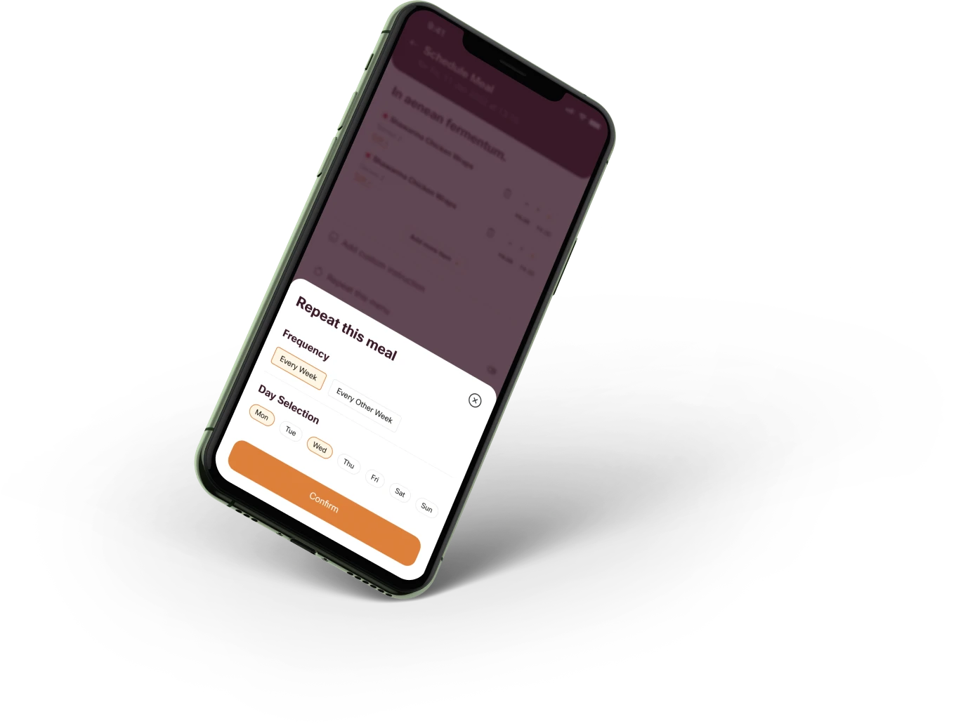
Familiar simplicity
Plan meals like Scheduling meetings
Inspired by digital calendars, I designed a simple calendar view that allows users to schedule multiple meals throughout the day. This familiar interface makes meal planning feel natural, giving users complete flexibility in choosing when and how often they want to eat.
UX Strategy:
Mental Model Alignment: Leveraging a calendar interface reduces the learning curve.
Flexibility & Autonomy: Users have full control over scheduling, adapting to their individual needs.
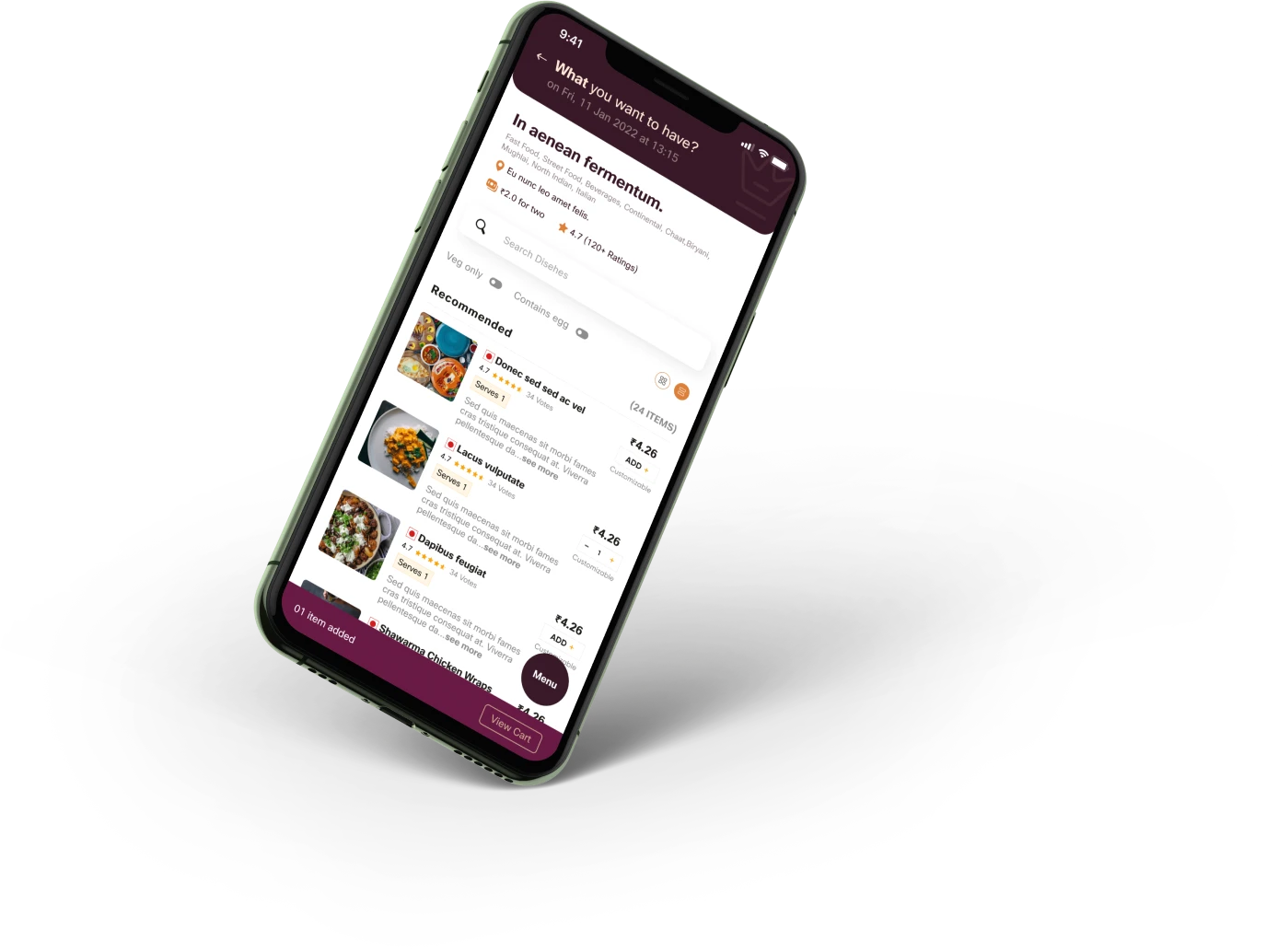
Clear navigation & Progress bar
Guiding users with clarity
I implemented clear navigation and a progress bar to break down the meal planning process into digestible steps. This structure reduces cognitive load and keeps users informed of their progress, boosting confidence and ensuring a smooth journey through meal selection.
UX Strategy:
Cognitive Load Reduction: A step-by-step flow minimizes overwhelm.
Goal Gradient Effect: A progress bar motivates users by showing how close they are to completion.
Leveraging memory
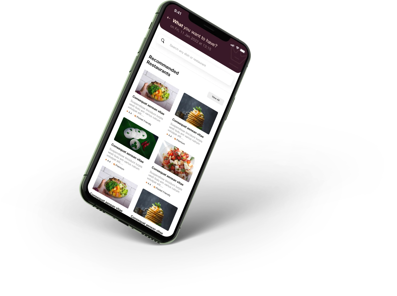
Effortless meal selection
I maintained an intuitive restaurant and item selection process similar to popular food ordering apps, but integrated scheduling to shift the focus from immediate ordering to future planning. This familiar interaction, combined with advanced scheduling, reduces last-minute decision fatigue.
UX Strategy:
Familiar Interaction Patterns: Known flows ease the transition for users.
Commitment-Consistency: Pre-scheduled orders enurage adherence to meal plans.
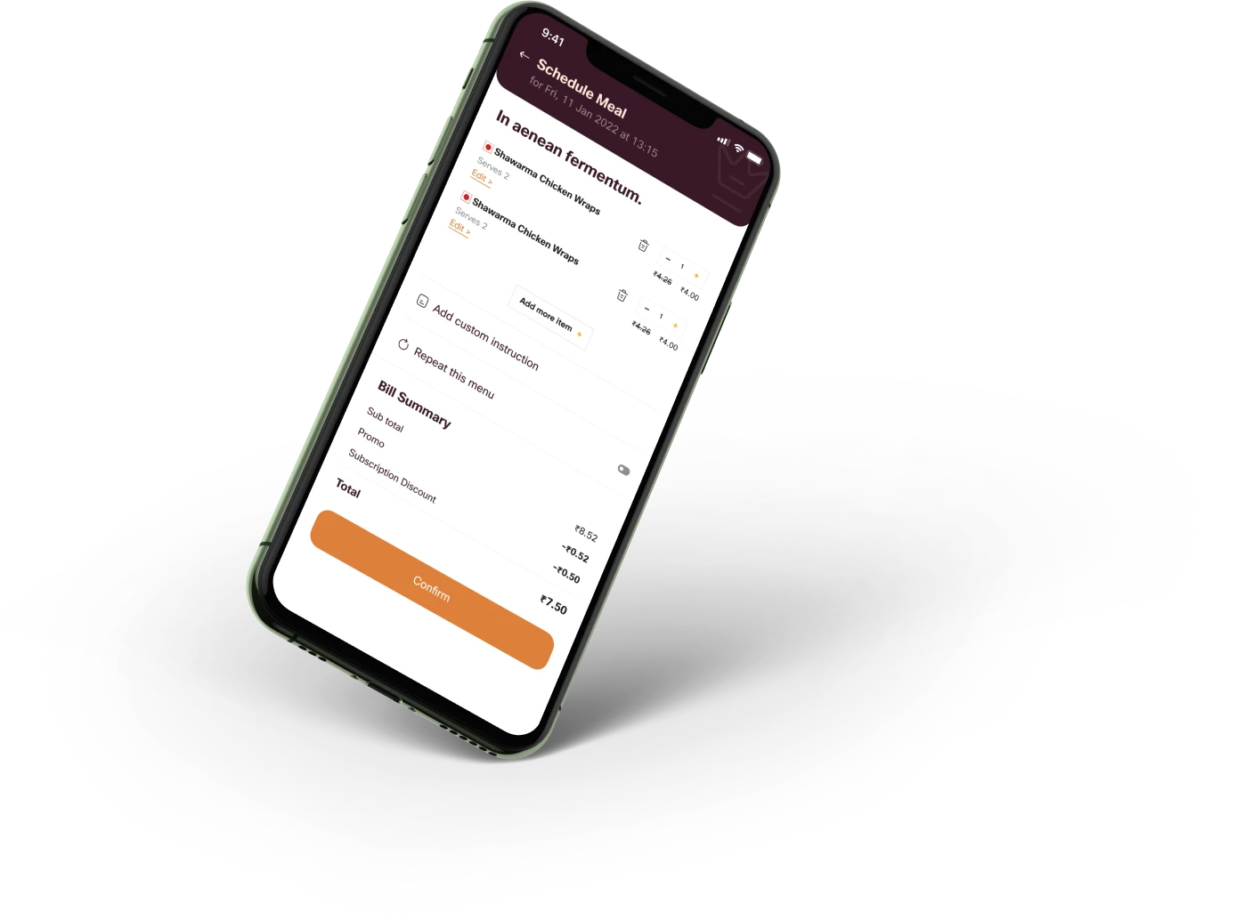
Simple savings insights
Clear meal cost overview
The Cost Calculator screen provides users with a clear overview of their savings by presenting the average meal cost from their subscription plan. This summary lets users quickly grasp their long-term savings, with an option to view a detailed breakdown for transparency.
UX Strategy:
Simplified Information Architecture: Focusing on average costs makes savings immediately clear.
Trust through Transparency: Detailed breakdowns, available on demand, build user confidence.
Direct and simple language
Effective UX writing
Throughout the platform, I used clear and direct UX writing to guide users effortlessly through the meal planning process. Prompts such as "Where to deliver?", "When to deliver?", "What to deliver?", and "How much will it cost?" reduce cognitive load and streamline the user experience.
High value, less distraction
UX of Notifications
Meaily’s notification system is designed to deliver timely, relevant updates without disrupting the user experience. Notifications are clear and concise, reminding users about their upcoming meals. Additionally, this notifications ensure users can easily adjust their plans—if there’s a change in schedule, they can cancel a meal without penalty, and restaurants can minimise food waste.

Unlocking business potential
Win-Win-Win for all
The subscription model not only enhances the user experience but also delivers significant business benefits. Consistent, predictable orders allow restaurants to streamline operations, optimise inventory, and reduce food waste, while fostering stronger partnerships. For Meaily, recurring subscriptions open new revenue streams, enable accurate demand forecasting, and improve logistics by optimising delivery routes for cost efficiency.
87%
User satisfaction rate reported during the pilot.
30
New restaurants joined in 15 days post-launch through predictable, recurring orders.
~20%
Reduction in customer drop-off, thanks to automatic meal delivery & pre-scheduled orders.
22%
Lower commissions for restaurants compared to Swiggy/Zomato.
~25%
Less food waste for partners due to improved demand forecasting.
30%
Reduction in logistics costs via advanced order scheduling.
35%
Users converted to subscriptions, leading to a ~35% increase in subscription sign-ups
13
1.2k+
Orders in the first 3 weeks of Phase 1 MVP launch
Impact & Results
Future opportunities
Looking ahead, we plan to introduce features that will enhance user experience and drive growth:
AI-Powered Recommendations: Personalised meal suggestions based on dietary preferences.
Express Delivery: 10-15 minute delivery for urgent meal needs.
Group Ordering: Simplified ordering for shared meals with colleagues or flatmates.
Loyalty Rewards: Points and rewards for frequent users to boost retention.


Lessons & Reflections
This case study reflects not only my ability to design engaging, user-centric digital products but also my strategic thinking in addressing real business challenges. By iterating quickly, balancing data with user insights, and prioritising key features, I delivered a solution that benefits both users and restaurant partners—laying a strong foundation for future growth in the competitive food delivery market.
Data-Driven insights must be cross-checked with user needs
Initially, data suggested a "make, pack, and deliver" model. However, through user research, I discovered that users wanted convenience, but also desired flexibility in meal selection. This taught me the importance of aligning data insights with real user needs—an approach that ensures a more intuitive and successful design.
Real-World inspirations translate well to digital
The traditional Tiffin service model and advance catering/restaurant bookings (which usually cheaper) inspired key aspects of the meal subscription design, highlighting how offline experiences can inform online solutions.
Automation + Flexibility = Success
Balancing automation with the freedom to customise (e.g., meal schedules and menu preferences) is key to ensuring user satisfaction and retention.
Feature prioritisation is key
Phasing features and focusing on core functionalities ensures a streamlined and effective solution.
Designing for both users and business goals:
Balancing user needs with business objectives is crucial to ensuring the design is successful for both users and stakeholders.
Effective UX writing enhances engagement
Clear, concise copy is essential for guiding users smoothly.

That’s a wrap? Maybe not.
Great things start with 'Meet'!

Open to  conversations,
  collabs,
  creative challenges,
  puzzles-or just a friendly game of
  Chess.
or connect through..


© Copyright & stuff...
Created with  curiosity
  coffee
  love,
love,  some peer pressure, and
  way too many open tabs. Thanks for stopping by—don’t forget to blink and drink (water ofc)!
Back to top
UX Case Study • 14 mins read
meaily
Designed an app to tackle inefficiencies in food delivery, improving convenience and cost-efficiency.
Role
Product Design, Product Strategy, Design Consulting
Industry
Food Delivery & Logistics
Tools
Figma, FigJam, Notion
Team
Client, Developer, Consultant (Me)
Client
A Local Food Delivery Business
Year
2022
Duration
03 Months
Overview
This case study highlights how I identified and leveraged a market gap to redesign meal ordering in India’s competitive food delivery space. By shifting from an on-demand model to a scheduled meal subscription, I balanced user convenience with business efficiency. Explore the research, design process, and strategic decisions that shaped this innovative yet practical solution.
About the client
What is Meaily?
Meaily is a food delivery startup on a mission to make everyday meals affordable, reliable, and hassle-free. Inspired by India’s traditional tiffin services, Meaily aimed to provide a smarter alternative to expensive, inconsistent, and time-consuming food delivery options.
Designed for students, working professionals, and busy individuals, Meaily wanted to simplify daily meal planning, reduce decision fatigue, and offer a cost-effective way to get food without hidden charges or long wait times.
High-level requirements
What we wanted to achieve?
Meaily aimed to launch a pilot platform to test market demand without excessive upfront investment. The goal was to create a customisable meal delivery service that allowed users to select meals based on their preferences—similar to a traditional tiffin service but with greater flexibility and convenience.
Meaily aimed to launch a pilot platform to test market demand without excessive upfront investment. The goal was to create a customisable meal delivery service that allowed users to select meals based on their preferences—similar to a traditional tiffin service but with greater flexibility and convenience.
Orders from platforms like Swiggy or Zomato cost 2x-3x more than home-cooked meals due to additional fees.
Initial research
Before diving into user research, I conducted secondary research to grasp the broader market landscape and pinpoint key challenges. This analysis validated the demand for an affordable, reliable, and scalable meal delivery service and strengthened our initial hypothesis.
These insights confirmed the need for a solution that delivers affordable, predictable daily meals.
About 20% of food waste in India comes from food services, with 15-25% of prepared food going uneaten.
Commisions
Restaurants pay 20-30% commission per order (up to 35% for smaller businesses)
Over 35% of India's population resides in urban areas, with millions seeking affordable daily meals.
food delivery market in 2022, projected to reach $12B by 2025 (CAGR ~25%).
Approximately 60% of urban professionals and students order food 5-6 times weekly due to time constraints.
Over 35% of India's population resides in urban areas, with millions seeking affordable daily meals.
food delivery market in 2022, projected to reach $12B by 2025 (CAGR ~25%).
Commisions
Restaurants pay 20 to 30% commission per order (up to 35% for smaller businesses)
Orders from platforms like Swiggy or Zomato cost 2x-3x more than home-cooked meals due to additional fees.
Initial research
Before diving into user research, I conducted secondary research to grasp the broader market landscape and pinpoint key challenges. This analysis validated the demand for an affordable, reliable, and scalable meal delivery service and strengthened our initial hypothesis.
These insights confirmed the need for a solution that delivers affordable, predictable daily meals.
About 20% of food waste in India comes from food services, with 15-25% of prepared food going uneaten.
Approximately 60% of urban professionals and students order food 5-6 times weekly due to time constraints.
Over 35% of India's population resides in urban areas, with millions seeking affordable daily meals.
food delivery market in 2022, projected to reach $12B by 2025 (CAGR ~25%).
Commisions
Restaurants pay 20-30% commission per order (up to 35% for smaller businesses)
Zomato & Swiggy offer variety but are expensive for daily meals, with hidden charges and no meal scheduling, making them inconvenient for time-sensitive users.
Local Tiffin Services are affordable yet lack customisation, have inconsistent quality, and operate offline with rigid meal timings.
Identifying gaps in the market
Competitive analysis
A competitive analysis of Zomato, Swiggy, and local tiffin services revealed distinct market gaps. By addressing these gaps, Meaily positions itself as a cost-effective, flexible, and predictable meal solution that combines affordability with modern digital convenience.
Orders from platforms like Swiggy or Zomato cost 2x-3x more than home-cooked meals due to additional fees.
Initial research
Understanding the market
Before diving into user research, I conducted secondary research to grasp the broader market landscape and pinpoint key challenges. This analysis validated the demand for an affordable, reliable, and scalable meal delivery service and strengthened our initial hypothesis.
These insights confirmed the need for a solution that delivers affordable, predictable daily meals.
Food waste
About 20% of food waste in India comes from food services, with 15-25% of prepared food going uneaten.
Commisions
Restaurants pay 20-30% commission per order (up to 35% for smaller businesses)
Urban migration
Over 35% of India's population resides in urban areas, with millions seeking affordable daily meals.
food delivery market in 2022, projected to reach $12B by 2025 (CAGR ~25%).
Reliance on external food
Approximately 60% of urban professionals and students order food 5-6 times weekly due to time constraints.
Orders from platforms like Swiggy or Zomato cost 2x-3x more than home-cooked meals due to additional fees.
Initial research
Before diving into user research, I conducted secondary research to grasp the broader market landscape and pinpoint key challenges. This analysis validated the demand for an affordable, reliable, and scalable meal delivery service and strengthened our initial hypothesis.
These insights confirmed the need for a solution that delivers affordable, predictable daily meals.
About 20% of food waste in India comes from food services, with 15-25% of prepared food going uneaten.
Commisions
Restaurants pay 20 to 30% commission per order (up to 35% for smaller businesses)
Over 35% of India's population resides in urban areas, with millions seeking affordable daily meals.
food delivery market in 2022, projected to reach $12B by 2025 (CAGR ~25%).
Approximately 60% of urban professionals and students order food 5-6 times weekly due to time constraints.
Initial hypothesis
What we believed
Based on research insights, I formulated key hypotheses to guide Meaily’s design:
Busy professionals need predictability
Scheduled meal deliveries can help manage limited break times and reduce last-minute unhealthy choices.
Affordability drives daily deal decisions
Transparent pricing is essential, as current platforms are too costly for regular use.
Customization without overwhelm
Users desire the freedom to customise their meals without being overwhelmed by options.
Restaurant demand management
Pre-scheduled orders can help restaurants better predict demand and reduce food waste.
Quick Meals for Urgent Needs
Although quick delivery is valued for snacks, for full meals, pre-planning is more effective given limited lunch breaks.
Design Process
Lean & Agile approach
To keep the business moving swiftly, I followed a hybrid lean and agile approach. I began by designing the core food ordering platform to enable quick market entry, while simultaneously conducting secondary research on meal delivery trends. This strategy allowed us to rapidly build the MVP and provided the flexibility to iterate based on emerging insights.
Phase 1: MVP launch
Competing with speed & simplicity
Given the need for a quick rollout our goal was to launch a basic food delivery platform to test demand. As the sole designer, I focused on:
Differentiation
Standing out in a crowded market
Cost Efficiency
Avoiding native app development
Speed
Launching in 6 weeks
Mobile-First WebApp Strategy
I advocated for a WebApp over native apps, reducing development costs by 40% and accelerating launch timelines.
Collaborated with developers to ensure responsive layouts worked seamlessly across devices.
Designed a low-fidelity prototype to validate core user flows like search, filters, checkout etc. This helped aligning stakeholders early.
Impact:
Unified the team on navigation and feature priorities in 2 workshops.
Enabled developers to start backend setup 10 days earlier while I refined UI details.
Example Trade-off:
Removed complex loyalty programs to focus on speed.
Built a high-fidelity prototype in Figma with:
WCAG 2.0-compliant UI: Contrast ratios, readable typography.
Essential features only: Search, filters, real-time tracking.
Branding integration: Warm color palette, friendly illustrations.
Developer Collaboration:
Shared component library early to ensure design-to-code alignment.
Used auto-layouts to simplify responsiveness for all screen sizes.
1200+ Orders
in the first 3 weeks.
launched MVP in
42 Days
with 15 restaurant partners.
Phase 2: Pivoting to Subscription
Solving deeper pain points
During the initial research, we identified a larger opportunity to move beyond on-demand ordering to a model that is replicates tiffin service. This pivot was driven by market insights and data, confirming that predictable, scheduled meals could solve key challenges for both users and restaurants.
"We face high commission fees on Swiggy and Zomato, and we’d be happy to pay them if we had a clearer idea of the order volume or some way to predict demand."
"I prefer ordering from restaurants that offer combos or meal sets, but sometimes the quantity isn’t enough, or there’s something I don’t want, but I still have to pay for it."
"I usually just pick up takeout from restaurants along the way, as I can’t spend hours on deciding food and wait for delivery after a long day."
"I don’t want to spend an hour picking what to order. With only 30 minutes for lunch, it’s just not feasible to order, get it delivered, and actually eat in that time."
"The food at my hostel isn’t great, so I end up ordering 3-4 times a week. But it’s getting really expensive, mainly with surge pricing."
"I don’t like tiffin services because I can't choose my own menu. That’s why I hired a cook, but managing both office and cooking schedules is tough, so I end up spending money on food delivery."
User research & persona
Understanding real problem & users
I conducted primary research through two surveys (targeting users and restaurants) with 73 responses and 8 in-depth interviews (5 with users, 3 with restaurant owners/managers). This research uncovered behavioural and emotional drivers behind food ordering. Key findings included that 81% of respondents were aged 19–38, and 59% had moved to cities for work or study. Additionally, restaurants often close listings during peak hours due to unpredictable demand.
Research revealed that the primary user demographic is aged 20–33. This tech-savvy group, comprising working professionals and students, values convenience and efficiency in managing their daily meals. They seek flexible, time-saving solutions that align with their busy lifestyles.
Validating hypothesis
What we discovered
After user research, I evaluated our initial hypotheses. This validation helped refine the solution, ensuring that Meaily effectively addresses real user needs while balancing convenience, affordability, and operational efficiency
Busy professionals need predictability
Scheduled meal deliveries can help manage limited break times and reduce last-minute unhealthy choices.
Correct
Scheduled meal deliveries meet users’ time constraints.
Affordability drives daily deal decisions
Transparent pricing is essential, as current platforms are too costly for regular use.
Correct
Hidden fees make on-demand ordering unsustainable.
Customization without overwhelm
Users desire the freedom to customise their meals without being overwhelmed by options.
Partially correct
Customisation wanted by users, but some desire preset options for convenience.
Restaurant demand management
Pre-scheduled orders can help restaurants better predict demand and reduce food waste.
Correct
Predictable orders help restaurants optimise operations.
Quick Meals for Urgent Needs
Although quick delivery is valued for snacks, for full meals, pre-planning is more effective given limited lunch breaks.
Partially correct
Fast delivery is fine for snacks, but for full meals, scheduling is more effective given limited breaks time.
How Might We
Defining the problem
Building on these findings, I used How Might We (HMW) statements to transform challenges into actionable design opportunities. This approach helped clarify the problems and enabled iterative ideation and solution testing. The HMW statements provided a clear foundation for creating solutions that directly addressed user pain points and market needs.
Possible solution
Defining features
Using the MoSCoW method, I prioritised features to build a focused MVP by implementing all Must-Haves and incorporating low-resource Should-Haves in collaboration with developers. It's like sampling a small pastry before buying the whole cake—ensuring we validate the concept without overcommitting resources.
Must-Have
Schedule deliveries via a simple calendar interface.
Create custom meals based on user preferences.
Charge users only for delivered meals, ensuring cost transparency.
Allow users to cancel scheduled orders within a set timeframe without penalties.
Offer subscription plans for daily or weekly meals at discounted rates.
Should-Have
Order from multiple restaurants in one go.
Add extra items to scheduled meals.
Could-Have
AI-powered meal recommendations based on dietary preferences.
Express delivery within 10-15 minutes for urgent needs.
Group ordering for shared meals with colleagues or flatmates.
Won’t-Have
Loyalty points or reward systems (explored in later phases).
Minimum Restriction,
Maximum Convenience
A seamless meal planning experience
I transformed the daunting daily food ordering process into a simple, seamless meal subscription experience. Instead of rushing to order every day, users can schedule meals in advance, customise their selections, and receive timely deliveries. By balancing automation and flexibility, Meaily creates a consistent meal routine while reducing decision fatigue.
UX Strategy:
Automation for Convenience: Pre-scheduled orders eliminate repetitive tasks, making the process effortless.
Effort Justification: Users’ upfront effort in planning increases perceived value and long-term engagement.
Familiar simplicity
Plan meals like Scheduling meetings
Inspired by digital calendars, I designed a simple calendar view that allows users to schedule multiple meals throughout the day. This familiar interface makes meal planning feel natural, giving users complete flexibility in choosing when and how often they want to eat.
UX Strategy:
Mental Model Alignment: Leveraging a calendar interface reduces the learning curve.
Flexibility & Autonomy: Users have full control over scheduling, adapting to their individual needs.
Clear navigation & Progress bar
Guiding users with clarity
I implemented clear navigation and a progress bar to break down the meal planning process into digestible steps. This structure reduces cognitive load and keeps users informed of their progress, boosting confidence and ensuring a smooth journey through meal selection.
UX Strategy:
Cognitive Load Reduction: A step-by-step flow minimizes overwhelm.
Goal Gradient Effect: A progress bar motivates users by showing how close they are to completion.
Leveraging memory
Effortless meal selection
I maintained an intuitive restaurant and item selection process similar to popular food ordering apps, but integrated scheduling to shift the focus from immediate ordering to future planning. This familiar interaction, combined with advanced scheduling, reduces last-minute decision fatigue.
UX Strategy:
Familiar Interaction Patterns: Known flows ease the transition for users.
Commitment-Consistency: Pre-scheduled orders enurage adherence to meal plans.
Simple savings insights
Clear meal cost overview
The Cost Calculator screen provides users with a clear overview of their savings by presenting the average meal cost from their subscription plan. This summary lets users quickly grasp their long-term savings, with an option to view a detailed breakdown for transparency.
UX Strategy:
Simplified Information Architecture: Focusing on average costs makes savings immediately clear.
Trust through Transparency: Detailed breakdowns, available on demand, build user confidence.
Direct and simple language
Effective UX writing
Throughout the platform, I used clear and direct UX writing to guide users effortlessly through the meal planning process. Prompts such as "Where to deliver?", "When to deliver?", "What to deliver?", and "How much will it cost?" reduce cognitive load and streamline the user experience.
High value, less distraction
UX of Notifications
Meaily’s notification system is designed to deliver timely, relevant updates without disrupting the user experience. Notifications are clear and concise, reminding users about their upcoming meals. Additionally, this notifications ensure users can easily adjust their plans—if there’s a change in schedule, they can cancel a meal without penalty, and restaurants can minimise food waste.
Unlocking business potential
Win-Win-Win for all
The subscription model not only enhances the user experience but also delivers significant business benefits. Consistent, predictable orders allow restaurants to streamline operations, optimise inventory, and reduce food waste, while fostering stronger partnerships. For Meaily, recurring subscriptions open new revenue streams, enable accurate demand forecasting, and improve logistics by optimising delivery routes for cost efficiency.
87%
User satisfaction rate reported during the pilot.
30
New restaurants joined in 15 days post-launch through predictable, recurring orders.
~20%
Reduction in customer drop-off, thanks to automatic meal delivery & pre-scheduled orders.
22%
Lower commissions for restaurants compared to Swiggy/Zomato.
~25%
Less food waste for partners due to improved demand forecasting.
30%
Reduction in logistics costs via advanced order scheduling.
35%
Users converted to subscriptions, leading to a ~35% increase in subscription sign-ups
13
1.2k+
Orders in the first 3 weeks of Phase 1 MVP launch
Impact & Results
Future opportunities
Looking ahead, we plan to introduce features that will enhance user experience and drive growth:
AI-Powered Recommendations: Personalised meal suggestions based on dietary preferences.
Express Delivery: 10-15 minute delivery for urgent meal needs.
Group Ordering: Simplified ordering for shared meals with colleagues or flatmates.
Loyalty Rewards: Points and rewards for frequent users to boost retention.
Lessons & Reflections
This case study reflects not only my ability to design engaging, user-centric digital products but also my strategic thinking in addressing real business challenges. By iterating quickly, balancing data with user insights, and prioritising key features, I delivered a solution that benefits both users and restaurant partners—laying a strong foundation for future growth in the competitive food delivery market.
Data-Driven insights must be cross-checked with user needs
Initially, data suggested a "make, pack, and deliver" model. However, through user research, I discovered that users wanted convenience, but also desired flexibility in meal selection. This taught me the importance of aligning data insights with real user needs—an approach that ensures a more intuitive and successful design.
Real-World inspirations translate well to digital
The traditional Tiffin service model and advance catering/restaurant bookings (which usually cheaper) inspired key aspects of the meal subscription design, highlighting how offline experiences can inform online solutions.
Automation + Flexibility = Success
Balancing automation with the freedom to customise (e.g., meal schedules and menu preferences) is key to ensuring user satisfaction and retention.
Feature prioritisation is key
Phasing features and focusing on core functionalities ensures a streamlined and effective solution.
Designing for both users and business goals:
Balancing user needs with business objectives is crucial to ensuring the design is successful for both users and stakeholders.
Effective UX writing enhances engagement
Clear, concise copy is essential for guiding users smoothly.
That’s a wrap? Maybe not.
Great things start with 'Meet'!
Open to conversations, collabs, creative challenges, puzzles-or just a friendly game of Chess.
or connect through..
© Copyright & stuff...
Created with curiosity coffee love, some peer pressure, and way too many open tabs. Thanks for stopping by—don’t forget to blink and drink (water ofc)!
Back to top
UX Case Study • 14 mins read
meaily
Designed an app to tackle inefficiencies in food delivery, improving convenience and cost-efficiency.
Role
Product Design, Product Strategy, Design Consulting
Industry
Food Delivery & Logistics
Tools
Figma, FigJam, Notion
Team
Client, Developer, Consultant (Me)
Client
A Local Food Delivery Business
Year
2022
Duration
03 Months
Overview
This case study highlights how I identified and leveraged a market gap to redesign meal ordering in India’s competitive food delivery space. By shifting from an on-demand model to a scheduled meal subscription, I balanced user convenience with business efficiency. Explore the research, design process, and strategic decisions that shaped this innovative yet practical solution.
About the client
What is Meaily?
Meaily is a food delivery startup on a mission to make everyday meals affordable, reliable, and hassle-free. Inspired by India’s traditional tiffin services, Meaily aimed to provide a smarter alternative to expensive, inconsistent, and time-consuming food delivery options.
Designed for students, working professionals, and busy individuals, Meaily wanted to simplify daily meal planning, reduce decision fatigue, and offer a cost-effective way to get food without hidden charges or long wait times.
Overview
This case study highlights how I identified and leveraged a market gap to redesign meal ordering in India’s competitive food delivery space. By shifting from an on-demand model to a scheduled meal subscription, I balanced user convenience with business efficiency. Explore the research, design process, and strategic decisions that shaped this innovative yet practical solution.
About the client
What is Meaily?
Meaily is a food delivery startup on a mission to make everyday meals affordable, reliable, and hassle-free. Inspired by India’s traditional tiffin services, Meaily aimed to provide a smarter alternative to expensive, inconsistent, and time-consuming food delivery options.
Designed for students, working professionals, and busy individuals, Meaily wanted to simplify daily meal planning, reduce decision fatigue, and offer a cost-effective way to get food without hidden charges or long wait times.
Overview
This case study highlights how I identified and leveraged a market gap to redesign meal ordering in India’s competitive food delivery space. By shifting from an on-demand model to a scheduled meal subscription, I balanced user convenience with business efficiency. Explore the research, design process, and strategic decisions that shaped this innovative yet practical solution.
About the client
What is Meaily?
Meaily is a food delivery startup on a mission to make everyday meals affordable, reliable, and hassle-free. Inspired by India’s traditional tiffin services, Meaily aimed to provide a smarter alternative to expensive, inconsistent, and time-consuming food delivery options.
Designed for students, working professionals, and busy individuals, Meaily wanted to simplify daily meal planning, reduce decision fatigue, and offer a cost-effective way to get food without hidden charges or long wait times.
High-level requirements
What we wanted to achieve?
Meaily aimed to launch a pilot platform to test market demand without excessive upfront investment. The goal was to create a customisable meal delivery service that allowed users to select meals based on their preferences—similar to a traditional tiffin service but with greater flexibility and convenience.
Meaily aimed to launch a pilot platform to test market demand without excessive upfront investment. The goal was to create a customisable meal delivery service that allowed users to select meals based on their preferences—similar to a traditional tiffin service but with greater flexibility and convenience.
Orders from platforms like Swiggy or Zomato cost 2x-3x more than home-cooked meals due to additional fees.
Initial research
Before diving into user research, I conducted secondary research to grasp the broader market landscape and pinpoint key challenges. This analysis validated the demand for an affordable, reliable, and scalable meal delivery service and strengthened our initial hypothesis.
These insights confirmed the need for a solution that delivers affordable, predictable daily meals.
About 20% of food waste in India comes from food services, with 15-25% of prepared food going uneaten.
Commisions
Restaurants pay 20-30% commission per order (up to 35% for smaller businesses)
Over 35% of India's population resides in urban areas, with millions seeking affordable daily meals.
food delivery market in 2022, projected to reach $12B by 2025 (CAGR ~25%).
Approximately 60% of urban professionals and students order food 5-6 times weekly due to time constraints.
Over 35% of India's population resides in urban areas, with millions seeking affordable daily meals.
food delivery market in 2022, projected to reach $12B by 2025 (CAGR ~25%).
Commisions
Restaurants pay 20-30% commission per order (up to 35% for smaller businesses)
Orders from platforms like Swiggy or Zomato cost 2x-3x more than home-cooked meals due to additional fees.
Initial research
Before diving into user research, I conducted secondary research to grasp the broader market landscape and pinpoint key challenges. This analysis validated the demand for an affordable, reliable, and scalable meal delivery service and strengthened our initial hypothesis.
These insights confirmed the need for a solution that delivers affordable, predictable daily meals.
About 20% of food waste in India comes from food services, with 15-25% of prepared food going uneaten.
Approximately 60% of urban professionals and students order food 5-6 times weekly due to time constraints.
Over 35% of India's population resides in urban areas, with millions seeking affordable daily meals.
food delivery market in 2022, projected to reach $12B by 2025 (CAGR ~25%).
Commisions
Restaurants pay 20-30% commission per order (up to 35% for smaller businesses)
Zomato & Swiggy offer variety but are expensive for daily meals, with hidden charges and no meal scheduling, making them inconvenient for time-sensitive users.
Local Tiffin Services are affordable yet lack customisation, have inconsistent quality, and operate offline with rigid meal timings.
Identifying gaps in the market
Competitive analysis
A competitive analysis of Zomato, Swiggy, and local tiffin services revealed distinct market gaps. By addressing these gaps, Meaily positions itself as a cost-effective, flexible, and predictable meal solution that combines affordability with modern digital convenience.
Orders from platforms like Swiggy or Zomato cost 2x-3x more than home-cooked meals due to additional fees.
Initial research
Understanding the market
Before diving into user research, I conducted secondary research to grasp the broader market landscape and pinpoint key challenges. This analysis validated the demand for an affordable, reliable, and scalable meal delivery service and strengthened our initial hypothesis.
These insights confirmed the need for a solution that delivers affordable, predictable daily meals.
Food waste
About 20% of food waste in India comes from food services, with 15-25% of prepared food going uneaten.
Commisions
Restaurants pay 20-30% commission per order (up to 35% for smaller businesses)
Urban migration
Over 35% of India's population resides in urban areas, with millions seeking affordable daily meals.
food delivery market in 2022, projected to reach $12B by 2025 (CAGR ~25%).
Reliance on external food
Approximately 60% of urban professionals and students order food 5-6 times weekly due to time constraints.
Orders from platforms like Swiggy or Zomato cost 2x-3x more than home-cooked meals due to additional fees.
Initial research
Before diving into user research, I conducted secondary research to grasp the broader market landscape and pinpoint key challenges. This analysis validated the demand for an affordable, reliable, and scalable meal delivery service and strengthened our initial hypothesis.
These insights confirmed the need for a solution that delivers affordable, predictable daily meals.
About 20% of food waste in India comes from food services, with 15-25% of prepared food going uneaten.
Commisions
Restaurants pay 20 to 30% commission per order (up to 35% for smaller businesses)
Over 35% of India's population resides in urban areas, with millions seeking affordable daily meals.
food delivery market in 2022, projected to reach $12B by 2025 (CAGR ~25%).
Approximately 60% of urban professionals and students order food 5-6 times weekly due to time constraints.
Initial hypothesis
What we believed
Based on research insights, I formulated key hypotheses to guide Meaily’s design:
Busy professionals need predictability
Scheduled meal deliveries can help manage limited break times and reduce last-minute unhealthy choices.
Affordability drives daily deal decisions
Transparent pricing is essential, as current platforms are too costly for regular use.
Customization without overwhelm
Users desire the freedom to customise their meals without being overwhelmed by options.
Restaurant demand management
Pre-scheduled orders can help restaurants better predict demand and reduce food waste.
Quick Meals for Urgent Needs
Although quick delivery is valued for snacks, for full meals, pre-planning is more effective given limited lunch breaks.
Design Process
Lean & Agile approach
To keep the business moving swiftly, I followed a hybrid lean and agile approach. I began by designing the core food ordering platform to enable quick market entry, while simultaneously conducting secondary research on meal delivery trends. This strategy allowed us to rapidly build the MVP and provided the flexibility to iterate based on emerging insights.
Phase 1: MVP launch
Competing with speed & simplicity
Given the need for a quick rollout our goal was to launch a basic food delivery platform to test demand. As the sole designer, I focused on:
Differentiation
Standing out in a crowded market
Cost Efficiency
Avoiding native app development
Speed
Launching in 6 weeks
Mobile-First WebApp Strategy
I advocated for a WebApp over native apps, reducing development costs by 40% and accelerating launch timelines.
Collaborated with developers to ensure responsive layouts worked seamlessly across devices.
Designed a low-fidelity prototype to validate core user flows like search, filters, checkout etc. This helped aligning stakeholders early.
Impact:
Unified the team on navigation and feature priorities in 2 workshops.
Enabled developers to start backend setup 10 days earlier while I refined UI details.
Example Trade-off:
Removed complex loyalty programs to focus on speed.
Built a high-fidelity prototype in Figma with:
WCAG 2.0-compliant UI: Contrast ratios, readable typography.
Essential features only: Search, filters, real-time tracking.
Branding integration: Warm color palette, friendly illustrations.
Developer Collaboration:
Shared component library early to ensure design-to-code alignment.
Used auto-layouts to simplify responsiveness for all screen sizes.
1200+ Orders
in the first 3 weeks.
launched MVP in
42 Days
with 15 restaurant partners.
Mobile-First WebApp Strategy
I advocated for a WebApp over native apps, reducing development costs by 40% and accelerating launch timelines.
Collaborated with developers to ensure responsive layouts worked seamlessly across devices.
Designed a low-fidelity prototype to validate core user flows like search, filters, checkout etc. This helped aligning stakeholders early.
Impact:
Unified the team on navigation and feature priorities in 2 workshops.
Enabled developers to start backend setup 10 days earlier while I refined UI details.
Example Trade-off:
Removed complex loyalty programs to focus on speed.
Built a high-fidelity prototype in Figma with:
WCAG 2.0-compliant UI: Contrast ratios, readable typography.
Essential features only: Search, filters, real-time tracking.
Branding integration: Warm color palette, friendly illustrations.
Developer Collaboration:
Shared component library early to ensure design-to-code alignment.
Used auto-layouts to simplify responsiveness for all screen sizes.
1200+ Orders
in the first 3 weeks.
launched MVP in
42 Days
with 15 restaurant partners.
Phase 2: Pivoting to Subscription
Solving deeper pain points
During the initial research, we identified a larger opportunity to move beyond on-demand ordering to a model that is replicates tiffin service. This pivot was driven by market insights and data, confirming that predictable, scheduled meals could solve key challenges for both users and restaurants.
"We face high commission fees on Swiggy and Zomato, and we’d be happy to pay them if we had a clearer idea of the order volume or some way to predict demand."
"I prefer ordering from restaurants that offer combos or meal sets, but sometimes the quantity isn’t enough, or there’s something I don’t want, but I still have to pay for it."
"I usually just pick up takeout from restaurants along the way, as I can’t spend hours on deciding food and wait for delivery after a long day."
"I don’t want to spend an hour picking what to order. With only 30 minutes for lunch, it’s just not feasible to order, get it delivered, and actually eat in that time."
"The food at my hostel isn’t great, so I end up ordering 3-4 times a week. But it’s getting really expensive, mainly with surge pricing."
"I don’t like tiffin services because I can't choose my own menu. That’s why I hired a cook, but managing both office and cooking schedules is tough, so I end up spending money on food delivery."
User research & persona
Understanding real problem & users
I conducted primary research through two surveys (targeting users and restaurants) with 73 responses and 8 in-depth interviews (5 with users, 3 with restaurant owners/managers). This research uncovered behavioural and emotional drivers behind food ordering. Key findings included that 81% of respondents were aged 19–38, and 59% had moved to cities for work or study. Additionally, restaurants often close listings during peak hours due to unpredictable demand.
Research revealed that the primary user demographic is aged 20–33. This tech-savvy group, comprising working professionals and students, values convenience and efficiency in managing their daily meals. They seek flexible, time-saving solutions that align with their busy lifestyles.
Validating hypothesis
What we discovered
After user research, I evaluated our initial hypotheses. This validation helped refine the solution, ensuring that Meaily effectively addresses real user needs while balancing convenience, affordability, and operational efficiency
Busy professionals need predictability
Scheduled meal deliveries can help manage limited break times and reduce last-minute unhealthy choices.
Correct
Scheduled meal deliveries meet users’ time constraints.
Affordability drives daily deal decisions
Transparent pricing is essential, as current platforms are too costly for regular use.
Correct
Hidden fees make on-demand ordering unsustainable.
Customization without overwhelm
Users desire the freedom to customise their meals without being overwhelmed by options.
Partially correct
Customisation wanted by users, but some desire preset options for convenience.
Restaurant demand management
Pre-scheduled orders can help restaurants better predict demand and reduce food waste.
Correct
Predictable orders help restaurants optimise operations.
Quick Meals for Urgent Needs
Although quick delivery is valued for snacks, for full meals, pre-planning is more effective given limited lunch breaks.
Partially correct
Fast delivery is fine for snacks, but for full meals, scheduling is more effective given limited breaks time.
How Might We
Defining the problem
Building on these findings, I used How Might We (HMW) statements to transform challenges into actionable design opportunities. This approach helped clarify the problems and enabled iterative ideation and solution testing. The HMW statements provided a clear foundation for creating solutions that directly addressed user pain points and market needs.
Possible solution
Defining features
Using the MoSCoW method, I prioritised features to build a focused MVP by implementing all Must-Haves and incorporating low-resource Should-Haves in collaboration with developers. It's like sampling a small pastry before buying the whole cake—ensuring we validate the concept without overcommitting resources.
Must-Have
Schedule deliveries via a simple calendar interface.
Create custom meals based on user preferences.
Charge users only for delivered meals, ensuring cost transparency.
Allow users to cancel scheduled orders within a set timeframe without penalties.
Offer subscription plans for daily or weekly meals at discounted rates.
Should-Have
Order from multiple restaurants in one go.
Add extra items to scheduled meals.
Could-Have
AI-powered meal recommendations based on dietary preferences.
Express delivery within 10-15 minutes for urgent needs.
Group ordering for shared meals with colleagues or flatmates.
Won’t-Have
Loyalty points or reward systems (explored in later phases).
Minimum Restriction, Maximum Convenience
A seamless meal planning experience
I transformed the daunting daily food ordering process into a simple, seamless meal subscription experience. Instead of rushing to order every day, users can schedule meals in advance, customise their selections, and receive timely deliveries. By balancing automation and flexibility, Meaily creates a consistent meal routine while reducing decision fatigue.
UX Strategy:
Automation for Convenience: Pre-scheduled orders eliminate repetitive tasks, making the process effortless.
Effort Justification: Users’ upfront effort in planning increases perceived value and long-term engagement.
Familiar simplicity
Plan meals like Scheduling meetings
Inspired by digital calendars, I designed a simple calendar view that allows users to schedule multiple meals throughout the day. This familiar interface makes meal planning feel natural, giving users complete flexibility in choosing when and how often they want to eat.
UX Strategy:
Mental Model Alignment: Leveraging a calendar interface reduces the learning curve.
Flexibility & Autonomy: Users have full control over scheduling, adapting to their individual needs.
Clear navigation & Progress bar
Guiding users with clarity
I implemented clear navigation and a progress bar to break down the meal planning process into digestible steps. This structure reduces cognitive load and keeps users informed of their progress, boosting confidence and ensuring a smooth journey through meal selection.
UX Strategy:
Cognitive Load Reduction: A step-by-step flow minimizes overwhelm.
Goal Gradient Effect: A progress bar motivates users by showing how close they are to completion.
Leveraging memory
Effortless meal selection
I maintained an intuitive restaurant and item selection process similar to popular food ordering apps, but integrated scheduling to shift the focus from immediate ordering to future planning. This familiar interaction, combined with advanced scheduling, reduces last-minute decision fatigue.
UX Strategy:
Familiar Interaction Patterns: Known flows ease the transition for users.
Commitment-Consistency: Pre-scheduled orders enurage adherence to meal plans.
Simple savings insights
Clear meal cost overview
The Cost Calculator screen provides users with a clear overview of their savings by presenting the average meal cost from their subscription plan. This summary lets users quickly grasp their long-term savings, with an option to view a detailed breakdown for transparency.
UX Strategy:
Simplified Information Architecture: Focusing on average costs makes savings immediately clear.
Trust through Transparency: Detailed breakdowns, available on demand, build user confidence.
Direct and simple language
Effective UX writing
Throughout the platform, I used clear and direct UX writing to guide users effortlessly through the meal planning process. Prompts such as "Where to deliver?", "When to deliver?", "What to deliver?", and "How much will it cost?" reduce cognitive load and streamline the user experience.
High value, less distraction
UX of Notifications
Meaily’s notification system is designed to deliver timely, relevant updates without disrupting the user experience. Notifications are clear and concise, reminding users about their upcoming meals. Additionally, this notifications ensure users can easily adjust their plans—if there’s a change in schedule, they can cancel a meal without penalty, and restaurants can minimise food waste.
Unlocking business potential
Win-Win-Win for all
The subscription model not only enhances the user experience but also delivers significant business benefits. Consistent, predictable orders allow restaurants to streamline operations, optimise inventory, and reduce food waste, while fostering stronger partnerships. For Meaily, recurring subscriptions open new revenue streams, enable accurate demand forecasting, and improve logistics by optimising delivery routes for cost efficiency.
87%
User satisfaction rate reported during the pilot.
30
New restaurants joined in 15 days post-launch through predictable, recurring orders.
~20%
Reduction in customer drop-off, thanks to automatic meal delivery & pre-scheduled orders.
22%
Lower commissions for restaurants compared to Swiggy/Zomato.
~25%
Less food waste for partners due to improved demand forecasting.
30%
Reduction in logistics costs via advanced order scheduling.
35%
Users converted to subscriptions, leading to a ~35% increase in subscription sign-ups
13
1.2k+
Orders in the first 3 weeks of Phase 1 MVP launch
Impact & Results
87%
User satisfaction rate reported during the pilot.
30
New restaurants joined in 15 days post-launch through predictable, recurring orders.
~20%
Reduction in customer drop-off, thanks to automatic meal delivery & pre-scheduled orders.
22%
Lower commissions for restaurants compared to Swiggy/Zomato.
~25%
Less food waste for partners due to improved demand forecasting.
30%
Reduction in logistics costs via advanced order scheduling.
35%
Users converted to subscriptions, leading to a ~35% increase in subscription sign-ups
13
1.2k+
Orders in the first 3 weeks of Phase 1 MVP launch
Impact & Results
Future opportunities
Looking ahead, we plan to introduce features that will enhance user experience and drive growth:
AI-Powered Recommendations: Personalised meal suggestions based on dietary preferences.
Express Delivery: 10-15 minute delivery for urgent meal needs.
Group Ordering: Simplified ordering for shared meals with colleagues or flatmates.
Loyalty Rewards: Points and rewards for frequent users to boost retention.
Lessons & Reflections
This case study reflects not only my ability to design engaging, user-centric digital products but also my strategic thinking in addressing real business challenges. By iterating quickly, balancing data with user insights, and prioritising key features, I delivered a solution that benefits both users and restaurant partners—laying a strong foundation for future growth in the competitive food delivery market.
Data-Driven insights must be cross-checked with user needs
Initially, data suggested a "make, pack, and deliver" model. However, through user research, I discovered that users wanted convenience, but also desired flexibility in meal selection. This taught me the importance of aligning data insights with real user needs—an approach that ensures a more intuitive and successful design.
Real-World inspirations translate well to digital
The traditional Tiffin service model and advance catering/restaurant bookings (which usually cheaper) inspired key aspects of the meal subscription design, highlighting how offline experiences can inform online solutions.
Automation + Flexibility = Success
Balancing automation with the freedom to customise (e.g., meal schedules and menu preferences) is key to ensuring user satisfaction and retention.
Feature prioritisation is key
Phasing features and focusing on core functionalities ensures a streamlined and effective solution.
Designing for both users and business goals:
Balancing user needs with business objectives is crucial to ensuring the design is successful for both users and stakeholders.
Effective UX writing enhances engagement
Clear, concise copy is essential for guiding users smoothly.
That’s a wrap? Maybe not.
Great things start with 'Meet'! 
Open to conversations, collabs, creative challenges, puzzles-or just a friendly game of Chess.
or connect through..
Created with curiosity coffee love, some peer pressure, and way too many open tabs. Thanks for stopping by—don’t forget to blink and drink (water ofc)!
© Copyright & stuff...
Back to top
UX Case Study • 14 mins read
meaily
Designed an app to tackle inefficiencies in food delivery, improving convenience and cost-efficiency.
Role
Product Design, Product Strategy, Design Consulting
Industry
Food Delivery & Logistics
Tools
Figma, FigJam, Notion
Team
Client, Developer, Consultant (Me)
Client
A Local Food Delivery Business
Year
2022
Duration
03 Months
Overview
This case study highlights how I identified and leveraged a market gap to redesign meal ordering in India’s competitive food delivery space. By shifting from an on-demand model to a scheduled meal subscription, I balanced user convenience with business efficiency. Explore the research, design process, and strategic decisions that shaped this innovative yet practical solution.
About the client
What is Meaily?
Meaily is a food delivery startup on a mission to make everyday meals affordable, reliable, and hassle-free. Inspired by India’s traditional tiffin services, Meaily aimed to provide a smarter alternative to expensive, inconsistent, and time-consuming food delivery options.
Designed for students, working professionals, and busy individuals, Meaily wanted to simplify daily meal planning, reduce decision fatigue, and offer a cost-effective way to get food without hidden charges or long wait times.
Overview
This case study highlights how I identified and leveraged a market gap to redesign meal ordering in India’s competitive food delivery space. By shifting from an on-demand model to a scheduled meal subscription, I balanced user convenience with business efficiency. Explore the research, design process, and strategic decisions that shaped this innovative yet practical solution.
About the client
What is Meaily?
Meaily is a food delivery startup on a mission to make everyday meals affordable, reliable, and hassle-free. Inspired by India’s traditional tiffin services, Meaily aimed to provide a smarter alternative to expensive, inconsistent, and time-consuming food delivery options.
Designed for students, working professionals, and busy individuals, Meaily wanted to simplify daily meal planning, reduce decision fatigue, and offer a cost-effective way to get food without hidden charges or long wait times.
Overview
This case study highlights how I identified and leveraged a market gap to redesign meal ordering in India’s competitive food delivery space. By shifting from an on-demand model to a scheduled meal subscription, I balanced user convenience with business efficiency. Explore the research, design process, and strategic decisions that shaped this innovative yet practical solution.
About the client
What is Meaily?
Meaily is a food delivery startup on a mission to make everyday meals affordable, reliable, and hassle-free. Inspired by India’s traditional tiffin services, Meaily aimed to provide a smarter alternative to expensive, inconsistent, and time-consuming food delivery options.
Designed for students, working professionals, and busy individuals, Meaily wanted to simplify daily meal planning, reduce decision fatigue, and offer a cost-effective way to get food without hidden charges or long wait times.
High-level requirements
What we wanted to achieve?
Meaily aimed to launch a pilot platform to test market demand without excessive upfront investment. The goal was to create a customisable meal delivery service that allowed users to select meals based on their preferences—similar to a traditional tiffin service but with greater flexibility and convenience.
Meaily aimed to launch a pilot platform to test market demand without excessive upfront investment. The goal was to create a customisable meal delivery service that allowed users to select meals based on their preferences—similar to a traditional tiffin service but with greater flexibility and convenience.
Orders from platforms like Swiggy or Zomato cost 2x-3x more than home-cooked meals due to additional fees.
Initial research
Before diving into user research, I conducted secondary research to grasp the broader market landscape and pinpoint key challenges. This analysis validated the demand for an affordable, reliable, and scalable meal delivery service and strengthened our initial hypothesis.
These insights confirmed the need for a solution that delivers affordable, predictable daily meals.
About 20% of food waste in India comes from food services, with 15-25% of prepared food going uneaten.
Commisions
Restaurants pay 20-30% commission per order (up to 35% for smaller businesses)
Over 35% of India's population resides in urban areas, with millions seeking affordable daily meals.
food delivery market in 2022, projected to reach $12B by 2025 (CAGR ~25%).
Approximately 60% of urban professionals and students order food 5-6 times weekly due to time constraints.
Over 35% of India's population resides in urban areas, with millions seeking affordable daily meals.
food delivery market in 2022, projected to reach $12B by 2025 (CAGR ~25%).
Commisions
Restaurants pay 20-30% commission per order (up to 35% for smaller businesses)
Orders from platforms like Swiggy or Zomato cost 2x-3x more than home-cooked meals due to additional fees.
Initial research
Before diving into user research, I conducted secondary research to grasp the broader market landscape and pinpoint key challenges. This analysis validated the demand for an affordable, reliable, and scalable meal delivery service and strengthened our initial hypothesis.
These insights confirmed the need for a solution that delivers affordable, predictable daily meals.
About 20% of food waste in India comes from food services, with 15-25% of prepared food going uneaten.
Approximately 60% of urban professionals and students order food 5-6 times weekly due to time constraints.
Over 35% of India's population resides in urban areas, with millions seeking affordable daily meals.
food delivery market in 2022, projected to reach $12B by 2025 (CAGR ~25%).
Commisions
Restaurants pay 20-30% commission per order (up to 35% for smaller businesses)
Zomato & Swiggy offer variety but are expensive for daily meals, with hidden charges and no meal scheduling, making them inconvenient for time-sensitive users.
Local Tiffin Services are affordable yet lack customisation, have inconsistent quality, and operate offline with rigid meal timings.
Identifying gaps in the market
Competitive analysis
A competitive analysis of Zomato, Swiggy, and local tiffin services revealed distinct market gaps. By addressing these gaps, Meaily positions itself as a cost-effective, flexible, and predictable meal solution that combines affordability with modern digital convenience.
Orders from platforms like Swiggy or Zomato cost 2x-3x more than home-cooked meals due to additional fees.
Initial research
Understanding the market
Before diving into user research, I conducted secondary research to grasp the broader market landscape and pinpoint key challenges. This analysis validated the demand for an affordable, reliable, and scalable meal delivery service and strengthened our initial hypothesis.
These insights confirmed the need for a solution that delivers affordable, predictable daily meals.
Food waste
About 20% of food waste in India comes from food services, with 15-25% of prepared food going uneaten.
Commisions
Restaurants pay 20-30% commission per order (up to 35% for smaller businesses)
Urban migration
Over 35% of India's population resides in urban areas, with millions seeking affordable daily meals.
food delivery market in 2022, projected to reach $12B by 2025 (CAGR ~25%).
Reliance on external food
Approximately 60% of urban professionals and students order food 5-6 times weekly due to time constraints.
Orders from platforms like Swiggy or Zomato cost 2x-3x more than home-cooked meals due to additional fees.
Initial research
Before diving into user research, I conducted secondary research to grasp the broader market landscape and pinpoint key challenges. This analysis validated the demand for an affordable, reliable, and scalable meal delivery service and strengthened our initial hypothesis.
These insights confirmed the need for a solution that delivers affordable, predictable daily meals.
About 20% of food waste in India comes from food services, with 15-25% of prepared food going uneaten.
Commisions
Restaurants pay 20 to 30% commission per order (up to 35% for smaller businesses)
Over 35% of India's population resides in urban areas, with millions seeking affordable daily meals.
food delivery market in 2022, projected to reach $12B by 2025 (CAGR ~25%).
Approximately 60% of urban professionals and students order food 5-6 times weekly due to time constraints.
Initial hypothesis
What we believed
Based on research insights, I formulated key hypotheses to guide Meaily’s design:
Busy professionals need predictability
Scheduled meal deliveries can help manage limited break times and reduce last-minute unhealthy choices.
Affordability drives daily deal decisions
Transparent pricing is essential, as current platforms are too costly for regular use.
Customization without overwhelm
Users desire the freedom to customise their meals without being overwhelmed by options.
Restaurant demand management
Pre-scheduled orders can help restaurants better predict demand and reduce food waste.
Quick Meals for Urgent Needs
Although quick delivery is valued for snacks, for full meals, pre-planning is more effective given limited lunch breaks.
Design Process
Lean & Agile approach
To keep the business moving swiftly, I followed a hybrid lean and agile approach. I began by designing the core food ordering platform to enable quick market entry, while simultaneously conducting secondary research on meal delivery trends. This strategy allowed us to rapidly build the MVP and provided the flexibility to iterate based on emerging insights.
Phase 1: MVP launch
Competing with speed & simplicity
Given the need for a quick rollout our goal was to launch a basic food delivery platform to test demand. As the sole designer, I focused on:
Differentiation
Standing out in a crowded market
Cost Efficiency
Avoiding native app development
Speed
Launching in 6 weeks
Mobile-First WebApp Strategy
I advocated for a WebApp over native apps, reducing development costs by 40% and accelerating launch timelines.
Collaborated with developers to ensure responsive layouts worked seamlessly across devices.
Designed a low-fidelity prototype to validate core user flows like search, filters, checkout etc. This helped aligning stakeholders early.
Impact:
Unified the team on navigation and feature priorities in 2 workshops.
Enabled developers to start backend setup 10 days earlier while I refined UI details.
Example Trade-off:
Removed complex loyalty programs to focus on speed.
Built a high-fidelity prototype in Figma with:
WCAG 2.0-compliant UI: Contrast ratios, readable typography.
Essential features only: Search, filters, real-time tracking.
Branding integration: Warm color palette, friendly illustrations.
Developer Collaboration:
Shared component library early to ensure design-to-code alignment.
Used auto-layouts to simplify responsiveness for all screen sizes.
1200+ Orders
in the first 3 weeks.
launched MVP in
42 Days
with 15 restaurant partners.
Mobile-First WebApp Strategy
I advocated for a WebApp over native apps, reducing development costs by 40% and accelerating launch timelines.
Collaborated with developers to ensure responsive layouts worked seamlessly across devices.
Designed a low-fidelity prototype to validate core user flows like search, filters, checkout etc. This helped aligning stakeholders early.
Impact:
Unified the team on navigation and feature priorities in 2 workshops.
Enabled developers to start backend setup 10 days earlier while I refined UI details.
Example Trade-off:
Removed complex loyalty programs to focus on speed.
Built a high-fidelity prototype in Figma with:
WCAG 2.0-compliant UI: Contrast ratios, readable typography.
Essential features only: Search, filters, real-time tracking.
Branding integration: Warm color palette, friendly illustrations.
Developer Collaboration:
Shared component library early to ensure design-to-code alignment.
Used auto-layouts to simplify responsiveness for all screen sizes.
1200+ Orders
in the first 3 weeks.
launched MVP in
42 Days
with 15 restaurant partners.
Phase 2: Pivoting to Subscription
Solving deeper pain points
During the initial research, we identified a larger opportunity to move beyond on-demand ordering to a model that is replicates tiffin service. This pivot was driven by market insights and data, confirming that predictable, scheduled meals could solve key challenges for both users and restaurants.
"We face high commission fees on Swiggy and Zomato, and we’d be happy to pay them if we had a clearer idea of the order volume or some way to predict demand."
"I prefer ordering from restaurants that offer combos or meal sets, but sometimes the quantity isn’t enough, or there’s something I don’t want, but I still have to pay for it."
"I usually just pick up takeout from restaurants along the way, as I can’t spend hours on deciding food and wait for delivery after a long day."
"I don’t want to spend an hour picking what to order. With only 30 minutes for lunch, it’s just not feasible to order, get it delivered, and actually eat in that time."
"The food at my hostel isn’t great, so I end up ordering 3-4 times a week. But it’s getting really expensive, mainly with surge pricing."
"I don’t like tiffin services because I can't choose my own menu. That’s why I hired a cook, but managing both office and cooking schedules is tough, so I end up spending money on food delivery."
User research & persona
Understanding real problem & users
I conducted primary research through two surveys (targeting users and restaurants) with 73 responses and 8 in-depth interviews (5 with users, 3 with restaurant owners/managers). This research uncovered behavioural and emotional drivers behind food ordering. Key findings included that 81% of respondents were aged 19–38, and 59% had moved to cities for work or study. Additionally, restaurants often close listings during peak hours due to unpredictable demand.
Research revealed that the primary user demographic is aged 20–33. This tech-savvy group, comprising working professionals and students, values convenience and efficiency in managing their daily meals. They seek flexible, time-saving solutions that align with their busy lifestyles.
Validating hypothesis
What we discovered
After user research, I evaluated our initial hypotheses. This validation helped refine the solution, ensuring that Meaily effectively addresses real user needs while balancing convenience, affordability, and operational efficiency
Busy professionals need predictability
Scheduled meal deliveries can help manage limited break times and reduce last-minute unhealthy choices.
Correct
Scheduled meal deliveries meet users’ time constraints.
Affordability drives daily deal decisions
Transparent pricing is essential, as current platforms are too costly for regular use.
Correct
Hidden fees make on-demand ordering unsustainable.
Customization without overwhelm
Users desire the freedom to customise their meals without being overwhelmed by options.
Partially correct
Customisation wanted by users, but some desire preset options for convenience.
Restaurant demand management
Pre-scheduled orders can help restaurants better predict demand and reduce food waste.
Correct
Predictable orders help restaurants optimise operations.
Quick Meals for Urgent Needs
Although quick delivery is valued for snacks, for full meals, pre-planning is more effective given limited lunch breaks.
Partially correct
Fast delivery is fine for snacks, but for full meals, scheduling is more effective given limited breaks time.
How Might We
Defining the problem
Building on these findings, I used How Might We (HMW) statements to transform challenges into actionable design opportunities. This approach helped clarify the problems and enabled iterative ideation and solution testing. The HMW statements provided a clear foundation for creating solutions that directly addressed user pain points and market needs.
Possible solution
Defining features
Using the MoSCoW method, I prioritised features to build a focused MVP by implementing all Must-Haves and incorporating low-resource Should-Haves in collaboration with developers. It's like sampling a small pastry before buying the whole cake—ensuring we validate the concept without overcommitting resources.
Must-Have
Schedule deliveries via a simple calendar interface.
Create custom meals based on user preferences.
Charge users only for delivered meals, ensuring cost transparency.
Allow users to cancel scheduled orders within a set timeframe without penalties.
Offer subscription plans for daily or weekly meals at discounted rates.
Should-Have
Order from multiple restaurants in one go.
Add extra items to scheduled meals.
Could-Have
AI-powered meal recommendations based on dietary preferences.
Express delivery within 10-15 minutes for urgent needs.
Group ordering for shared meals with colleagues or flatmates.
Won’t-Have
Loyalty points or reward systems (explored in later phases).
Minimum Restriction, Maximum Convenience
A seamless meal planning experience
I transformed the daunting daily food ordering process into a simple, seamless meal subscription experience. Instead of rushing to order every day, users can schedule meals in advance, customise their selections, and receive timely deliveries. By balancing automation and flexibility, Meaily creates a consistent meal routine while reducing decision fatigue.
UX Strategy:
Automation for Convenience: Pre-scheduled orders eliminate repetitive tasks, making the process effortless.
Effort Justification: Users’ upfront effort in planning increases perceived value and long-term engagement.
Familiar simplicity
Plan meals like Scheduling meetings
Inspired by digital calendars, I designed a simple calendar view that allows users to schedule multiple meals throughout the day. This familiar interface makes meal planning feel natural, giving users complete flexibility in choosing when and how often they want to eat.
UX Strategy:
Mental Model Alignment: Leveraging a calendar interface reduces the learning curve.
Flexibility & Autonomy: Users have full control over scheduling, adapting to their individual needs.
Clear navigation & Progress bar
Guiding users with clarity
I implemented clear navigation and a progress bar to break down the meal planning process into digestible steps. This structure reduces cognitive load and keeps users informed of their progress, boosting confidence and ensuring a smooth journey through meal selection.
UX Strategy:
Cognitive Load Reduction: A step-by-step flow minimizes overwhelm.
Goal Gradient Effect: A progress bar motivates users by showing how close they are to completion.
Leveraging memory
Effortless meal selection
I maintained an intuitive restaurant and item selection process similar to popular food ordering apps, but integrated scheduling to shift the focus from immediate ordering to future planning. This familiar interaction, combined with advanced scheduling, reduces last-minute decision fatigue.
UX Strategy:
Familiar Interaction Patterns: Known flows ease the transition for users.
Commitment-Consistency: Pre-scheduled orders enurage adherence to meal plans.
Simple savings insights
Clear meal cost overview
The Cost Calculator screen provides users with a clear overview of their savings by presenting the average meal cost from their subscription plan. This summary lets users quickly grasp their long-term savings, with an option to view a detailed breakdown for transparency.
UX Strategy:
Simplified Information Architecture: Focusing on average costs makes savings immediately clear.
Trust through Transparency: Detailed breakdowns, available on demand, build user confidence.
Direct and simple language
Effective UX writing
Throughout the platform, I used clear and direct UX writing to guide users effortlessly through the meal planning process. Prompts such as "Where to deliver?", "When to deliver?", "What to deliver?", and "How much will it cost?" reduce cognitive load and streamline the user experience.
High value, less distraction
UX of Notifications
Meaily’s notification system is designed to deliver timely, relevant updates without disrupting the user experience. Notifications are clear and concise, reminding users about their upcoming meals. Additionally, this notifications ensure users can easily adjust their plans—if there’s a change in schedule, they can cancel a meal without penalty, and restaurants can minimise food waste.
Unlocking business potential
Win-Win-Win for all
The subscription model not only enhances the user experience but also delivers significant business benefits. Consistent, predictable orders allow restaurants to streamline operations, optimise inventory, and reduce food waste, while fostering stronger partnerships. For Meaily, recurring subscriptions open new revenue streams, enable accurate demand forecasting, and improve logistics by optimising delivery routes for cost efficiency.
87%
User satisfaction rate reported during the pilot.
30
New restaurants joined in 15 days post-launch through predictable, recurring orders.
~20%
Reduction in customer drop-off, thanks to automatic meal delivery & pre-scheduled orders.
22%
Lower commissions for restaurants compared to Swiggy/Zomato.
~25%
Less food waste for partners due to improved demand forecasting.
30%
Reduction in logistics costs via advanced order scheduling.
35%
Users converted to subscriptions, leading to a ~35% increase in subscription sign-ups
13
1.2k+
Orders in the first 3 weeks of Phase 1 MVP launch
Impact & Results
87%
User satisfaction rate reported during the pilot.
30
New restaurants joined in 15 days post-launch through predictable, recurring orders.
~20%
Reduction in customer drop-off, thanks to automatic meal delivery & pre-scheduled orders.
22%
Lower commissions for restaurants compared to Swiggy/Zomato.
~25%
Less food waste for partners due to improved demand forecasting.
30%
Reduction in logistics costs via advanced order scheduling.
35%
Users converted to subscriptions, leading to a ~35% increase in subscription sign-ups
13
1.2k+
Orders in the first 3 weeks of Phase 1 MVP launch
Impact & Results
Future opportunities
Looking ahead, we plan to introduce features that will enhance user experience and drive growth:
AI-Powered Recommendations: Personalised meal suggestions based on dietary preferences.
Express Delivery: 10-15 minute delivery for urgent meal needs.
Group Ordering: Simplified ordering for shared meals with colleagues or flatmates.
Loyalty Rewards: Points and rewards for frequent users to boost retention.
Lessons & Reflections
This case study reflects not only my ability to design engaging, user-centric digital products but also my strategic thinking in addressing real business challenges. By iterating quickly, balancing data with user insights, and prioritising key features, I delivered a solution that benefits both users and restaurant partners—laying a strong foundation for future growth in the competitive food delivery market.
Data-Driven insights must be cross-checked with user needs
Initially, data suggested a "make, pack, and deliver" model. However, through user research, I discovered that users wanted convenience, but also desired flexibility in meal selection. This taught me the importance of aligning data insights with real user needs—an approach that ensures a more intuitive and successful design.
Real-World inspirations translate well to digital
The traditional Tiffin service model and advance catering/restaurant bookings (which usually cheaper) inspired key aspects of the meal subscription design, highlighting how offline experiences can inform online solutions.
Automation + Flexibility = Success
Balancing automation with the freedom to customise (e.g., meal schedules and menu preferences) is key to ensuring user satisfaction and retention.
Feature prioritisation is key
Phasing features and focusing on core functionalities ensures a streamlined and effective solution.
Designing for both users and business goals:
Balancing user needs with business objectives is crucial to ensuring the design is successful for both users and stakeholders.
Effective UX writing enhances engagement
Clear, concise copy is essential for guiding users smoothly.
That’s a wrap? Maybe not.
Great things start with 'Meet'!
Open to conversations, collabs, creative challenges, puzzles-or just a friendly game of Chess.
or connect through..
Created with curiosity coffee love, some peer pressure, and way too many open tabs. Thanks for stopping by—don’t forget to blink and drink (water ofc)!
© Copyright & stuff...
Back to top
UX Case Study • 14 mins read
Designed an app to tackle inefficiencies in food delivery, improving convenience and cost-efficiency.
Role
Product Design, Product Strategy, Design Consulting
Industry
Food Delivery & Logistics
Tools
Figma, FigJam, Notion
Team
Client, Developer, Consultant (Me)
Client
A Local Food Delivery Business
Year
2022
Duration
03 Months
Overview
This case study highlights how I identified and leveraged a market gap to redesign meal ordering in India’s competitive food delivery space. By shifting from an on-demand model to a scheduled meal subscription, I balanced user convenience with business efficiency. Explore the research, design process, and strategic decisions that shaped this innovative yet practical solution.
About the client
What is Meaily?
Meaily is a food delivery startup on a mission to make everyday meals affordable, reliable, and hassle-free. Inspired by India’s traditional tiffin services, Meaily aimed to provide a smarter alternative to expensive, inconsistent, and time-consuming food delivery options.
Designed for students, working professionals, and busy individuals, Meaily wanted to simplify daily meal planning, reduce decision fatigue, and offer a cost-effective way to get food without hidden charges or long wait times.
Overview
This case study highlights how I identified and leveraged a market gap to redesign meal ordering in India’s competitive food delivery space. By shifting from an on-demand model to a scheduled meal subscription, I balanced user convenience with business efficiency. Explore the research, design process, and strategic decisions that shaped this innovative yet practical solution.
About the client
What is Meaily?
Meaily is a food delivery startup on a mission to make everyday meals affordable, reliable, and hassle-free. Inspired by India’s traditional tiffin services, Meaily aimed to provide a smarter alternative to expensive, inconsistent, and time-consuming food delivery options.
Designed for students, working professionals, and busy individuals, Meaily wanted to simplify daily meal planning, reduce decision fatigue, and offer a cost-effective way to get food without hidden charges or long wait times.
Overview
This case study highlights how I identified and leveraged a market gap to redesign meal ordering in India’s competitive food delivery space. By shifting from an on-demand model to a scheduled meal subscription, I balanced user convenience with business efficiency. Explore the research, design process, and strategic decisions that shaped this innovative yet practical solution.
About the client
What is Meaily?
Meaily is a food delivery startup on a mission to make everyday meals affordable, reliable, and hassle-free. Inspired by India’s traditional tiffin services, Meaily aimed to provide a smarter alternative to expensive, inconsistent, and time-consuming food delivery options.
Designed for students, working professionals, and busy individuals, Meaily wanted to simplify daily meal planning, reduce decision fatigue, and offer a cost-effective way to get food without hidden charges or long wait times.
High-level requirements
What we wanted to achieve?
Meaily aimed to launch a pilot platform to test market demand without excessive upfront investment. The goal was to create a customisable meal delivery service that allowed users to select meals based on their preferences—similar to a traditional tiffin service but with greater flexibility and convenience.
Meaily aimed to launch a pilot platform to test market demand without excessive upfront investment. The goal was to create a customisable meal delivery service that allowed users to select meals based on their preferences—similar to a traditional tiffin service but with greater flexibility and convenience.
Orders from platforms like Swiggy or Zomato cost 2x-3x more than home-cooked meals due to additional fees.
Initial research
Before diving into user research, I conducted secondary research to grasp the broader market landscape and pinpoint key challenges. This analysis validated the demand for an affordable, reliable, and scalable meal delivery service and strengthened our initial hypothesis.
These insights confirmed the need for a solution that delivers affordable, predictable daily meals.
About 20% of food waste in India comes from food services, with 15-25% of prepared food going uneaten.
Commisions
Restaurants pay 20-30% commission per order (up to 35% for smaller businesses)
Over 35% of India's population resides in urban areas, with millions seeking affordable daily meals.
food delivery market in 2022, projected to reach $12B by 2025 (CAGR ~25%).
Approximately 60% of urban professionals and students order food 5-6 times weekly due to time constraints.
Over 35% of India's population resides in urban areas, with millions seeking affordable daily meals.
food delivery market in 2022, projected to reach $12B by 2025 (CAGR ~25%).
Commisions
Restaurants pay 20-30% commission per order (up to 35% for smaller businesses)
Orders from platforms like Swiggy or Zomato cost 2x-3x more than home-cooked meals due to additional fees.
Initial research
Before diving into user research, I conducted secondary research to grasp the broader market landscape and pinpoint key challenges. This analysis validated the demand for an affordable, reliable, and scalable meal delivery service and strengthened our initial hypothesis.
These insights confirmed the need for a solution that delivers affordable, predictable daily meals.
About 20% of food waste in India comes from food services, with 15-25% of prepared food going uneaten.
Approximately 60% of urban professionals and students order food 5-6 times weekly due to time constraints.
Over 35% of India's population resides in urban areas, with millions seeking affordable daily meals.
food delivery market in 2022, projected to reach $12B by 2025 (CAGR ~25%).
Commisions
Restaurants pay 20-30% commission per order (up to 35% for smaller businesses)
Zomato & Swiggy offer variety but are expensive for daily meals, with hidden charges and no meal scheduling, making them inconvenient for time-sensitive users.
Local Tiffin Services are affordable yet lack customisation, have inconsistent quality, and operate offline with rigid meal timings.
Identifying gaps in the market
Competitive analysis
A competitive analysis of Zomato, Swiggy, and local tiffin services revealed distinct market gaps. By addressing these gaps, Meaily positions itself as a cost-effective, flexible, and predictable meal solution that combines affordability with modern digital convenience.
Orders from platforms like Swiggy or Zomato cost 2x-3x more than home-cooked meals due to additional fees.
Initial research
Understanding the market
Before diving into user research, I conducted secondary research to grasp the broader market landscape and pinpoint key challenges. This analysis validated the demand for an affordable, reliable, and scalable meal delivery service and strengthened our initial hypothesis.
These insights confirmed the need for a solution that delivers affordable, predictable daily meals.
Food waste
About 20% of food waste in India comes from food services, with 15-25% of prepared food going uneaten.
Commisions
Restaurants pay 20-30% commission per order (up to 35% for smaller businesses)
Urban migration
Over 35% of India's population resides in urban areas, with millions seeking affordable daily meals.
food delivery market in 2022, projected to reach $12B by 2025 (CAGR ~25%).
Reliance on external food
Approximately 60% of urban professionals and students order food 5-6 times weekly due to time constraints.
Orders from platforms like Swiggy or Zomato cost 2x-3x more than home-cooked meals due to additional fees.
Initial research
Before diving into user research, I conducted secondary research to grasp the broader market landscape and pinpoint key challenges. This analysis validated the demand for an affordable, reliable, and scalable meal delivery service and strengthened our initial hypothesis.
These insights confirmed the need for a solution that delivers affordable, predictable daily meals.
About 20% of food waste in India comes from food services, with 15-25% of prepared food going uneaten.
Commisions
Restaurants pay 20 to 30% commission per order (up to 35% for smaller businesses)
Over 35% of India's population resides in urban areas, with millions seeking affordable daily meals.
food delivery market in 2022, projected to reach $12B by 2025 (CAGR ~25%).
Approximately 60% of urban professionals and students order food 5-6 times weekly due to time constraints.
Initial hypothesis
What we believed
Based on research insights, I formulated key hypotheses to guide Meaily’s design:
Busy professionals need predictability
Scheduled meal deliveries can help manage limited break times and reduce last-minute unhealthy choices.
Affordability drives daily deal decisions
Transparent pricing is essential, as current platforms are too costly for regular use.
Customization without overwhelm
Users desire the freedom to customise their meals without being overwhelmed by options.
Restaurant demand management
Pre-scheduled orders can help restaurants better predict demand and reduce food waste.
Quick Meals for Urgent Needs
Although quick delivery is valued for snacks, for full meals, pre-planning is more effective given limited lunch breaks.
Design Process
Lean & Agile approach
To keep the business moving swiftly, I followed a hybrid lean and agile approach. I began by designing the core food ordering platform to enable quick market entry, while simultaneously conducting secondary research on meal delivery trends. This strategy allowed us to rapidly build the MVP and provided the flexibility to iterate based on emerging insights.
Phase 1: MVP launch
Competing with speed & simplicity
Given the need for a quick rollout our goal was to launch a basic food delivery platform to test demand. As the sole designer, I focused on:
Differentiation
Standing out in a crowded market
Cost Efficiency
Avoiding native app development
Speed
Launching in 6 weeks
Mobile-First WebApp Strategy
I advocated for a WebApp over native apps, reducing development costs by 40% and accelerating launch timelines.
Collaborated with developers to ensure responsive layouts worked seamlessly across devices.
Designed a low-fidelity prototype to validate core user flows like search, filters, checkout etc. This helped aligning stakeholders early.
Impact:
Unified the team on navigation and feature priorities in 2 workshops.
Enabled developers to start backend setup 10 days earlier while I refined UI details.
Example Trade-off:
Removed complex loyalty programs to focus on speed.
Built a high-fidelity prototype in Figma with:
WCAG 2.0-compliant UI: Contrast ratios, readable typography.
Essential features only: Search, filters, real-time tracking.
Branding integration: Warm color palette, friendly illustrations.
Developer Collaboration:
Shared component library early to ensure design-to-code alignment.
Used auto-layouts to simplify responsiveness for all screen sizes.
1200+ Orders
in the first 3 weeks.
launched MVP in
42 Days
with 15 restaurant partners.
Mobile-First WebApp Strategy
I advocated for a WebApp over native apps, reducing development costs by 40% and accelerating launch timelines.
Collaborated with developers to ensure responsive layouts worked seamlessly across devices.
Designed a low-fidelity prototype to validate core user flows like search, filters, checkout etc. This helped aligning stakeholders early.
Impact:
Unified the team on navigation and feature priorities in 2 workshops.
Enabled developers to start backend setup 10 days earlier while I refined UI details.
Example Trade-off:
Removed complex loyalty programs to focus on speed.
Built a high-fidelity prototype in Figma with:
WCAG 2.0-compliant UI: Contrast ratios, readable typography.
Essential features only: Search, filters, real-time tracking.
Branding integration: Warm color palette, friendly illustrations.
Developer Collaboration:
Shared component library early to ensure design-to-code alignment.
Used auto-layouts to simplify responsiveness for all screen sizes.
1200+ Orders
in the first 3 weeks.
launched MVP in
42 Days
with 15 restaurant partners.
Phase 2: Pivoting to Subscription
Solving deeper pain points
During the initial research, we identified a larger opportunity to move beyond on-demand ordering to a model that is replicates tiffin service. This pivot was driven by market insights and data, confirming that predictable, scheduled meals could solve key challenges for both users and restaurants.
"We face high commission fees on Swiggy and Zomato, and we’d be happy to pay them if we had a clearer idea of the order volume or some way to predict demand."
"I prefer ordering from restaurants that offer combos or meal sets, but sometimes the quantity isn’t enough, or there’s something I don’t want, but I still have to pay for it."
"I usually just pick up takeout from restaurants along the way, as I can’t spend hours on deciding food and wait for delivery after a long day."
"I don’t want to spend an hour picking what to order. With only 30 minutes for lunch, it’s just not feasible to order, get it delivered, and actually eat in that time."
"The food at my hostel isn’t great, so I end up ordering 3-4 times a week. But it’s getting really expensive, mainly with surge pricing."
"I don’t like tiffin services because I can't choose my own menu. That’s why I hired a cook, but managing both office and cooking schedules is tough, so I end up spending money on food delivery."
User research & persona
Understanding real problem & users
I conducted primary research through two surveys (targeting users and restaurants) with 73 responses and 8 in-depth interviews (5 with users, 3 with restaurant owners/managers). This research uncovered behavioural and emotional drivers behind food ordering. Key findings included that 81% of respondents were aged 19–38, and 59% had moved to cities for work or study. Additionally, restaurants often close listings during peak hours due to unpredictable demand.
Research revealed that the primary user demographic is aged 20–33. This tech-savvy group, comprising working professionals and students, values convenience and efficiency in managing their daily meals. They seek flexible, time-saving solutions that align with their busy lifestyles.
Validating hypothesis
What we discovered
After user research, I evaluated our initial hypotheses. This validation helped refine the solution, ensuring that Meaily effectively addresses real user needs while balancing convenience, affordability, and operational efficiency
Busy professionals need predictability
Scheduled meal deliveries can help manage limited break times and reduce last-minute unhealthy choices.
Correct
Scheduled meal deliveries meet users’ time constraints.
Affordability drives daily deal decisions
Transparent pricing is essential, as current platforms are too costly for regular use.
Correct
Hidden fees make on-demand ordering unsustainable.
Customization without overwhelm
Users desire the freedom to customise their meals without being overwhelmed by options.
Partially correct
Customisation wanted by users, but some desire preset options for convenience.
Restaurant demand management
Pre-scheduled orders can help restaurants better predict demand and reduce food waste.
Correct
Predictable orders help restaurants optimise operations.
Quick Meals for Urgent Needs
Although quick delivery is valued for snacks, for full meals, pre-planning is more effective given limited lunch breaks.
Partially correct
Fast delivery is fine for snacks, but for full meals, scheduling is more effective given limited breaks time.

How Might We
Defining the problem
Building on these findings, I used How Might We (HMW) statements to transform challenges into actionable design opportunities. This approach helped clarify the problems and enabled iterative ideation and solution testing. The HMW statements provided a clear foundation for creating solutions that directly addressed user pain points and market needs.
Possible solution
Defining features
Using the MoSCoW method, I prioritised features to build a focused MVP by implementing all Must-Haves and incorporating low-resource Should-Haves in collaboration with developers. It's like sampling a small pastry before buying the whole cake—ensuring we validate the concept without overcommitting resources.
Must-Have
Schedule deliveries via a simple calendar interface.
Create custom meals based on user preferences.
Charge users only for delivered meals, ensuring cost transparency.
Allow users to cancel scheduled orders within a set timeframe without penalties.
Offer subscription plans for daily or weekly meals at discounted rates.
Should-Have
Order from multiple restaurants in one go.
Add extra items to scheduled meals.
Could-Have
AI-powered meal recommendations based on dietary preferences.
Express delivery within 10-15 minutes for urgent needs.
Group ordering for shared meals with colleagues or flatmates.
Won’t-Have
Loyalty points or reward systems (explored in later phases).
Minimum Restriction, Maximum Convenience
A seamless meal planning experience
I transformed the daunting daily food ordering process into a simple, seamless meal subscription experience. Instead of rushing to order every day, users can schedule meals in advance, customise their selections, and receive timely deliveries. By balancing automation and flexibility, Meaily creates a consistent meal routine while reducing decision fatigue.
UX Strategy:
Automation for Convenience: Pre-scheduled orders eliminate repetitive tasks, making the process effortless.
Effort Justification: Users’ upfront effort in planning increases perceived value and long-term engagement.
Familiar simplicity
Plan meals like Scheduling meetings
Inspired by digital calendars, I designed a simple calendar view that allows users to schedule multiple meals throughout the day. This familiar interface makes meal planning feel natural, giving users complete flexibility in choosing when and how often they want to eat.
UX Strategy:
Mental Model Alignment: Leveraging a calendar interface reduces the learning curve.
Flexibility & Autonomy: Users have full control over scheduling, adapting to their individual needs.
Clear navigation & Progress bar
Guiding users with clarity
I implemented clear navigation and a progress bar to break down the meal planning process into digestible steps. This structure reduces cognitive load and keeps users informed of their progress, boosting confidence and ensuring a smooth journey through meal selection.
UX Strategy:
Cognitive Load Reduction: A step-by-step flow minimizes overwhelm.
Goal Gradient Effect: A progress bar motivates users by showing how close they are to completion.
Leveraging memory
Effortless meal selection
I maintained an intuitive restaurant and item selection process similar to popular food ordering apps, but integrated scheduling to shift the focus from immediate ordering to future planning. This familiar interaction, combined with advanced scheduling, reduces last-minute decision fatigue.
UX Strategy:
Familiar Interaction Patterns: Known flows ease the transition for users.
Commitment-Consistency: Pre-scheduled orders enurage adherence to meal plans.
Simple savings insights
Clear meal cost overview
The Cost Calculator screen provides users with a clear overview of their savings by presenting the average meal cost from their subscription plan. This summary lets users quickly grasp their long-term savings, with an option to view a detailed breakdown for transparency.
UX Strategy:
Simplified Information Architecture: Focusing on average costs makes savings immediately clear.
Trust through Transparency: Detailed breakdowns, available on demand, build user confidence.
Direct and simple language
Effective UX writing
Throughout the platform, I used clear and direct UX writing to guide users effortlessly through the meal planning process. Prompts such as "Where to deliver?", "When to deliver?", "What to deliver?", and "How much will it cost?" reduce cognitive load and streamline the user experience.
High value, less distraction
UX of Notifications
Meaily’s notification system is designed to deliver timely, relevant updates without disrupting the user experience. Notifications are clear and concise, reminding users about their upcoming meals. Additionally, this notifications ensure users can easily adjust their plans—if there’s a change in schedule, they can cancel a meal without penalty, and restaurants can minimise food waste.
Unlocking business potential
Win-Win-Win for all
The subscription model not only enhances the user experience but also delivers significant business benefits. Consistent, predictable orders allow restaurants to streamline operations, optimise inventory, and reduce food waste, while fostering stronger partnerships. For Meaily, recurring subscriptions open new revenue streams, enable accurate demand forecasting, and improve logistics by optimising delivery routes for cost efficiency.
87%
User satisfaction rate reported during the pilot.
30
New restaurants joined in 15 days post-launch through predictable, recurring orders.
~20%
Reduction in customer drop-off, thanks to automatic meal delivery & pre-scheduled orders.
22%
Lower commissions for restaurants compared to Swiggy/Zomato.
~25%
Less food waste for partners due to improved demand forecasting.
30%
Reduction in logistics costs via advanced order scheduling.
35%
Users converted to subscriptions, leading to a ~35% increase in subscription sign-ups
13
1.2k+
Orders in the first 3 weeks of Phase 1 MVP launch
Impact & Results
87%
User satisfaction rate reported during the pilot.
30
New restaurants joined in 15 days post-launch through predictable, recurring orders.
~20%
Reduction in customer drop-off, thanks to automatic meal delivery & pre-scheduled orders.
22%
Lower commissions for restaurants compared to Swiggy/Zomato.
~25%
Less food waste for partners due to improved demand forecasting.
30%
Reduction in logistics costs via advanced order scheduling.
35%
Users converted to subscriptions, leading to a ~35% increase in subscription sign-ups
13
1.2k+
Orders in the first 3 weeks of Phase 1 MVP launch
Impact & Results
Future opportunities
Looking ahead, we plan to introduce features that will enhance user experience and drive growth:
AI-Powered Recommendations: Personalised meal suggestions based on dietary preferences.
Express Delivery: 10-15 minute delivery for urgent meal needs.
Group Ordering: Simplified ordering for shared meals with colleagues or flatmates.
Loyalty Rewards: Points and rewards for frequent users to boost retention.
Lessons & Reflections
This case study reflects not only my ability to design engaging, user-centric digital products but also my strategic thinking in addressing real business challenges. By iterating quickly, balancing data with user insights, and prioritising key features, I delivered a solution that benefits both users and restaurant partners—laying a strong foundation for future growth in the competitive food delivery market.
Data-Driven insights must be cross-checked with user needs
Initially, data suggested a "make, pack, and deliver" model. However, through user research, I discovered that users wanted convenience, but also desired flexibility in meal selection. This taught me the importance of aligning data insights with real user needs—an approach that ensures a more intuitive and successful design.
Real-World inspirations translate well to digital
The traditional Tiffin service model and advance catering/restaurant bookings (which usually cheaper) inspired key aspects of the meal subscription design, highlighting how offline experiences can inform online solutions.
Automation + Flexibility = Success
Balancing automation with the freedom to customise (e.g., meal schedules and menu preferences) is key to ensuring user satisfaction and retention.
Feature prioritisation is key
Phasing features and focusing on core functionalities ensures a streamlined and effective solution.
Designing for both users and business goals:
Balancing user needs with business objectives is crucial to ensuring the design is successful for both users and stakeholders.
Effective UX writing enhances engagement
Clear, concise copy is essential for guiding users smoothly.
That’s a wrap? Maybe not.
Great things start with 'Meet'!
Open to conversations, collabs, creative challenges, puzzles-or just a friendly game of Chess.
or connect through..
Created with curiosity coffee love, some peer pressure, and way too many open tabs. Thanks for stopping by—don’t forget to blink and drink (water ofc)!
© Copyright & stuff...
Back to top
UX Case Study • 14 mins read
meaily
Designed an app to tackle inefficiencies in food delivery, improving convenience and cost-efficiency.
Role
Product Design, Product Strategy, Design Consulting
Industry
Food Delivery & Logistics
Tools
Figma, FigJam, Notion
Team
Client, Developer, Consultant (Me)
Client
A Local Food Delivery Business
Year
2022
Duration
03 Months
Overview
This case study highlights how I identified and leveraged a market gap to redesign meal ordering in India’s competitive food delivery space. By shifting from an on-demand model to a scheduled meal subscription, I balanced user convenience with business efficiency. Explore the research, design process, and strategic decisions that shaped this innovative yet practical solution.
About the client
What is Meaily?
Meaily is a food delivery startup on a mission to make everyday meals affordable, reliable, and hassle-free. Inspired by India’s traditional tiffin services, Meaily aimed to provide a smarter alternative to expensive, inconsistent, and time-consuming food delivery options.
Designed for students, working professionals, and busy individuals, Meaily wanted to simplify daily meal planning, reduce decision fatigue, and offer a cost-effective way to get food without hidden charges or long wait times.
Overview
This case study highlights how I identified and leveraged a market gap to redesign meal ordering in India’s competitive food delivery space. By shifting from an on-demand model to a scheduled meal subscription, I balanced user convenience with business efficiency. Explore the research, design process, and strategic decisions that shaped this innovative yet practical solution.
About the client
What is Meaily?
Meaily is a food delivery startup on a mission to make everyday meals affordable, reliable, and hassle-free. Inspired by India’s traditional tiffin services, Meaily aimed to provide a smarter alternative to expensive, inconsistent, and time-consuming food delivery options.
Designed for students, working professionals, and busy individuals, Meaily wanted to simplify daily meal planning, reduce decision fatigue, and offer a cost-effective way to get food without hidden charges or long wait times.
Overview
This case study highlights how I identified and leveraged a market gap to redesign meal ordering in India’s competitive food delivery space. By shifting from an on-demand model to a scheduled meal subscription, I balanced user convenience with business efficiency. Explore the research, design process, and strategic decisions that shaped this innovative yet practical solution.
About the client
What is Meaily?
Meaily is a food delivery startup on a mission to make everyday meals affordable, reliable, and hassle-free. Inspired by India’s traditional tiffin services, Meaily aimed to provide a smarter alternative to expensive, inconsistent, and time-consuming food delivery options.
Designed for students, working professionals, and busy individuals, Meaily wanted to simplify daily meal planning, reduce decision fatigue, and offer a cost-effective way to get food without hidden charges or long wait times.
High-level requirements
What we wanted to achieve?
Meaily aimed to launch a pilot platform to test market demand without excessive upfront investment. The goal was to create a customisable meal delivery service that allowed users to select meals based on their preferences—similar to a traditional tiffin service but with greater flexibility and convenience.
Meaily aimed to launch a pilot platform to test market demand without excessive upfront investment. The goal was to create a customisable meal delivery service that allowed users to select meals based on their preferences—similar to a traditional tiffin service but with greater flexibility and convenience.
Orders from platforms like Swiggy or Zomato cost 2x-3x more than home-cooked meals due to additional fees.
Initial research
Before diving into user research, I conducted secondary research to grasp the broader market landscape and pinpoint key challenges. This analysis validated the demand for an affordable, reliable, and scalable meal delivery service and strengthened our initial hypothesis.
These insights confirmed the need for a solution that delivers affordable, predictable daily meals.
About 20% of food waste in India comes from food services, with 15-25% of prepared food going uneaten.
Commisions
Restaurants pay 20-30% commission per order (up to 35% for smaller businesses)
Over 35% of India's population resides in urban areas, with millions seeking affordable daily meals.
food delivery market in 2022, projected to reach $12B by 2025 (CAGR ~25%).
Approximately 60% of urban professionals and students order food 5-6 times weekly due to time constraints.
Over 35% of India's population resides in urban areas, with millions seeking affordable daily meals.
food delivery market in 2022, projected to reach $12B by 2025 (CAGR ~25%).
Commisions
Restaurants pay 20 to 30% commission per order (up to 35% for smaller businesses)
Orders from platforms like Swiggy or Zomato cost 2x-3x more than home-cooked meals due to additional fees.
Initial research
Before diving into user research, I conducted secondary research to grasp the broader market landscape and pinpoint key challenges. This analysis validated the demand for an affordable, reliable, and scalable meal delivery service and strengthened our initial hypothesis.
These insights confirmed the need for a solution that delivers affordable, predictable daily meals.
About 20% of food waste in India comes from food services, with 15-25% of prepared food going uneaten.
Approximately 60% of urban professionals and students order food 5-6 times weekly due to time constraints.
Over 35% of India's population resides in urban areas, with millions seeking affordable daily meals.
food delivery market in 2022, projected to reach $12B by 2025 (CAGR ~25%).
Commisions
Restaurants pay 20-30% commission per order (up to 35% for smaller businesses)
Zomato & Swiggy offer variety but are expensive for daily meals, with hidden charges and no meal scheduling, making them inconvenient for time-sensitive users.
Local Tiffin Services are affordable yet lack customisation, have inconsistent quality, and operate offline with rigid meal timings.
Identifying gaps in the market
Competitive analysis
A competitive analysis of Zomato, Swiggy, and local tiffin services revealed distinct market gaps. By addressing these gaps, Meaily positions itself as a cost-effective, flexible, and predictable meal solution that combines affordability with modern digital convenience.
Orders from platforms like Swiggy or Zomato cost 2x-3x more than home-cooked meals due to additional fees.
Initial research
Understanding the market
Before diving into user research, I conducted secondary research to grasp the broader market landscape and pinpoint key challenges. This analysis validated the demand for an affordable, reliable, and scalable meal delivery service and strengthened our initial hypothesis.
These insights confirmed the need for a solution that delivers affordable, predictable daily meals.
Food waste
About 20% of food waste in India comes from food services, with 15-25% of prepared food going uneaten.
Commisions
Restaurants pay 20-30% commission per order (up to 35% for smaller businesses)
Urban migration
Over 35% of India's population resides in urban areas, with millions seeking affordable daily meals.
food delivery market in 2022, projected to reach $12B by 2025 (CAGR ~25%).
Reliance on external food
Approximately 60% of urban professionals and students order food 5-6 times weekly due to time constraints.
Orders from platforms like Swiggy or Zomato cost 2x-3x more than home-cooked meals due to additional fees.
Initial research
Before diving into user research, I conducted secondary research to grasp the broader market landscape and pinpoint key challenges. This analysis validated the demand for an affordable, reliable, and scalable meal delivery service and strengthened our initial hypothesis.
These insights confirmed the need for a solution that delivers affordable, predictable daily meals.
About 20% of food waste in India comes from food services, with 15-25% of prepared food going uneaten.
Commisions
Restaurants pay 20 to 30% commission per order (up to 35% for smaller businesses)
Over 35% of India's population resides in urban areas, with millions seeking affordable daily meals.
food delivery market in 2022, projected to reach $12B by 2025 (CAGR ~25%).
Approximately 60% of urban professionals and students order food 5-6 times weekly due to time constraints.
Initial hypothesis
What we believed
Based on research insights, I formulated key hypotheses to guide Meaily’s design:
Busy professionals need predictability
Scheduled meal deliveries can help manage limited break times and reduce last-minute unhealthy choices.
Affordability drives daily deal decisions
Transparent pricing is essential, as current platforms are too costly for regular use.
Customization without overwhelm
Users desire the freedom to customise their meals without being overwhelmed by options.
Restaurant demand management
Pre-scheduled orders can help restaurants better predict demand and reduce food waste.
Quick Meals for Urgent Needs
Although quick delivery is valued for snacks, for full meals, pre-planning is more effective given limited lunch breaks.
Design Process
Lean & Agile approach
To keep the business moving swiftly, I followed a hybrid lean and agile approach. I began by designing the core food ordering platform to enable quick market entry, while simultaneously conducting secondary research on meal delivery trends. This strategy allowed us to rapidly build the MVP and provided the flexibility to iterate based on emerging insights.
Phase 1: MVP launch
Competing with speed & simplicity
Given the need for a quick rollout our goal was to launch a basic food delivery platform to test demand. As the sole designer, I focused on:
Differentiation
Standing out in a crowded market
Cost Efficiency
Avoiding native app development
Speed
Launching in 6 weeks
Mobile-First WebApp Strategy
I advocated for a WebApp over native apps, reducing development costs by 40% and accelerating launch timelines.
Collaborated with developers to ensure responsive layouts worked seamlessly across devices.
Designed a low-fidelity prototype to validate core user flows like search, filters, checkout etc. This helped aligning stakeholders early.
Impact:
Unified the team on navigation and feature priorities in 2 workshops.
Enabled developers to start backend setup 10 days earlier while I refined UI details.
Example Trade-off:
Removed complex loyalty programs to focus on speed.
Built a high-fidelity prototype in Figma with:
WCAG 2.0-compliant UI: Contrast ratios, readable typography.
Essential features only: Search, filters, real-time tracking.
Branding integration: Warm color palette, friendly illustrations.
Developer Collaboration:
Shared component library early to ensure design-to-code alignment.
Used auto-layouts to simplify responsiveness for all screen sizes.
1200+ Orders
in the first 3 weeks.
launched MVP in
42 Days
with 15 restaurant partners.
Mobile-First WebApp Strategy
I advocated for a WebApp over native apps, reducing development costs by 40% and accelerating launch timelines.
Collaborated with developers to ensure responsive layouts worked seamlessly across devices.
Designed a low-fidelity prototype to validate core user flows like search, filters, checkout etc. This helped aligning stakeholders early.
Impact:
Unified the team on navigation and feature priorities in 2 workshops.
Enabled developers to start backend setup 10 days earlier while I refined UI details.
Example Trade-off:
Removed complex loyalty programs to focus on speed.
Built a high-fidelity prototype in Figma with:
WCAG 2.0-compliant UI: Contrast ratios, readable typography.
Essential features only: Search, filters, real-time tracking.
Branding integration: Warm color palette, friendly illustrations.
Developer Collaboration:
Shared component library early to ensure design-to-code alignment.
Used auto-layouts to simplify responsiveness for all screen sizes.
1200+ Orders
in the first 3 weeks.
launched MVP in
42 Days
with 15 restaurant partners.
Phase 2: Pivoting to Subscription
Solving deeper pain points
During the initial research, we identified a larger opportunity to move beyond on-demand ordering to a model that is replicates tiffin service. This pivot was driven by market insights and data, confirming that predictable, scheduled meals could solve key challenges for both users and restaurants.
"We face high commission fees on Swiggy and Zomato, and we’d be happy to pay them if we had a clearer idea of the order volume or some way to predict demand."
"I prefer ordering from restaurants that offer combos or meal sets, but sometimes the quantity isn’t enough, or there’s something I don’t want, but I still have to pay for it."
"I usually just pick up takeout from restaurants along the way, as I can’t spend hours on deciding food and wait for delivery after a long day."
"I don’t want to spend an hour picking what to order. With only 30 minutes for lunch, it’s just not feasible to order, get it delivered, and actually eat in that time."
"The food at my hostel isn’t great, so I end up ordering 3-4 times a week. But it’s getting really expensive, mainly with surge pricing."
"I don’t like tiffin services because I can't choose my own menu. That’s why I hired a cook, but managing both office and cooking schedules is tough, so I end up spending money on food delivery."
User research & persona
Understanding real problem & users
I conducted primary research through two surveys (targeting users and restaurants) with 73 responses and 8 in-depth interviews (5 with users, 3 with restaurant owners/managers). This research uncovered behavioural and emotional drivers behind food ordering. Key findings included that 81% of respondents were aged 19–38, and 59% had moved to cities for work or study. Additionally, restaurants often close listings during peak hours due to unpredictable demand.
Research revealed that the primary user demographic is aged 20–33. This tech-savvy group, comprising working professionals and students, values convenience and efficiency in managing their daily meals. They seek flexible, time-saving solutions that align with their busy lifestyles.
Validating hypothesis
What we discovered
After user research, I evaluated our initial hypotheses. This validation helped refine the solution, ensuring that Meaily effectively addresses real user needs while balancing convenience, affordability, and operational efficiency
Busy professionals need predictability
Scheduled meal deliveries can help manage limited break times and reduce last-minute unhealthy choices.
Correct
Scheduled meal deliveries meet users’ time constraints.
Affordability drives daily deal decisions
Transparent pricing is essential, as current platforms are too costly for regular use.
Correct
Hidden fees make on-demand ordering unsustainable.
Customization without overwhelm
Users desire the freedom to customise their meals without being overwhelmed by options.
Partially correct
Customisation wanted by users, but some desire preset options for convenience.
Restaurant demand management
Pre-scheduled orders can help restaurants better predict demand and reduce food waste.
Correct
Predictable orders help restaurants optimise operations.
Quick Meals for Urgent Needs
Although quick delivery is valued for snacks, for full meals, pre-planning is more effective given limited lunch breaks.
Partially correct
Fast delivery is fine for snacks, but for full meals, scheduling is more effective given limited breaks time.
How Might We
Defining the problem
Building on these findings, I used How Might We (HMW) statements to transform challenges into actionable design opportunities. This approach helped clarify the problems and enabled iterative ideation and solution testing. The HMW statements provided a clear foundation for creating solutions that directly addressed user pain points and market needs.
Possible solution
Defining features
Using the MoSCoW method, I prioritised features to build a focused MVP by implementing all Must-Haves and incorporating low-resource Should-Haves in collaboration with developers. It's like sampling a small pastry before buying the whole cake—ensuring we validate the concept without overcommitting resources.
Must-Have
Schedule deliveries via a simple calendar interface.
Create custom meals based on user preferences.
Charge users only for delivered meals, ensuring cost transparency.
Allow users to cancel scheduled orders within a set timeframe without penalties.
Offer subscription plans for daily or weekly meals at discounted rates.
Should-Have
Order from multiple restaurants in one go.
Add extra items to scheduled meals.
Could-Have
AI-powered meal recommendations based on dietary preferences.
Express delivery within 10-15 minutes for urgent needs.
Group ordering for shared meals with colleagues or flatmates.
Won’t-Have
Loyalty points or reward systems (explored in later phases).
Minimum Restriction,
Maximum Convenience
A seamless meal planning experience
I transformed the daunting daily food ordering process into a simple, seamless meal subscription experience. Instead of rushing to order every day, users can schedule meals in advance, customise their selections, and receive timely deliveries. By balancing automation and flexibility, Meaily creates a consistent meal routine while reducing decision fatigue.
UX Strategy:
Automation for Convenience: Pre-scheduled orders eliminate repetitive tasks, making the process effortless.
Effort Justification: Users’ upfront effort in planning increases perceived value and long-term engagement.
Familiar simplicity
Plan meals like Scheduling meetings
Inspired by digital calendars, I designed a simple calendar view that allows users to schedule multiple meals throughout the day. This familiar interface makes meal planning feel natural, giving users complete flexibility in choosing when and how often they want to eat.
UX Strategy:
Mental Model Alignment: Leveraging a calendar interface reduces the learning curve.
Flexibility & Autonomy: Users have full control over scheduling, adapting to their individual needs.
Clear navigation & Progress bar
Guiding users with clarity
I implemented clear navigation and a progress bar to break down the meal planning process into digestible steps. This structure reduces cognitive load and keeps users informed of their progress, boosting confidence and ensuring a smooth journey through meal selection.
UX Strategy:
Cognitive Load Reduction: A step-by-step flow minimizes overwhelm.
Goal Gradient Effect: A progress bar motivates users by showing how close they are to completion.
Leveraging memory
Effortless meal selection
I maintained an intuitive restaurant and item selection process similar to popular food ordering apps, but integrated scheduling to shift the focus from immediate ordering to future planning. This familiar interaction, combined with advanced scheduling, reduces last-minute decision fatigue.
UX Strategy:
Familiar Interaction Patterns: Known flows ease the transition for users.
Commitment-Consistency: Pre-scheduled orders enurage adherence to meal plans.
Simple savings insights
Clear meal cost overview
The Cost Calculator screen provides users with a clear overview of their savings by presenting the average meal cost from their subscription plan. This summary lets users quickly grasp their long-term savings, with an option to view a detailed breakdown for transparency.
UX Strategy:
Simplified Information Architecture: Focusing on average costs makes savings immediately clear.
Trust through Transparency: Detailed breakdowns, available on demand, build user confidence.
Direct and simple language
Effective UX writing
Throughout the platform, I used clear and direct UX writing to guide users effortlessly through the meal planning process. Prompts such as "Where to deliver?", "When to deliver?", "What to deliver?", and "How much will it cost?" reduce cognitive load and streamline the user experience.
High value, less distraction
UX of Notifications
Meaily’s notification system is designed to deliver timely, relevant updates without disrupting the user experience. Notifications are clear and concise, reminding users about their upcoming meals. Additionally, this notifications ensure users can easily adjust their plans—if there’s a change in schedule, they can cancel a meal without penalty, and restaurants can minimise food waste.
Unlocking business potential
Win-Win-Win for all
The subscription model not only enhances the user experience but also delivers significant business benefits. Consistent, predictable orders allow restaurants to streamline operations, optimise inventory, and reduce food waste, while fostering stronger partnerships. For Meaily, recurring subscriptions open new revenue streams, enable accurate demand forecasting, and improve logistics by optimising delivery routes for cost efficiency.
87%
User satisfaction rate reported during the pilot.
30
New restaurants joined in 15 days post-launch through predictable, recurring orders.
~20%
Reduction in customer drop-off, thanks to automatic meal delivery & pre-scheduled orders.
22%
Lower commissions for restaurants compared to Swiggy/Zomato.
~25%
Less food waste for partners due to improved demand forecasting.
30%
Reduction in logistics costs via advanced order scheduling.
35%
Users converted to subscriptions, leading to a ~35% increase in subscription sign-ups
13
1.2k+
Orders in the first 3 weeks of Phase 1 MVP launch
Impact & Results
87%
User satisfaction rate reported during the pilot.
30
New restaurants joined in 15 days post-launch through predictable, recurring orders.
~20%
Reduction in customer drop-off, thanks to automatic meal delivery & pre-scheduled orders.
22%
Lower commissions for restaurants compared to Swiggy/Zomato.
~25%
Less food waste for partners due to improved demand forecasting.
30%
Reduction in logistics costs via advanced order scheduling.
35%
Users converted to subscriptions, leading to a ~35% increase in subscription sign-ups
13
1.2k+
Orders in the first 3 weeks of Phase 1 MVP launch
Impact & Results
Future opportunities
Looking ahead, we plan to introduce features that will enhance user experience and drive growth:
AI-Powered Recommendations: Personalised meal suggestions based on dietary preferences.
Express Delivery: 10-15 minute delivery for urgent meal needs.
Group Ordering: Simplified ordering for shared meals with colleagues or flatmates.
Loyalty Rewards: Points and rewards for frequent users to boost retention.
Lessons & Reflections
This case study reflects not only my ability to design engaging, user-centric digital products but also my strategic thinking in addressing real business challenges. By iterating quickly, balancing data with user insights, and prioritising key features, I delivered a solution that benefits both users and restaurant partners—laying a strong foundation for future growth in the competitive food delivery market.
Data-Driven insights must be cross-checked with user needs
Initially, data suggested a "make, pack, and deliver" model. However, through user research, I discovered that users wanted convenience, but also desired flexibility in meal selection. This taught me the importance of aligning data insights with real user needs—an approach that ensures a more intuitive and successful design.
Real-World inspirations translate well to digital
The traditional Tiffin service model and advance catering/restaurant bookings (which usually cheaper) inspired key aspects of the meal subscription design, highlighting how offline experiences can inform online solutions.
Automation + Flexibility = Success
Balancing automation with the freedom to customise (e.g., meal schedules and menu preferences) is key to ensuring user satisfaction and retention.
Feature prioritisation is key
Phasing features and focusing on core functionalities ensures a streamlined and effective solution.
Designing for both users and business goals:
Balancing user needs with business objectives is crucial to ensuring the design is successful for both users and stakeholders.
Effective UX writing enhances engagement
Clear, concise copy is essential for guiding users smoothly.
That’s a wrap? Maybe not.
Great things start with 'Meet'!
Open to conversations, collabs, creative challenges, puzzles-or just a friendly game of Chess.
or connect through..
© Copyright & stuff...
Created with curiosity coffee love, some peer pressure, and way too many open tabs. Thanks for stopping by—don’t forget to blink and drink (water ofc)!
Back to top
UX Case Study • 14 mins read
meaily
Designed an app to tackle inefficiencies in food delivery, improving convenience and cost-efficiency.
Role
Product Design, Product Strategy, Design Consulting
Industry
Food Delivery & Logistics
Tools
Figma, FigJam, Notion
Team
Client, Developer, Consultant (Me)
Client
A Local Food Delivery Business
Year
2022
Duration
03 Months
Overview
This case study highlights how I identified and leveraged a market gap to redesign meal ordering in India’s competitive food delivery space. By shifting from an on-demand model to a scheduled meal subscription, I balanced user convenience with business efficiency. Explore the research, design process, and strategic decisions that shaped this innovative yet practical solution.
About the client
What is Meaily?
Meaily is a food delivery startup on a mission to make everyday meals affordable, reliable, and hassle-free. Inspired by India’s traditional tiffin services, Meaily aimed to provide a smarter alternative to expensive, inconsistent, and time-consuming food delivery options.
Designed for students, working professionals, and busy individuals, Meaily wanted to simplify daily meal planning, reduce decision fatigue, and offer a cost-effective way to get food without hidden charges or long wait times.
Overview
This case study highlights how I identified and leveraged a market gap to redesign meal ordering in India’s competitive food delivery space. By shifting from an on-demand model to a scheduled meal subscription, I balanced user convenience with business efficiency. Explore the research, design process, and strategic decisions that shaped this innovative yet practical solution.
About the client
What is Meaily?
Meaily is a food delivery startup on a mission to make everyday meals affordable, reliable, and hassle-free. Inspired by India’s traditional tiffin services, Meaily aimed to provide a smarter alternative to expensive, inconsistent, and time-consuming food delivery options.
Designed for students, working professionals, and busy individuals, Meaily wanted to simplify daily meal planning, reduce decision fatigue, and offer a cost-effective way to get food without hidden charges or long wait times.
Overview
This case study highlights how I identified and leveraged a market gap to redesign meal ordering in India’s competitive food delivery space. By shifting from an on-demand model to a scheduled meal subscription, I balanced user convenience with business efficiency. Explore the research, design process, and strategic decisions that shaped this innovative yet practical solution.
About the client
What is Meaily?
Meaily is a food delivery startup on a mission to make everyday meals affordable, reliable, and hassle-free. Inspired by India’s traditional tiffin services, Meaily aimed to provide a smarter alternative to expensive, inconsistent, and time-consuming food delivery options.
Designed for students, working professionals, and busy individuals, Meaily wanted to simplify daily meal planning, reduce decision fatigue, and offer a cost-effective way to get food without hidden charges or long wait times.
High-level requirements
What we wanted to achieve?
Meaily aimed to launch a pilot platform to test market demand without excessive upfront investment. The goal was to create a customisable meal delivery service that allowed users to select meals based on their preferences—similar to a traditional tiffin service but with greater flexibility and convenience.
Meaily aimed to launch a pilot platform to test market demand without excessive upfront investment. The goal was to create a customisable meal delivery service that allowed users to select meals based on their preferences—similar to a traditional tiffin service but with greater flexibility and convenience.
Orders from platforms like Swiggy or Zomato cost 2x-3x more than home-cooked meals due to additional fees.
Initial research
Before diving into user research, I conducted secondary research to grasp the broader market landscape and pinpoint key challenges. This analysis validated the demand for an affordable, reliable, and scalable meal delivery service and strengthened our initial hypothesis.
These insights confirmed the need for a solution that delivers affordable, predictable daily meals.
About 20% of food waste in India comes from food services, with 15-25% of prepared food going uneaten.
Commisions
Restaurants pay 20-30% commission per order (up to 35% for smaller businesses)
Over 35% of India's population resides in urban areas, with millions seeking affordable daily meals.
food delivery market in 2022, projected to reach $12B by 2025 (CAGR ~25%).
Approximately 60% of urban professionals and students order food 5-6 times weekly due to time constraints.
Over 35% of India's population resides in urban areas, with millions seeking affordable daily meals.
food delivery market in 2022, projected to reach $12B by 2025 (CAGR ~25%).
Commisions
Restaurants pay 20-30% commission per order (up to 35% for smaller businesses)
Orders from platforms like Swiggy or Zomato cost 2x-3x more than home-cooked meals due to additional fees.
Initial research
Before diving into user research, I conducted secondary research to grasp the broader market landscape and pinpoint key challenges. This analysis validated the demand for an affordable, reliable, and scalable meal delivery service and strengthened our initial hypothesis.
These insights confirmed the need for a solution that delivers affordable, predictable daily meals.
About 20% of food waste in India comes from food services, with 15-25% of prepared food going uneaten.
Approximately 60% of urban professionals and students order food 5-6 times weekly due to time constraints.
Over 35% of India's population resides in urban areas, with millions seeking affordable daily meals.
food delivery market in 2022, projected to reach $12B by 2025 (CAGR ~25%).
Commisions
Restaurants pay 20-30% commission per order (up to 35% for smaller businesses)
Zomato & Swiggy offer variety but are expensive for daily meals, with hidden charges and no meal scheduling, making them inconvenient for time-sensitive users.
Local Tiffin Services are affordable yet lack customisation, have inconsistent quality, and operate offline with rigid meal timings.
Identifying gaps in the market
Competitive analysis
A competitive analysis of Zomato, Swiggy, and local tiffin services revealed distinct market gaps. By addressing these gaps, Meaily positions itself as a cost-effective, flexible, and predictable meal solution that combines affordability with modern digital convenience.
Orders from platforms like Swiggy or Zomato cost 2x-3x more than home-cooked meals due to additional fees.
Initial research
Understanding the market
Before diving into user research, I conducted secondary research to grasp the broader market landscape and pinpoint key challenges. This analysis validated the demand for an affordable, reliable, and scalable meal delivery service and strengthened our initial hypothesis.
These insights confirmed the need for a solution that delivers affordable, predictable daily meals.
Food waste
About 20% of food waste in India comes from food services, with 15-25% of prepared food going uneaten.
Commisions
Restaurants pay 20-30% commission per order (up to 35% for smaller businesses)
Urban migration
Over 35% of India's population resides in urban areas, with millions seeking affordable daily meals.
food delivery market in 2022, projected to reach $12B by 2025 (CAGR ~25%).
Reliance on external food
Approximately 60% of urban professionals and students order food 5-6 times weekly due to time constraints.
Orders from platforms like Swiggy or Zomato cost 2x-3x more than home-cooked meals due to additional fees.
Initial research
Before diving into user research, I conducted secondary research to grasp the broader market landscape and pinpoint key challenges. This analysis validated the demand for an affordable, reliable, and scalable meal delivery service and strengthened our initial hypothesis.
These insights confirmed the need for a solution that delivers affordable, predictable daily meals.
About 20% of food waste in India comes from food services, with 15-25% of prepared food going uneaten.
Commisions
Restaurants pay 20 to 30% commission per order (up to 35% for smaller businesses)
Over 35% of India's population resides in urban areas, with millions seeking affordable daily meals.
food delivery market in 2022, projected to reach $12B by 2025 (CAGR ~25%).
Approximately 60% of urban professionals and students order food 5-6 times weekly due to time constraints.
Initial hypothesis
What we believed
Based on research insights, I formulated key hypotheses to guide Meaily’s design:
Busy professionals need predictability
Scheduled meal deliveries can help manage limited break times and reduce last-minute unhealthy choices.
Affordability drives daily deal decisions
Transparent pricing is essential, as current platforms are too costly for regular use.
Customization without overwhelm
Users desire the freedom to customise their meals without being overwhelmed by options.
Restaurant demand management
Pre-scheduled orders can help restaurants better predict demand and reduce food waste.
Quick Meals for Urgent Needs
Although quick delivery is valued for snacks, for full meals, pre-planning is more effective given limited lunch breaks.
Design Process
Lean & Agile approach
To keep the business moving swiftly, I followed a hybrid lean and agile approach. I began by designing the core food ordering platform to enable quick market entry, while simultaneously conducting secondary research on meal delivery trends. This strategy allowed us to rapidly build the MVP and provided the flexibility to iterate based on emerging insights.
Phase 1: MVP launch
Competing with speed & simplicity
Given the need for a quick rollout our goal was to launch a basic food delivery platform to test demand. As the sole designer, I focused on:
Differentiation
Standing out in a crowded market
Cost Efficiency
Avoiding native app development
Speed
Launching in 6 weeks
Mobile-First WebApp Strategy
I advocated for a WebApp over native apps, reducing development costs by 40% and accelerating launch timelines.
Collaborated with developers to ensure responsive layouts worked seamlessly across devices.
Designed a low-fidelity prototype to validate core user flows like search, filters, checkout etc. This helped aligning stakeholders early.
Impact:
Unified the team on navigation and feature priorities in 2 workshops.
Enabled developers to start backend setup 10 days earlier while I refined UI details.
Example Trade-off:
Removed complex loyalty programs to focus on speed.
Built a high-fidelity prototype in Figma with:
WCAG 2.0-compliant UI: Contrast ratios, readable typography.
Essential features only: Search, filters, real-time tracking.
Branding integration: Warm color palette, friendly illustrations.
Developer Collaboration:
Shared component library early to ensure design-to-code alignment.
Used auto-layouts to simplify responsiveness for all screen sizes.
1200+ Orders
in the first 3 weeks.
launched MVP in
42 Days
with 15 restaurant partners.
Mobile-First WebApp Strategy
I advocated for a WebApp over native apps, reducing development costs by 40% and accelerating launch timelines.
Collaborated with developers to ensure responsive layouts worked seamlessly across devices.
Designed a low-fidelity prototype to validate core user flows like search, filters, checkout etc. This helped aligning stakeholders early.
Impact:
Unified the team on navigation and feature priorities in 2 workshops.
Enabled developers to start backend setup 10 days earlier while I refined UI details.
Example Trade-off:
Removed complex loyalty programs to focus on speed.
Built a high-fidelity prototype in Figma with:
WCAG 2.0-compliant UI: Contrast ratios, readable typography.
Essential features only: Search, filters, real-time tracking.
Branding integration: Warm color palette, friendly illustrations.
Developer Collaboration:
Shared component library early to ensure design-to-code alignment.
Used auto-layouts to simplify responsiveness for all screen sizes.
1200+ Orders
in the first 3 weeks.
launched MVP in
42 Days
with 15 restaurant partners.
Phase 2: Pivoting to Subscription
Solving deeper pain points
During the initial research, we identified a larger opportunity to move beyond on-demand ordering to a model that is replicates tiffin service. This pivot was driven by market insights and data, confirming that predictable, scheduled meals could solve key challenges for both users and restaurants.
"We face high commission fees on Swiggy and Zomato, and we’d be happy to pay them if we had a clearer idea of the order volume or some way to predict demand."
"I prefer ordering from restaurants that offer combos or meal sets, but sometimes the quantity isn’t enough, or there’s something I don’t want, but I still have to pay for it."
"I usually just pick up takeout from restaurants along the way, as I can’t spend hours on deciding food and wait for delivery after a long day."
"I don’t want to spend an hour picking what to order. With only 30 minutes for lunch, it’s just not feasible to order, get it delivered, and actually eat in that time."
"The food at my hostel isn’t great, so I end up ordering 3-4 times a week. But it’s getting really expensive, mainly with surge pricing."
"I don’t like tiffin services because I can't choose my own menu. That’s why I hired a cook, but managing both office and cooking schedules is tough, so I end up spending money on food delivery."
User research & persona
Understanding real problem & users
I conducted primary research through two surveys (targeting users and restaurants) with 73 responses and 8 in-depth interviews (5 with users, 3 with restaurant owners/managers). This research uncovered behavioural and emotional drivers behind food ordering. Key findings included that 81% of respondents were aged 19–38, and 59% had moved to cities for work or study. Additionally, restaurants often close listings during peak hours due to unpredictable demand.
Research revealed that the primary user demographic is aged 20–33. This tech-savvy group, comprising working professionals and students, values convenience and efficiency in managing their daily meals. They seek flexible, time-saving solutions that align with their busy lifestyles.
Validating hypothesis
What we discovered
After user research, I evaluated our initial hypotheses. This validation helped refine the solution, ensuring that Meaily effectively addresses real user needs while balancing convenience, affordability, and operational efficiency
Busy professionals need predictability
Scheduled meal deliveries can help manage limited break times and reduce last-minute unhealthy choices.
Correct
Scheduled meal deliveries meet users’ time constraints.
Affordability drives daily deal decisions
Transparent pricing is essential, as current platforms are too costly for regular use.
Correct
Hidden fees make on-demand ordering unsustainable.
Customization without overwhelm
Users desire the freedom to customise their meals without being overwhelmed by options.
Partially correct
Customisation wanted by users, but some desire preset options for convenience.
Restaurant demand management
Pre-scheduled orders can help restaurants better predict demand and reduce food waste.
Correct
Predictable orders help restaurants optimise operations.
Quick Meals for Urgent Needs
Although quick delivery is valued for snacks, for full meals, pre-planning is more effective given limited lunch breaks.
Partially correct
Fast delivery is fine for snacks, but for full meals, scheduling is more effective given limited breaks time.
How Might We
Defining the problem
Building on these findings, I used How Might We (HMW) statements to transform challenges into actionable design opportunities. This approach helped clarify the problems and enabled iterative ideation and solution testing. The HMW statements provided a clear foundation for creating solutions that directly addressed user pain points and market needs.
Possible solution
Defining features
Using the MoSCoW method, I prioritised features to build a focused MVP by implementing all Must-Haves and incorporating low-resource Should-Haves in collaboration with developers. It's like sampling a small pastry before buying the whole cake—ensuring we validate the concept without overcommitting resources.
Must-Have
Schedule deliveries via a simple calendar interface.
Create custom meals based on user preferences.
Charge users only for delivered meals, ensuring cost transparency.
Allow users to cancel scheduled orders within a set timeframe without penalties.
Offer subscription plans for daily or weekly meals at discounted rates.
Should-Have
Order from multiple restaurants in one go.
Add extra items to scheduled meals.
Could-Have
AI-powered meal recommendations based on dietary preferences.
Express delivery within 10-15 minutes for urgent needs.
Group ordering for shared meals with colleagues or flatmates.
Won’t-Have
Loyalty points or reward systems (explored in later phases).
Minimum Restriction, Maximum Convenience
A seamless meal planning experience
I transformed the daunting daily food ordering process into a simple, seamless meal subscription experience. Instead of rushing to order every day, users can schedule meals in advance, customise their selections, and receive timely deliveries. By balancing automation and flexibility, Meaily creates a consistent meal routine while reducing decision fatigue.
UX Strategy:
Automation for Convenience: Pre-scheduled orders eliminate repetitive tasks, making the process effortless.
Effort Justification: Users’ upfront effort in planning increases perceived value and long-term engagement.
Familiar simplicity
Plan meals like Scheduling meetings
Inspired by digital calendars, I designed a simple calendar view that allows users to schedule multiple meals throughout the day. This familiar interface makes meal planning feel natural, giving users complete flexibility in choosing when and how often they want to eat.
UX Strategy:
Mental Model Alignment: Leveraging a calendar interface reduces the learning curve.
Flexibility & Autonomy: Users have full control over scheduling, adapting to their individual needs.
Clear navigation & Progress bar
Guiding users with clarity
I implemented clear navigation and a progress bar to break down the meal planning process into digestible steps. This structure reduces cognitive load and keeps users informed of their progress, boosting confidence and ensuring a smooth journey through meal selection.
UX Strategy:
Cognitive Load Reduction: A step-by-step flow minimizes overwhelm.
Goal Gradient Effect: A progress bar motivates users by showing how close they are to completion.
Leveraging memory
Effortless meal selection
I maintained an intuitive restaurant and item selection process similar to popular food ordering apps, but integrated scheduling to shift the focus from immediate ordering to future planning. This familiar interaction, combined with advanced scheduling, reduces last-minute decision fatigue.
UX Strategy:
Familiar Interaction Patterns: Known flows ease the transition for users.
Commitment-Consistency: Pre-scheduled orders enurage adherence to meal plans.
Simple savings insights
Clear meal cost overview
The Cost Calculator screen provides users with a clear overview of their savings by presenting the average meal cost from their subscription plan. This summary lets users quickly grasp their long-term savings, with an option to view a detailed breakdown for transparency.
UX Strategy:
Simplified Information Architecture: Focusing on average costs makes savings immediately clear.
Trust through Transparency: Detailed breakdowns, available on demand, build user confidence.
Direct and simple language
Effective UX writing
Throughout the platform, I used clear and direct UX writing to guide users effortlessly through the meal planning process. Prompts such as "Where to deliver?", "When to deliver?", "What to deliver?", and "How much will it cost?" reduce cognitive load and streamline the user experience.
High value, less distraction
UX of Notifications
Meaily’s notification system is designed to deliver timely, relevant updates without disrupting the user experience. Notifications are clear and concise, reminding users about their upcoming meals. Additionally, this notifications ensure users can easily adjust their plans—if there’s a change in schedule, they can cancel a meal without penalty, and restaurants can minimise food waste.
Unlocking business potential
Win-Win-Win for all
The subscription model not only enhances the user experience but also delivers significant business benefits. Consistent, predictable orders allow restaurants to streamline operations, optimise inventory, and reduce food waste, while fostering stronger partnerships. For Meaily, recurring subscriptions open new revenue streams, enable accurate demand forecasting, and improve logistics by optimising delivery routes for cost efficiency.
87%
User satisfaction rate reported during the pilot.
30
New restaurants joined in 15 days post-launch through predictable, recurring orders.
~20%
Reduction in customer drop-off, thanks to automatic meal delivery & pre-scheduled orders.
22%
Lower commissions for restaurants compared to Swiggy/Zomato.
~25%
Less food waste for partners due to improved demand forecasting.
30%
Reduction in logistics costs via advanced order scheduling.
35%
Users converted to subscriptions, leading to a ~35% increase in subscription sign-ups
13
1.2k+
Orders in the first 3 weeks of Phase 1 MVP launch
Impact & Results
87%
User satisfaction rate reported during the pilot.
30
New restaurants joined in 15 days post-launch through predictable, recurring orders.
~20%
Reduction in customer drop-off, thanks to automatic meal delivery & pre-scheduled orders.
22%
Lower commissions for restaurants compared to Swiggy/Zomato.
~25%
Less food waste for partners due to improved demand forecasting.
30%
Reduction in logistics costs via advanced order scheduling.
35%
Users converted to subscriptions, leading to a ~35% increase in subscription sign-ups
13
1.2k+
Orders in the first 3 weeks of Phase 1 MVP launch
Impact & Results
Future opportunities
Looking ahead, we plan to introduce features that will enhance user experience and drive growth:
AI-Powered Recommendations: Personalised meal suggestions based on dietary preferences.
Express Delivery: 10-15 minute delivery for urgent meal needs.
Group Ordering: Simplified ordering for shared meals with colleagues or flatmates.
Loyalty Rewards: Points and rewards for frequent users to boost retention.
Lessons & Reflections
This case study reflects not only my ability to design engaging, user-centric digital products but also my strategic thinking in addressing real business challenges. By iterating quickly, balancing data with user insights, and prioritising key features, I delivered a solution that benefits both users and restaurant partners—laying a strong foundation for future growth in the competitive food delivery market.
Data-Driven insights must be cross-checked with user needs
Initially, data suggested a "make, pack, and deliver" model. However, through user research, I discovered that users wanted convenience, but also desired flexibility in meal selection. This taught me the importance of aligning data insights with real user needs—an approach that ensures a more intuitive and successful design.
Real-World inspirations translate well to digital
The traditional Tiffin service model and advance catering/restaurant bookings (which usually cheaper) inspired key aspects of the meal subscription design, highlighting how offline experiences can inform online solutions.
Automation + Flexibility = Success
Balancing automation with the freedom to customise (e.g., meal schedules and menu preferences) is key to ensuring user satisfaction and retention.
Feature prioritisation is key
Phasing features and focusing on core functionalities ensures a streamlined and effective solution.
Designing for both users and business goals:
Balancing user needs with business objectives is crucial to ensuring the design is successful for both users and stakeholders.
Effective UX writing enhances engagement
Clear, concise copy is essential for guiding users smoothly.
That’s a wrap? Maybe not.
Great things start with 'Meet'!
Open to conversations, collabs, creative challenges, puzzles-or just a friendly game of Chess.
or connect through..
Created with curiosity coffee love, some peer pressure, and way too many open tabs. Thanks for stopping by—don’t forget to blink and drink (water ofc)!
© Copyright & stuff...
Back to top
UX Case Study • 14 mins read
Designed an app to tackle inefficiencies in food delivery, improving convenience and cost-efficiency.
Role
Product Design, Product Strategy, Design Consulting
Industry
Food Delivery & Logistics
Tools
Figma, FigJam, Notion
Team
Client, Developer, Consultant (Me)
Client
A Local Food Delivery Business
Year
2022
Duration
03 Months
Overview
This case study highlights how I identified and leveraged a market gap to redesign meal ordering in India’s competitive food delivery space. By shifting from an on-demand model to a scheduled meal subscription, I balanced user convenience with business efficiency. Explore the research, design process, and strategic decisions that shaped this innovative yet practical solution.
About the client
What is Meaily?
Meaily is a food delivery startup on a mission to make everyday meals affordable, reliable, and hassle-free. Inspired by India’s traditional tiffin services, Meaily aimed to provide a smarter alternative to expensive, inconsistent, and time-consuming food delivery options.
Designed for students, working professionals, and busy individuals, Meaily wanted to simplify daily meal planning, reduce decision fatigue, and offer a cost-effective way to get food without hidden charges or long wait times.
Overview
This case study highlights how I identified and leveraged a market gap to redesign meal ordering in India’s competitive food delivery space. By shifting from an on-demand model to a scheduled meal subscription, I balanced user convenience with business efficiency. Explore the research, design process, and strategic decisions that shaped this innovative yet practical solution.
About the client
What is Meaily?
Meaily is a food delivery startup on a mission to make everyday meals affordable, reliable, and hassle-free. Inspired by India’s traditional tiffin services, Meaily aimed to provide a smarter alternative to expensive, inconsistent, and time-consuming food delivery options.
Designed for students, working professionals, and busy individuals, Meaily wanted to simplify daily meal planning, reduce decision fatigue, and offer a cost-effective way to get food without hidden charges or long wait times.
Overview
This case study highlights how I identified and leveraged a market gap to redesign meal ordering in India’s competitive food delivery space. By shifting from an on-demand model to a scheduled meal subscription, I balanced user convenience with business efficiency. Explore the research, design process, and strategic decisions that shaped this innovative yet practical solution.
About the client
What is Meaily?
Meaily is a food delivery startup on a mission to make everyday meals affordable, reliable, and hassle-free. Inspired by India’s traditional tiffin services, Meaily aimed to provide a smarter alternative to expensive, inconsistent, and time-consuming food delivery options.
Designed for students, working professionals, and busy individuals, Meaily wanted to simplify daily meal planning, reduce decision fatigue, and offer a cost-effective way to get food without hidden charges or long wait times.
High-level requirements
What we wanted to achieve?
Meaily aimed to launch a pilot platform to test market demand without excessive upfront investment. The goal was to create a customisable meal delivery service that allowed users to select meals based on their preferences—similar to a traditional tiffin service but with greater flexibility and convenience.
Meaily aimed to launch a pilot platform to test market demand without excessive upfront investment. The goal was to create a customisable meal delivery service that allowed users to select meals based on their preferences—similar to a traditional tiffin service but with greater flexibility and convenience.
Orders from platforms like Swiggy or Zomato cost 2x-3x more than home-cooked meals due to additional fees.
Initial research
Before diving into user research, I conducted secondary research to grasp the broader market landscape and pinpoint key challenges. This analysis validated the demand for an affordable, reliable, and scalable meal delivery service and strengthened our initial hypothesis.
These insights confirmed the need for a solution that delivers affordable, predictable daily meals.
About 20% of food waste in India comes from food services, with 15-25% of prepared food going uneaten.
Commisions
Restaurants pay 20-30% commission per order (up to 35% for smaller businesses)
Over 35% of India's population resides in urban areas, with millions seeking affordable daily meals.
food delivery market in 2022, projected to reach $12B by 2025 (CAGR ~25%).
Approximately 60% of urban professionals and students order food 5-6 times weekly due to time constraints.
Over 35% of India's population resides in urban areas, with millions seeking affordable daily meals.
food delivery market in 2022, projected to reach $12B by 2025 (CAGR ~25%).
Commisions
Restaurants pay 20-30% commission per order (up to 35% for smaller businesses)
Orders from platforms like Swiggy or Zomato cost 2x-3x more than home-cooked meals due to additional fees.
Initial research
Before diving into user research, I conducted secondary research to grasp the broader market landscape and pinpoint key challenges. This analysis validated the demand for an affordable, reliable, and scalable meal delivery service and strengthened our initial hypothesis.
These insights confirmed the need for a solution that delivers affordable, predictable daily meals.
About 20% of food waste in India comes from food services, with 15-25% of prepared food going uneaten.
Approximately 60% of urban professionals and students order food 5-6 times weekly due to time constraints.
Over 35% of India's population resides in urban areas, with millions seeking affordable daily meals.
food delivery market in 2022, projected to reach $12B by 2025 (CAGR ~25%).
Commisions
Restaurants pay 20-30% commission per order (up to 35% for smaller businesses)
Zomato & Swiggy offer variety but are expensive for daily meals, with hidden charges and no meal scheduling, making them inconvenient for time-sensitive users.
Local Tiffin Services are affordable yet lack customisation, have inconsistent quality, and operate offline with rigid meal timings.
Identifying gaps in the market
Competitive analysis
A competitive analysis of Zomato, Swiggy, and local tiffin services revealed distinct market gaps. By addressing these gaps, Meaily positions itself as a cost-effective, flexible, and predictable meal solution that combines affordability with modern digital convenience.
Orders from platforms like Swiggy or Zomato cost 2x-3x more than home-cooked meals due to additional fees.
Initial research
Understanding the market
Before diving into user research, I conducted secondary research to grasp the broader market landscape and pinpoint key challenges. This analysis validated the demand for an affordable, reliable, and scalable meal delivery service and strengthened our initial hypothesis.
These insights confirmed the need for a solution that delivers affordable, predictable daily meals.
Food waste
About 20% of food waste in India comes from food services, with 15-25% of prepared food going uneaten.
Commisions
Restaurants pay 20-30% commission per order (up to 35% for smaller businesses)
Urban migration
Over 35% of India's population resides in urban areas, with millions seeking affordable daily meals.
food delivery market in 2022, projected to reach $12B by 2025 (CAGR ~25%).
Reliance on external food
Approximately 60% of urban professionals and students order food 5-6 times weekly due to time constraints.
Orders from platforms like Swiggy or Zomato cost 2x-3x more than home-cooked meals due to additional fees.
Initial research
Before diving into user research, I conducted secondary research to grasp the broader market landscape and pinpoint key challenges. This analysis validated the demand for an affordable, reliable, and scalable meal delivery service and strengthened our initial hypothesis.
These insights confirmed the need for a solution that delivers affordable, predictable daily meals.
About 20% of food waste in India comes from food services, with 15-25% of prepared food going uneaten.
Commisions
Restaurants pay 20 to 30% commission per order (up to 35% for smaller businesses)
Over 35% of India's population resides in urban areas, with millions seeking affordable daily meals.
food delivery market in 2022, projected to reach $12B by 2025 (CAGR ~25%).
Approximately 60% of urban professionals and students order food 5-6 times weekly due to time constraints.
Initial hypothesis
What we believed
Based on research insights, I formulated key hypotheses to guide Meaily’s design:
Busy professionals need predictability
Scheduled meal deliveries can help manage limited break times and reduce last-minute unhealthy choices.
Affordability drives daily deal decisions
Transparent pricing is essential, as current platforms are too costly for regular use.
Customization without overwhelm
Users desire the freedom to customise their meals without being overwhelmed by options.
Restaurant demand management
Pre-scheduled orders can help restaurants better predict demand and reduce food waste.
Quick Meals for Urgent Needs
Although quick delivery is valued for snacks, for full meals, pre-planning is more effective given limited lunch breaks.
Design Process
Lean & Agile approach
To keep the business moving swiftly, I followed a hybrid lean and agile approach. I began by designing the core food ordering platform to enable quick market entry, while simultaneously conducting secondary research on meal delivery trends. This strategy allowed us to rapidly build the MVP and provided the flexibility to iterate based on emerging insights.
Phase 1: MVP launch
Competing with speed & simplicity
Given the need for a quick rollout our goal was to launch a basic food delivery platform to test demand. As the sole designer, I focused on:
Differentiation
Standing out in a crowded market
Cost Efficiency
Avoiding native app development
Speed
Launching in 6 weeks
Mobile-First WebApp Strategy
I advocated for a WebApp over native apps, reducing development costs by 40% and accelerating launch timelines.
Collaborated with developers to ensure responsive layouts worked seamlessly across devices.
Designed a low-fidelity prototype to validate core user flows like search, filters, checkout etc. This helped aligning stakeholders early.
Impact:
Unified the team on navigation and feature priorities in 2 workshops.
Enabled developers to start backend setup 10 days earlier while I refined UI details.
Example Trade-off:
Removed complex loyalty programs to focus on speed.
Built a high-fidelity prototype in Figma with:
WCAG 2.0-compliant UI: Contrast ratios, readable typography.
Essential features only: Search, filters, real-time tracking.
Branding integration: Warm color palette, friendly illustrations.
Developer Collaboration:
Shared component library early to ensure design-to-code alignment.
Used auto-layouts to simplify responsiveness for all screen sizes.
1200+ Orders
in the first 3 weeks.
launched MVP in
42 Days
with 15 restaurant partners.
Mobile-First WebApp Strategy
I advocated for a WebApp over native apps, reducing development costs by 40% and accelerating launch timelines.
Collaborated with developers to ensure responsive layouts worked seamlessly across devices.
Designed a low-fidelity prototype to validate core user flows like search, filters, checkout etc. This helped aligning stakeholders early.
Impact:
Unified the team on navigation and feature priorities in 2 workshops.
Enabled developers to start backend setup 10 days earlier while I refined UI details.
Example Trade-off:
Removed complex loyalty programs to focus on speed.
Built a high-fidelity prototype in Figma with:
WCAG 2.0-compliant UI: Contrast ratios, readable typography.
Essential features only: Search, filters, real-time tracking.
Branding integration: Warm color palette, friendly illustrations.
Developer Collaboration:
Shared component library early to ensure design-to-code alignment.
Used auto-layouts to simplify responsiveness for all screen sizes.
1200+ Orders
in the first 3 weeks.
launched MVP in
42 Days
with 15 restaurant partners.
Phase 2: Pivoting to Subscription
Solving deeper pain points
During the initial research, we identified a larger opportunity to move beyond on-demand ordering to a model that is replicates tiffin service. This pivot was driven by market insights and data, confirming that predictable, scheduled meals could solve key challenges for both users and restaurants.
"We face high commission fees on Swiggy and Zomato, and we’d be happy to pay them if we had a clearer idea of the order volume or some way to predict demand."
"I prefer ordering from restaurants that offer combos or meal sets, but sometimes the quantity isn’t enough, or there’s something I don’t want, but I still have to pay for it."
"I usually just pick up takeout from restaurants along the way, as I can’t spend hours on deciding food and wait for delivery after a long day."
"I don’t want to spend an hour picking what to order. With only 30 minutes for lunch, it’s just not feasible to order, get it delivered, and actually eat in that time."
"The food at my hostel isn’t great, so I end up ordering 3-4 times a week. But it’s getting really expensive, mainly with surge pricing."
"I don’t like tiffin services because I can't choose my own menu. That’s why I hired a cook, but managing both office and cooking schedules is tough, so I end up spending money on food delivery."
User research & persona
Understanding real problem & users
I conducted primary research through two surveys (targeting users and restaurants) with 73 responses and 8 in-depth interviews (5 with users, 3 with restaurant owners/managers). This research uncovered behavioural and emotional drivers behind food ordering. Key findings included that 81% of respondents were aged 19–38, and 59% had moved to cities for work or study. Additionally, restaurants often close listings during peak hours due to unpredictable demand.
Research revealed that the primary user demographic is aged 20–33. This tech-savvy group, comprising working professionals and students, values convenience and efficiency in managing their daily meals. They seek flexible, time-saving solutions that align with their busy lifestyles.
Validating hypothesis
What we discovered
After user research, I evaluated our initial hypotheses. This validation helped refine the solution, ensuring that Meaily effectively addresses real user needs while balancing convenience, affordability, and operational efficiency
Busy professionals need predictability
Scheduled meal deliveries can help manage limited break times and reduce last-minute unhealthy choices.
Correct
Scheduled meal deliveries meet users’ time constraints.
Affordability drives daily deal decisions
Transparent pricing is essential, as current platforms are too costly for regular use.
Correct
Hidden fees make on-demand ordering unsustainable.
Customization without overwhelm
Users desire the freedom to customise their meals without being overwhelmed by options.
Partially correct
Customisation wanted by users, but some desire preset options for convenience.
Restaurant demand management
Pre-scheduled orders can help restaurants better predict demand and reduce food waste.
Correct
Predictable orders help restaurants optimise operations.
Quick Meals for Urgent Needs
Although quick delivery is valued for snacks, for full meals, pre-planning is more effective given limited lunch breaks.
Partially correct
Fast delivery is fine for snacks, but for full meals, scheduling is more effective given limited breaks time.
How Might We
Defining the problem
Building on these findings, I used How Might We (HMW) statements to transform challenges into actionable design opportunities. This approach helped clarify the problems and enabled iterative ideation and solution testing. The HMW statements provided a clear foundation for creating solutions that directly addressed user pain points and market needs.
Possible solution
Defining features
Using the MoSCoW method, I prioritised features to build a focused MVP by implementing all Must-Haves and incorporating low-resource Should-Haves in collaboration with developers. It's like sampling a small pastry before buying the whole cake—ensuring we validate the concept without overcommitting resources.
Must-Have
Schedule deliveries via a simple calendar interface.
Create custom meals based on user preferences.
Charge users only for delivered meals, ensuring cost transparency.
Allow users to cancel scheduled orders within a set timeframe without penalties.
Offer subscription plans for daily or weekly meals at discounted rates.
Should-Have
Order from multiple restaurants in one go.
Add extra items to scheduled meals.
Could-Have
AI-powered meal recommendations based on dietary preferences.
Express delivery within 10-15 minutes for urgent needs.
Group ordering for shared meals with colleagues or flatmates.
Won’t-Have
Loyalty points or reward systems (explored in later phases).
Minimum Restriction, Maximum Convenience
A seamless meal planning experience
I transformed the daunting daily food ordering process into a simple, seamless meal subscription experience. Instead of rushing to order every day, users can schedule meals in advance, customise their selections, and receive timely deliveries. By balancing automation and flexibility, Meaily creates a consistent meal routine while reducing decision fatigue.
UX Strategy:
Automation for Convenience: Pre-scheduled orders eliminate repetitive tasks, making the process effortless.
Effort Justification: Users’ upfront effort in planning increases perceived value and long-term engagement.
Familiar simplicity
Plan meals like Scheduling meetings
Inspired by digital calendars, I designed a simple calendar view that allows users to schedule multiple meals throughout the day. This familiar interface makes meal planning feel natural, giving users complete flexibility in choosing when and how often they want to eat.
UX Strategy:
Mental Model Alignment: Leveraging a calendar interface reduces the learning curve.
Flexibility & Autonomy: Users have full control over scheduling, adapting to their individual needs.
Clear navigation & Progress bar
Guiding users with clarity
I implemented clear navigation and a progress bar to break down the meal planning process into digestible steps. This structure reduces cognitive load and keeps users informed of their progress, boosting confidence and ensuring a smooth journey through meal selection.
UX Strategy:
Cognitive Load Reduction: A step-by-step flow minimizes overwhelm.
Goal Gradient Effect: A progress bar motivates users by showing how close they are to completion.
Leveraging memory
Effortless meal selection
I maintained an intuitive restaurant and item selection process similar to popular food ordering apps, but integrated scheduling to shift the focus from immediate ordering to future planning. This familiar interaction, combined with advanced scheduling, reduces last-minute decision fatigue.
UX Strategy:
Familiar Interaction Patterns: Known flows ease the transition for users.
Commitment-Consistency: Pre-scheduled orders enurage adherence to meal plans.
Simple savings insights
Clear meal cost overview
The Cost Calculator screen provides users with a clear overview of their savings by presenting the average meal cost from their subscription plan. This summary lets users quickly grasp their long-term savings, with an option to view a detailed breakdown for transparency.
UX Strategy:
Simplified Information Architecture: Focusing on average costs makes savings immediately clear.
Trust through Transparency: Detailed breakdowns, available on demand, build user confidence.
Direct and simple language
Effective UX writing
Throughout the platform, I used clear and direct UX writing to guide users effortlessly through the meal planning process. Prompts such as "Where to deliver?", "When to deliver?", "What to deliver?", and "How much will it cost?" reduce cognitive load and streamline the user experience.
High value, less distraction
UX of Notifications
Meaily’s notification system is designed to deliver timely, relevant updates without disrupting the user experience. Notifications are clear and concise, reminding users about their upcoming meals. Additionally, this notifications ensure users can easily adjust their plans—if there’s a change in schedule, they can cancel a meal without penalty, and restaurants can minimise food waste.
Unlocking business potential
Win-Win-Win for all
The subscription model not only enhances the user experience but also delivers significant business benefits. Consistent, predictable orders allow restaurants to streamline operations, optimise inventory, and reduce food waste, while fostering stronger partnerships. For Meaily, recurring subscriptions open new revenue streams, enable accurate demand forecasting, and improve logistics by optimising delivery routes for cost efficiency.
87%
User satisfaction rate reported during the pilot.
30
New restaurants joined in 15 days post-launch through predictable, recurring orders.
~20%
Reduction in customer drop-off, thanks to automatic meal delivery & pre-scheduled orders.
22%
Lower commissions for restaurants compared to Swiggy/Zomato.
~25%
Less food waste for partners due to improved demand forecasting.
30%
Reduction in logistics costs via advanced order scheduling.
35%
Users converted to subscriptions, leading to a ~35% increase in subscription sign-ups
13
1.2k+
Orders in the first 3 weeks of Phase 1 MVP launch
Impact & Results
87%
User satisfaction rate reported during the pilot.
30
New restaurants joined in 15 days post-launch through predictable, recurring orders.
~20%
Reduction in customer drop-off, thanks to automatic meal delivery & pre-scheduled orders.
22%
Lower commissions for restaurants compared to Swiggy/Zomato.
~25%
Less food waste for partners due to improved demand forecasting.
30%
Reduction in logistics costs via advanced order scheduling.
35%
Users converted to subscriptions, leading to a ~35% increase in subscription sign-ups
13
1.2k+
Orders in the first 3 weeks of Phase 1 MVP launch
Impact & Results
Future opportunities
Looking ahead, we plan to introduce features that will enhance user experience and drive growth:
AI-Powered Recommendations: Personalised meal suggestions based on dietary preferences.
Express Delivery: 10-15 minute delivery for urgent meal needs.
Group Ordering: Simplified ordering for shared meals with colleagues or flatmates.
Loyalty Rewards: Points and rewards for frequent users to boost retention.
Lessons & Reflections
This case study reflects not only my ability to design engaging, user-centric digital products but also my strategic thinking in addressing real business challenges. By iterating quickly, balancing data with user insights, and prioritising key features, I delivered a solution that benefits both users and restaurant partners—laying a strong foundation for future growth in the competitive food delivery market.
Data-Driven insights must be cross-checked with user needs
Initially, data suggested a "make, pack, and deliver" model. However, through user research, I discovered that users wanted convenience, but also desired flexibility in meal selection. This taught me the importance of aligning data insights with real user needs—an approach that ensures a more intuitive and successful design.
Real-World inspirations translate well to digital
The traditional Tiffin service model and advance catering/restaurant bookings (which usually cheaper) inspired key aspects of the meal subscription design, highlighting how offline experiences can inform online solutions.
Automation + Flexibility = Success
Balancing automation with the freedom to customise (e.g., meal schedules and menu preferences) is key to ensuring user satisfaction and retention.
Feature prioritisation is key
Phasing features and focusing on core functionalities ensures a streamlined and effective solution.
Designing for both users and business goals:
Balancing user needs with business objectives is crucial to ensuring the design is successful for both users and stakeholders.
Effective UX writing enhances engagement
Clear, concise copy is essential for guiding users smoothly.
That’s a wrap? Maybe not.
Great things start with 'Meet'!
Open to conversations, collabs, creative challenges, puzzles-or just a friendly game of Chess.
or connect through..
Created with curiosity coffee love, some peer pressure, and way too many open tabs. Thanks for stopping by—don’t forget to blink and drink (water ofc)!
© Copyright & stuff...
Back to top