Mobile View Coming soon
Please switch to a larger screen to view this page.
Case Study • 13 mins read • 2022-23
(Re)Branding
UX & UI Design
Animation
Crafted unified experiences across touchpoints for Cisco’s IoT-based SaaS Platform
Cisco Spaces

Duration
Jul’22 - Sep’23
Role
UX/UI Designer
Industry
IOT, SaaS
Team
Designers, Developer, PMs
Disclaimer: Certain aspects of the design process are not disclosed here due to confidentiality agreements with Cisco. This case study highlights publicly shareable work and overarching impact.
Overview
In 2022, I joined the Cisco Spaces team in Bangalore, India as a UI/UX Designer in a multidisciplinary role that spanned across web, product, signage, branding, and internal tooling. While Cisco is a global enterprise, the Spaces team operated more like a fast-moving startup—scrappy, cross-functional, and constantly evolving.
I worked across multiple verticals: activation and adoption, go-to-market (GTM), growth and website, and engineering/product, which meant designing for a wide range of needs—from rebranding the platform to building dashboards, signage interfaces, mobile experiences, marketing pages, and presentation decks.
This case study offers a high-level view into the breadth of my contributions, why they were needed, and the impact they had—while respecting all confidentiality agreements.


What is Cisco Spaces?
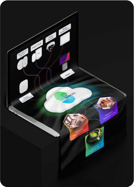
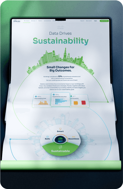
Cisco Spaces is an IoT-based SaaS platform that helps enterprises digitise their physical environments using Cisco’s existing infrastructure like Meraki and Catalyst access points. The platform enables everything from occupancy tracking and asset locationing to contextual engagement, indoor navigation, and energy monitoring.
This data is centralised into a dashboard, allowing stakeholders—whether IT teams, facility managers, or marketing leads—to visualise, configure, and act on insights. The result: smarter buildings, streamlined operations, and more responsive, data-driven workplaces.


Challenges
As Cisco Spaces scaled rapidly in both feature set and footprint, design needed to act as a connective tissue—tying together experiences, aligning teams, and elevating usability. Below are the core challenges that drove much of my design work:
Fragmented User Experience Across Multiple Surfaces
The platform spanned web dashboards, mobile apps, large-format signage, and printed materials. Each was built in isolation over time, leading to inconsistent experiences, broken visual cohesion, and unclear UX patterns across touchpoints.


Complex Data, Disconnected Flows
As the platform grew from its legacy foundations, different parts—like the website, dashboard, onboarding, and activation—were developed in silos. This led to scattered user journeys, where powerful features were underutilised due to unclear structure, inconsistent logic, and poor discoverability. Streamlining these experiences became critical to make the platform more intuitive, connected, and effective.

A Wide Audience with Diverse Needs
From IT admins and data analysts to marketers, CX teams, and end users, the audience for Cisco Spaces was as broad as the features it offered. Each group had unique goals, comfort levels, and technical understanding—demanding a flexible, inclusive design approach.

The Need for Speed
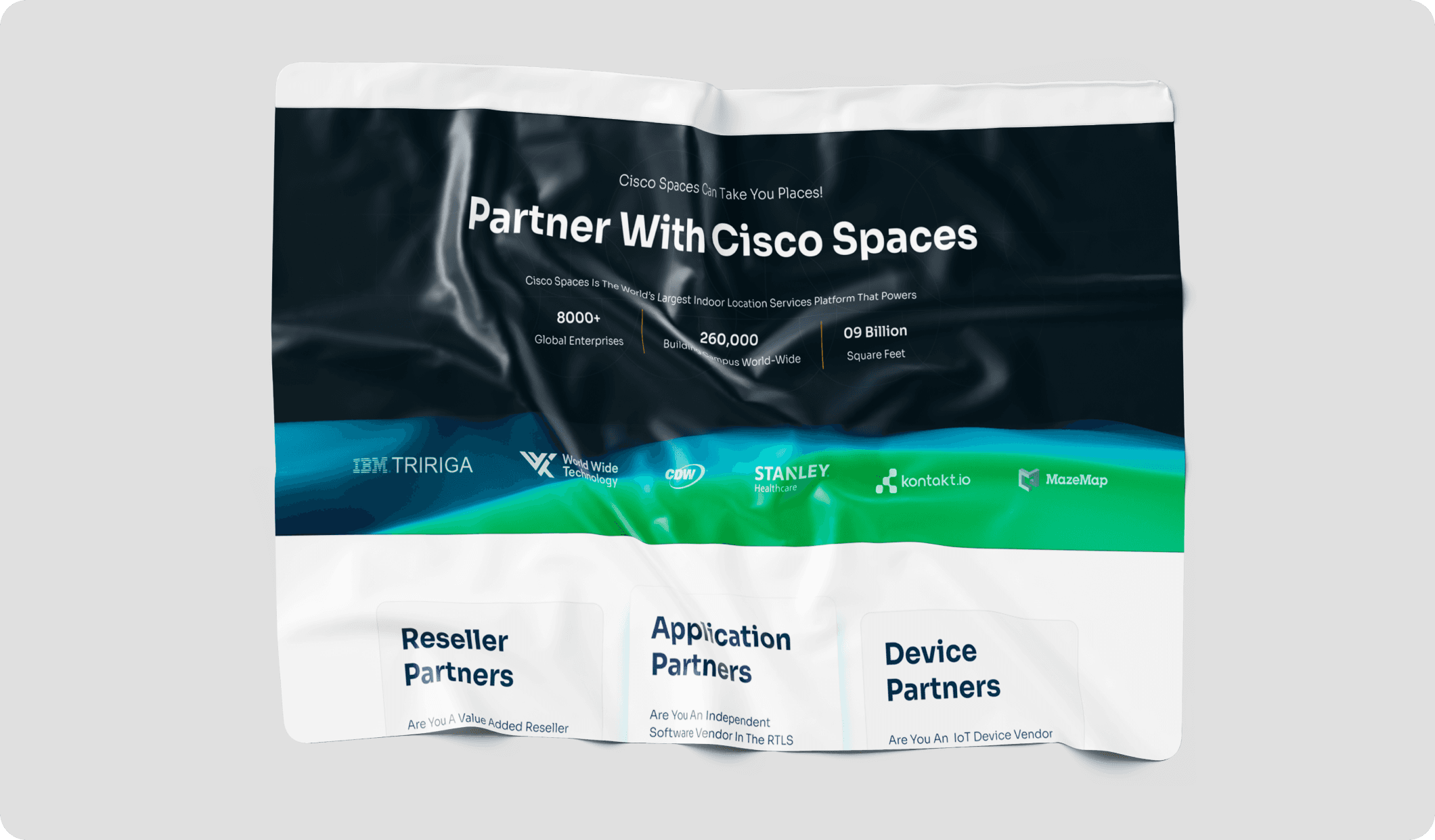
Whether it was supporting product launches, rolling out marketing campaigns, or executing a rebrand—from Cisco DNA Spaces to Cisco Spaces—design needed to move fast. The challenge wasn’t just speed—it was scale and quality under pressure.

One Platform, Multiple teams
I worked across GTM, growth, engineering, and adoption teams—each with their own priorities and timelines. Aligning those efforts into one cohesive experience required strong collaboration, constant communication, and design systems that could flex without breaking.
Users
Cisco Spaces wasn’t built for one type of user. It served facilities managers, IT administrators, business leaders, marketers, and even guests or employees navigating a smart building. Each persona brought different goals, workflows, and levels of technical fluency.
Designing for this diversity required more than just UI polish—it required systems thinking, empathy, and adaptability. From simplifying onboarding flows for newcomers to building dashboards for power users, my goal was always to strike the right balance between clarity and capability.

IT Teams

Facilities & Real Estate

Operations Teams

Marketing Teams

Strategy & Data teams

IT Directors

Visitors or Guests

Employees

HR Teams

Shoppers
Patients

Nurses & caregivers

Security
Design Principles
Across the diverse set of projects at Cisco Spaces—from dashboards and signage to marketing and onboarding flows—my design decisions were anchored in a few key principles. These principles helped me navigate enterprise complexity, unify brand experience, and create solutions that worked for a wide spectrum of users. Whether I was crafting a landing page or refining a data-heavy dashboard, these values consistently guided my process and outcomes.

Clarity Over Complexity
Simplified complex information into clear, actionable interfaces—especially in data-heavy views and onboarding flows.
→ Applied in: Dashboards, signage, and activation experiences.

Flexibility by Default
Built modular, adaptable assets that could scale with shifting product, brand, and campaign needs.
→ Applied in: Landing pages, email templates, seasonal assets.

Consistency Across Touchpoints
Maintained a cohesive design language across web, signage, print, and internal tools using scalable systems and reusable UI patterns.
→ Applied in: Rebranding, design systems, signage UIs

Empathy & Accessibility
Designed for varied user roles and skill levels by prioritising clear layouts, intuitive flows, and inclusive interaction patterns.
→ Applied in: Signage apps, user tools, internal dashboards.

Collaboration Drives Design
Worked closely with engineers, PMs, and marketers to align early, iterate fast, and ship thoughtfully.
→ Applied in: GTM rollouts, product interfaces, growth initiatives.

Tools & Tech
To support fast-paced, cross-functional work, I relied on a mix of design, no-code, and analytics tools:
Figma – for everything UI/UX: design systems, prototypes, developer handoff
Elementor & Unbounce – for building and iterating on web pages without developer bottlenecks
Hotjar, Pendo & HubSpot – for gathering behavioural insights and improving UX flows
MS Powerpoint, Illustrator, Photoshop – for internal presentations, event collateral, and visual storytelling
Using no-code tools not only accelerated delivery—it also empowered non-dev stakeholders (like PMs or content teams) to contribute, test ideas, and iterate independently.


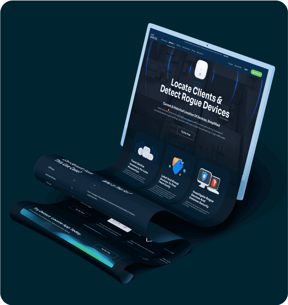
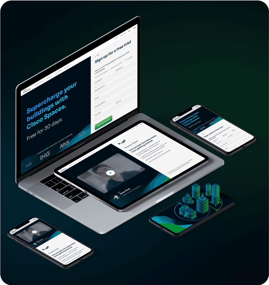
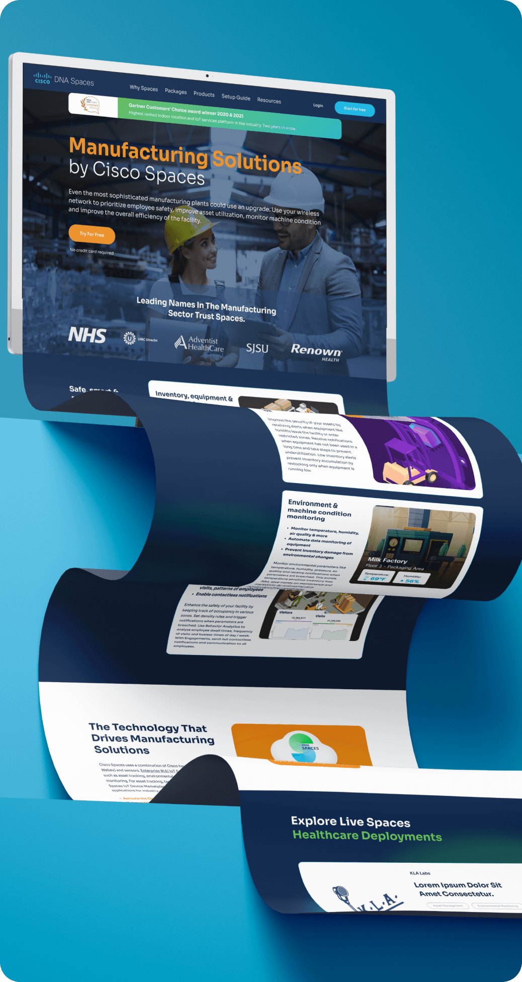
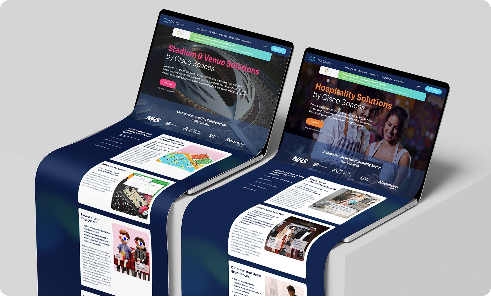
Website Design for Marketing & GTM
The ask? Launch better, faster, smarter landing pages for Cisco Spaces—and make sure they actually convert. For what? Webinars. Feature launches. Cisco Live. You name it.
Why now? We had just rebranded from Cisco DNA Spaces, the product was evolving fast, and the feature set was expanding—our web presence had to keep up.
I designed and developed a series of responsive landing and marketing pages using Elementor and Unbounce, built flexible templates, and embedded tools like Hotjar, Pendo, and HubSpot to track behaviour, measure success, and identify what wasn’t working. This wasn’t just about launching pages—it was about creating a scalable system that could support high-velocity campaigns across marketing and GTM.
I leaned heavily on real user data—scroll maps, drop-offs, and form heatmaps—to refine layout hierarchy, CTA placement, and content structure. I also referenced industry benchmarks and iterated post-launch to fine-tune performance.
The result? A modular system of landing pages that powered everything from webinars to GTM pushes—consistently outperforming SaaS benchmarks (~3.8%) with 9–12% average conversions, and 20%+ inquiry rates on use-case-specific pages. Webinar registrations rose ~25%, directly tied to these improvements.
Not every experiment worked—but every one taught us something useful. The real win? A web system that helped us move fast, learn faster, and scale design with intent.


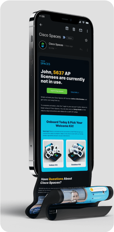
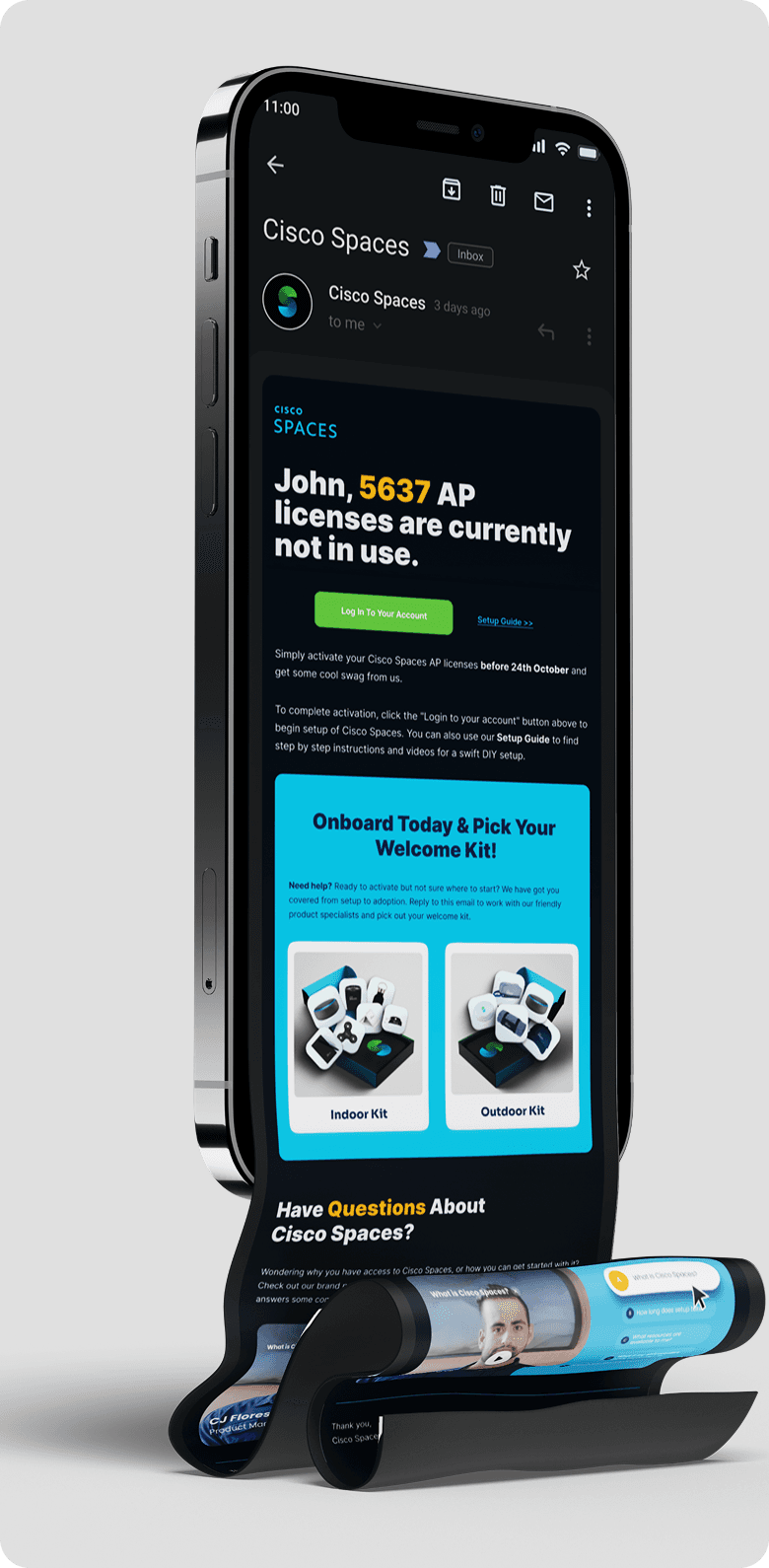
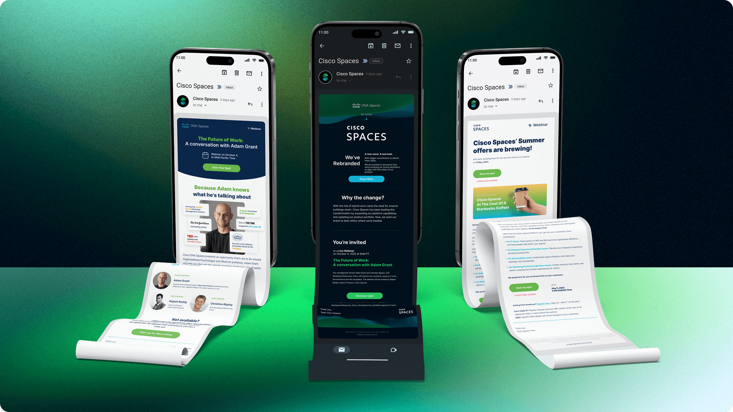
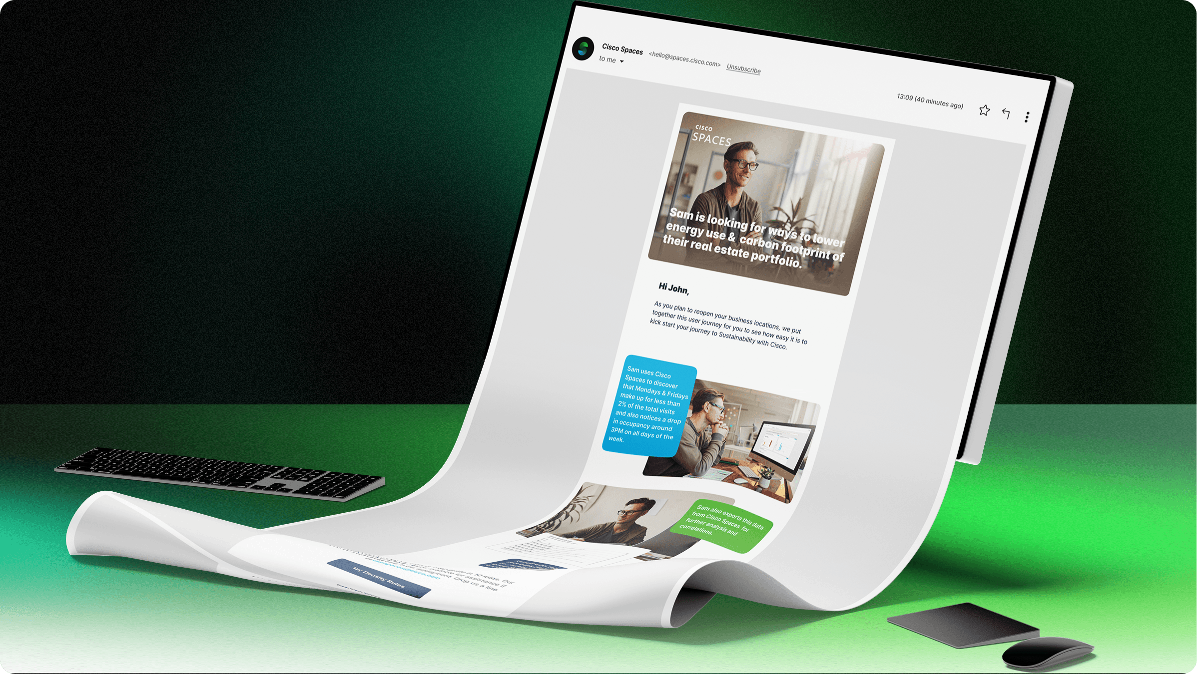
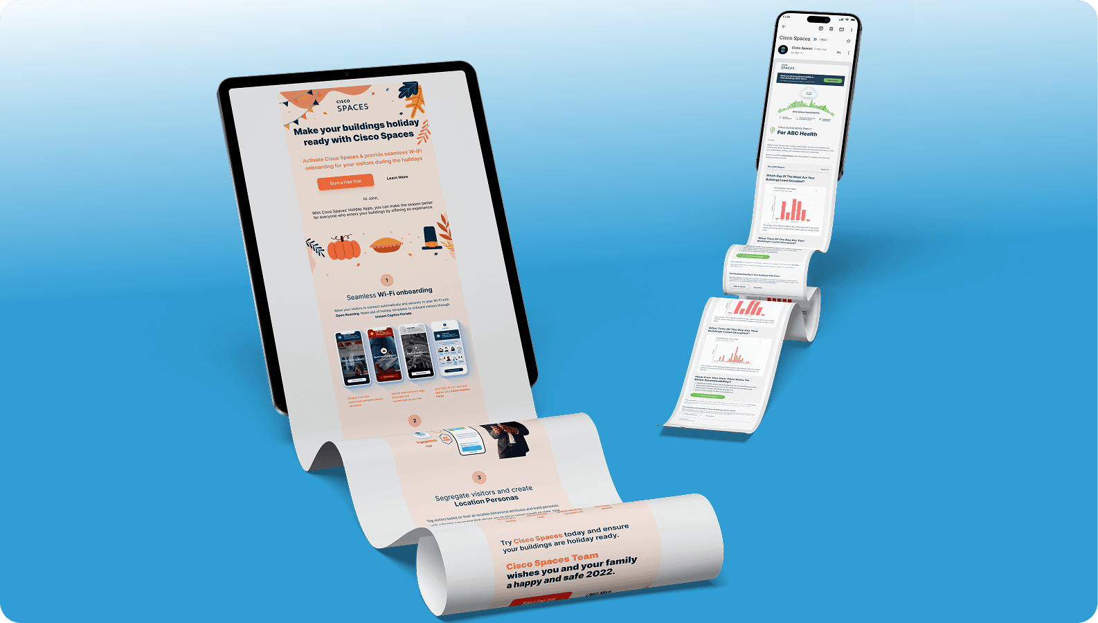
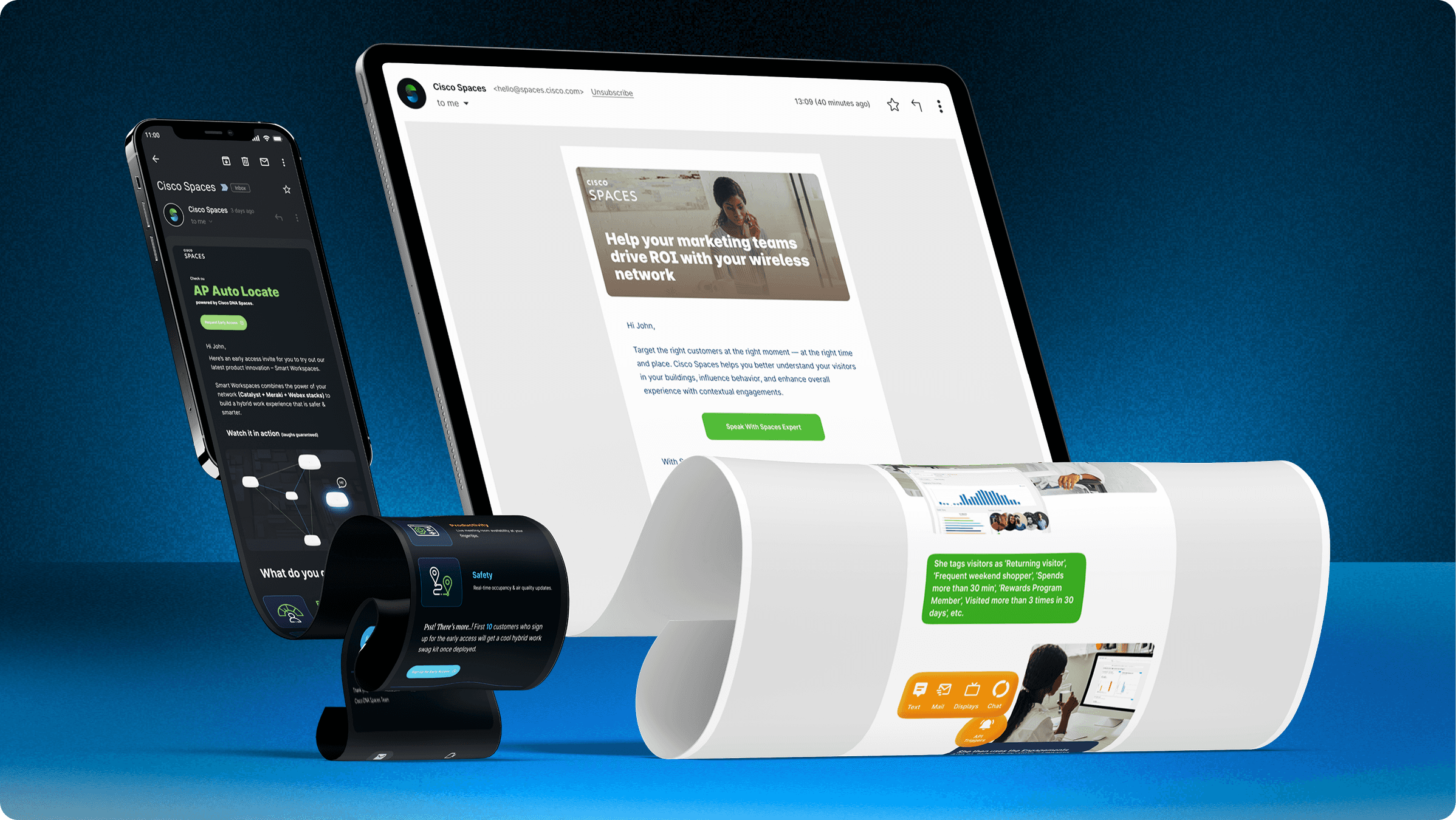
Responsive Email Designs
The challenge? Make emails more than just messages—make them part of the product experience. Whether it was onboarding new users, nudging adoption, or driving feature awareness, every email needed to do one thing: deliver value clearly.
I worked closely with PMs to align on strategy, structure, and tone—translating their content ideas into modular, user-focused templates. From subject line to CTA, each component was designed for clarity, adaptability, and performance.
We also evolved and adopted a lightweight email design system using wireframed components, which empowered PMs to visualise and build out email ideas faster—without starting from scratch each time.
The result? Higher engagement across the board. Campaigns using the new templates saw up to 2× the open and click-through rates, and adoption emails helped reduce drop-off during onboarding by ~18%.
The scalable system also cut design turnaround time by 40%, making it easier to test, learn, and iterate quickly.
Sometimes, good design isn't just about the pixels—it's about giving your team the tools to think in design.


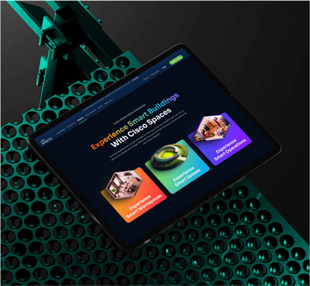
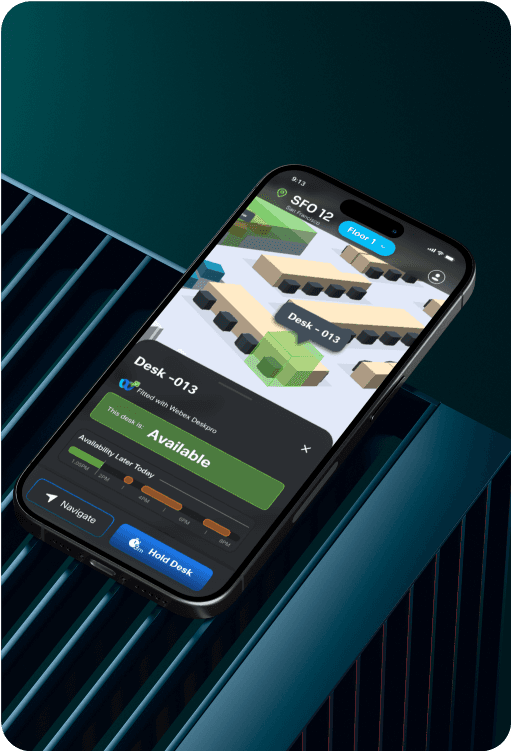
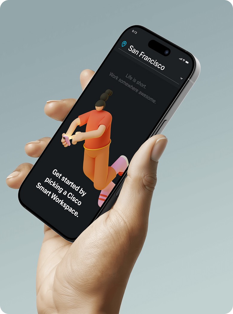
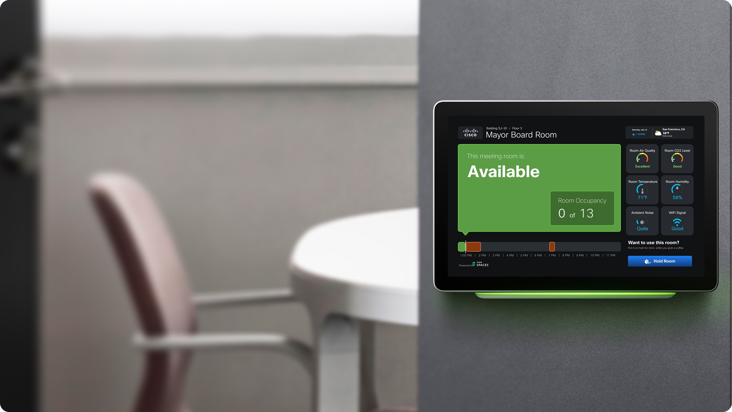
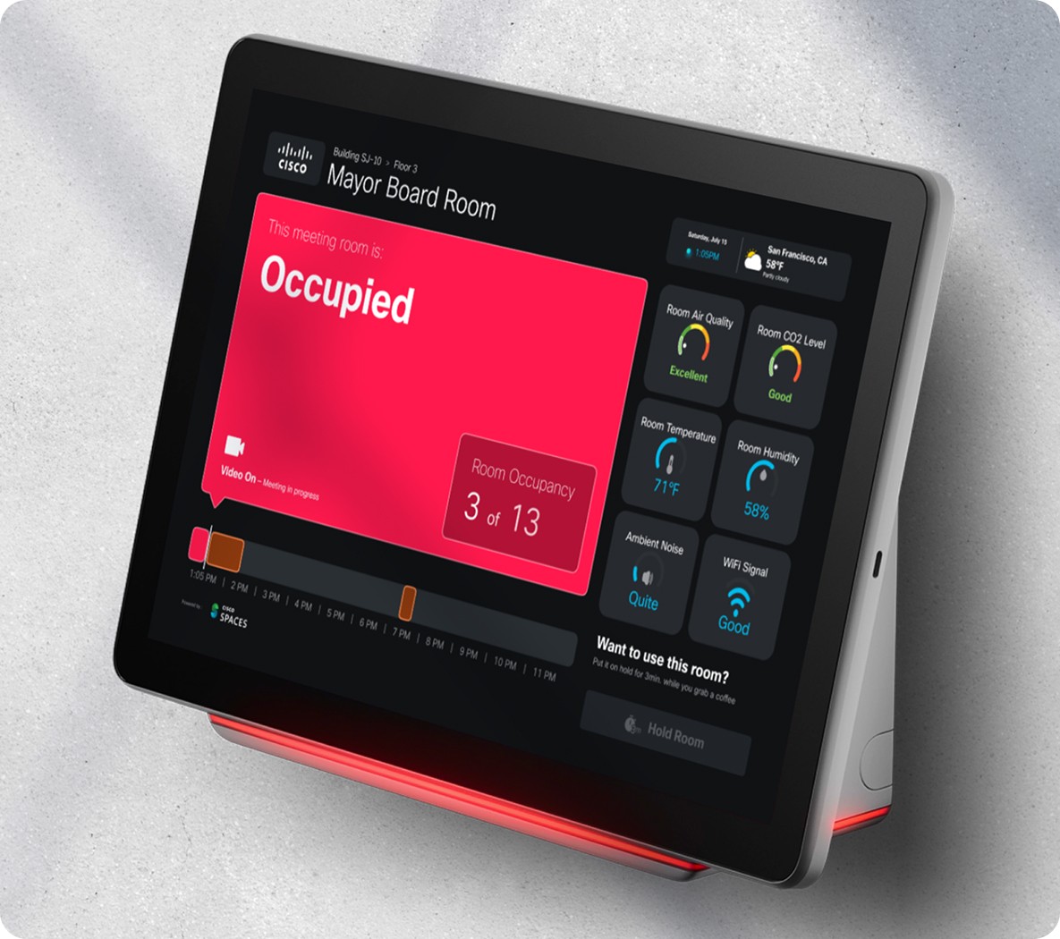
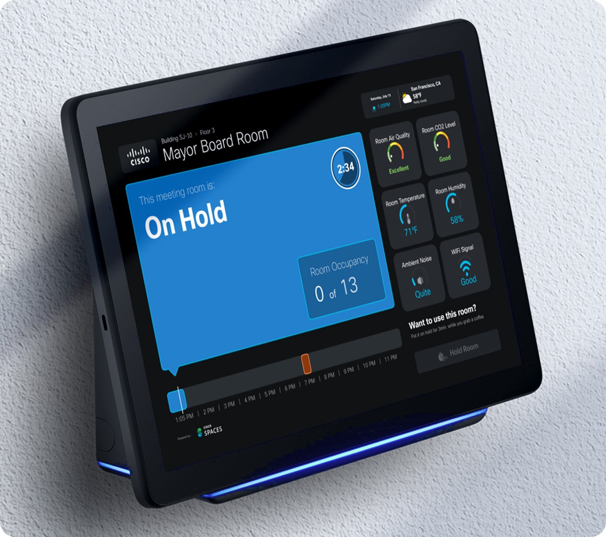
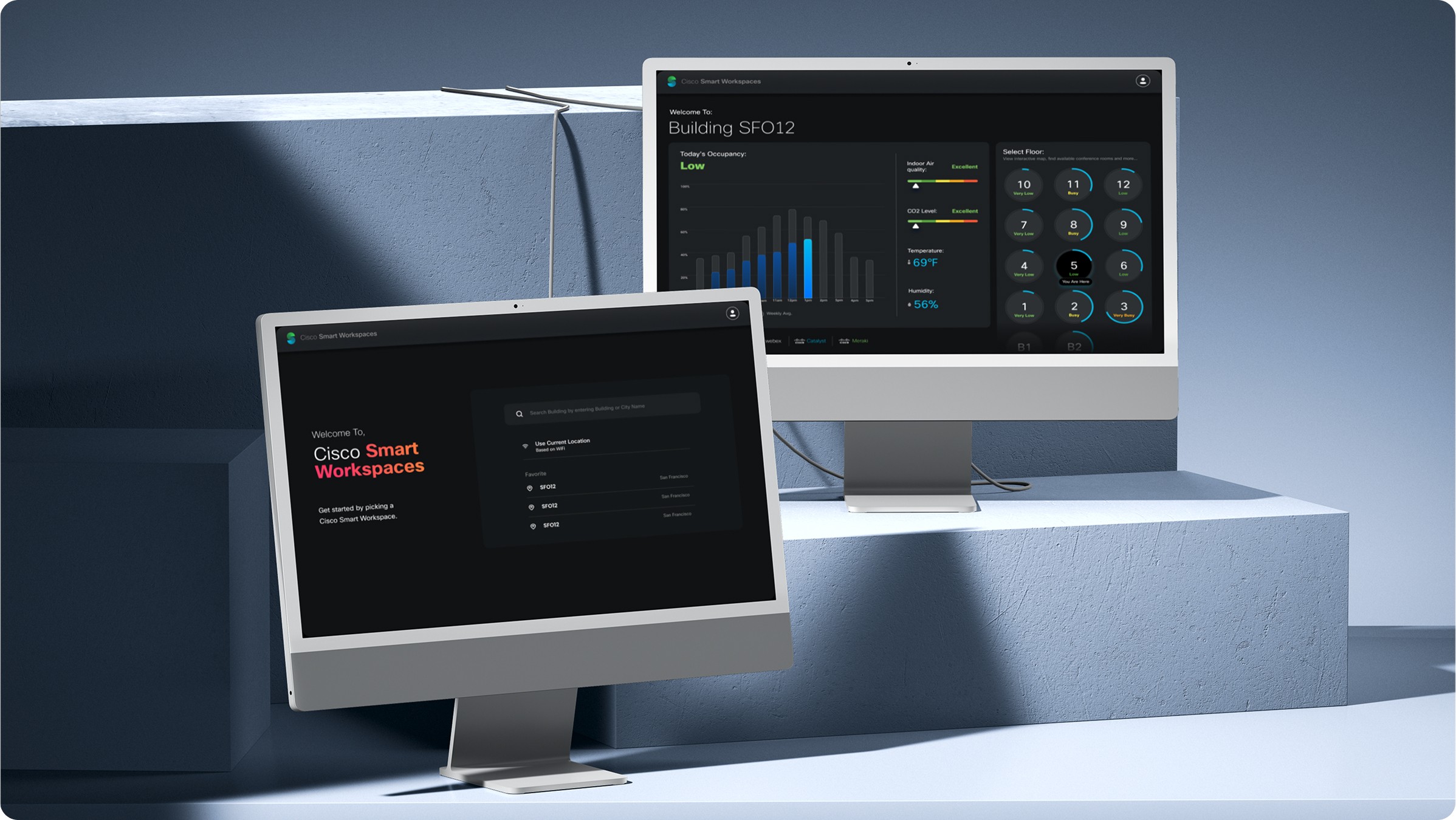
Smart Workspaces App Design
The goal was simple: help people find a desk or meeting room—whether they were already in the office or booking from home before arrival.
The challenge? Design one experience—and make it work everywhere. The catch? It had to work seamlessly across all screen types—from a 5" mobile phone to a 75" Cisco Webex board.
I redesigned the digital signage experience to improve clarity and usability, while introducing new features like desk booking alongside existing meeting room finding. These interfaces needed to be glanceable, accessible, and legible from a distance. I focused on visual hierarchy, real-time updates, and layouts that helped users stay focused—whether they were exploring the space or searching with intent.
In parallel, I worked on the mobile app version of the same experience—focused more on booking and wayfinding on the go. The flows included short paths, rich 3D indoor maps, and smart suggestions based on user location, helping people move through large campuses with confidence.
The result? A unified system designed to flex across screen sizes with minimal adaptation—purpose-driven, responsive, and visually consistent across mobile, Webex Room Navigators, desktops, and large displays.
While outcomes remain confidential, this work played a critical role in shaping the experience within Cisco’s vision for smarter, connected environments—across workspaces, event venues, and campuses.
In the end, it wasn’t just about scale—it was about context.


Navigation Redesign
The challenge? Cisco Spaces had grown—fast. New features, new use cases, new industries. But the website’s navigation hadn’t kept up.
Users—especially first-time visitors—were getting lost, and key content was buried under vague labels and nested menus. The ask was simple: make it easier to find what matters.
I worked on restructuring the global navigation, aligning it with real user journeys—from enterprise IT buyers and facilities teams to partners and existing customers. This included:
Auditing existing pages and user behaviour using Hotjar and GA
Re-mapping the IA to group content by intent, not by internal org structure
Designing new navigation patterns optimised for both desktop and mobile
Collaborating with PMs and developers to align links, CTAs, and page groupings
The result? A cleaner, more intuitive navigation that made key content easier to find, improved bounce and click-through rates, and supported stronger SEO performance by clarifying site structure and reducing orphan pages.
Dashboard Redesign
As part of Cisco Spaces’ broader brand and product evolution, we began rethinking the core dashboard experience.
The goal? Make existing features—many of which were underutilised due to complex UX—more accessible, actionable, and valuable for enterprise users.
I contributed to the early conceptualisation of the redesign, focusing on improving visual clarity, user flows, and data prioritisation. This initiative was informed by adoption metrics and stakeholder feedback, which indicated friction in navigating the platform’s deeper capabilities.
The redesigned concept received positive feedback from internal teams and leadership, and served as a foundation for aligning future product enhancements with real user needs.
🔒 Due to confidentiality, full details can’t be shared publicly—but feel free to connect with me to learn more about the design direction and rationale.
Branding & Beyond:
The Unseen but Essential
Every product needs a shiny front—but someone’s got to make sure everything else holds up too.
When Cisco DNA Spaces rebranded to Cisco Spaces, I supported the transition across multiple touchpoints—from web to product to marketing. That meant carefully updating visuals across the website, platform, and internal tools—without disrupting live systems or breaking continuity for users.
I also worked on a range of supporting assets:
Event collateral and merch designs for things like Cisco Live
Social media graphics and blog visuals
Ebooks and long-form content layouts for campaigns
While these might seem like “supporting” tasks, getting them right was crucial to delivering a consistent, trustworthy brand experience across every screen, page, or booth.


LEARNINGS
Enterprise doesn’t have to mean slow
I learned how to ship fast, even in a global org—by staying close to cross-functional teams and embracing startup-like agility.

Build once, reuse often
I became more intentional about building re-usable components, templates, and logic to help other teams (especially PMs and content owners) move faster and maintain consistency.

No-code isn’t a shortcut
— it’s a strategy
Tools like Elementor, Unbounce, HubSpot, and Pendo let us build fast, test quickly, and hand off control to non-dev teams—without losing quality.

Collaboration is a design tool
Some of the best outcomes came from working directly with PMs, marketers, and engineers early—rather than treating handoff as the final stage. Being looped into GTM or engineering discussions helped shape more relevant, feasible designs.

Not every design win is pixel-deep
Sometimes the biggest impact came from less glamorous tasks: streamlining navigation, updating brand elements, or tweaking a landing page flow that boosted sign-ups.

Context is everything
Mobile, signage, web—each demanded a different approach, even when solving the same problem.

Trade-offs are part of the job
Working within an evolving design system and changing brand meant making trade-offs—between ideal UX, engineering feasibility, brand constraints, and deadlines.

Website & LandIN..
That’s a wrap? Maybe not.
Great things start with 'Meet'!

Open to  conversations,
  collabs,
  creative challenges,
  puzzles-or just a friendly game of
  Chess.
or connect through..


© Copyright & stuff...
Created with  curiosity
  coffee
  love,
love,  some peer pressure, and
  way too many open tabs. Thanks for stopping by—don’t forget to blink and drink (water ofc)!
Back to top